```html
Best Paint Colors For 2024
The selection of paint colors for interior and exterior spaces demands careful consideration. Paint significantly impacts the atmosphere of a room, influences perceived space, and contributes to the overall aesthetic of a building. As color trends evolve, understanding the projected palettes for a given year becomes crucial for both homeowners and design professionals. This article examines some of the anticipated best paint colors for 2024, providing insights into their characteristics and potential applications.
Predicting color trends relies on analyzing a range of influences, including fashion, technology, societal shifts, and environmental concerns. Paint manufacturers and color experts conduct extensive research to identify the shades and hues likely to resonate with consumers in the coming year. These predictions often reflect a desire for comfort, connection to nature, and a sense of optimism.
Earthy and Grounded Tones
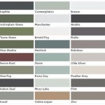
A consistent theme in color trend forecasts is the continued popularity of earthy and grounded tones. These colors evoke a sense of stability, warmth, and connection to the natural world. They often include variations of browns, greens, and terracotta.
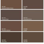
Browns, ranging from deep chocolate to lighter tans and beiges, offer a sense of comfort and sophistication. They can serve as a neutral backdrop for bolder accents or create a cozy, enveloping atmosphere in living rooms or bedrooms. Utilizing different shades of brown within the same space adds depth and visual interest. For instance, a dark brown accent wall paired with lighter beige walls and trim can create a balanced and inviting environment.
Green, a color strongly associated with nature, is expected to remain prominent in 2024. Shades ranging from muted sage green to richer forest green are anticipated to be highly sought after. Sage green, with its subtle gray undertones, provides a calming and versatile option for bedrooms, bathrooms, and kitchens. Forest green, with its depth and richness, can create a sophisticated and inviting atmosphere in living rooms, dining rooms, or even home offices. Combining green with natural materials like wood and stone further enhances the connection to nature.
Terracotta, a warm, earthy hue reminiscent of clay and sun-baked earth, brings a sense of rustic charm and character to interiors. It works well in spaces where a sense of warmth and authenticity is desired, such as kitchens, dining rooms, and entryways. Terracotta can be used as an accent color or as a dominant color on walls, depending on the desired effect. Pairing terracotta with creamy whites or natural linens creates a balanced and inviting palette.
Soft and Serene Blues
Blue, traditionally associated with tranquility and serenity, is also expected to feature prominently in 2024. However, rather than the bolder, more saturated blues of previous years, the emphasis will likely be on softer, more muted shades, creating a sense of calm and relaxation.
Powder blue, a delicate and airy hue, evokes a sense of peace and tranquility. It is an excellent choice for bedrooms, bathrooms, and nurseries, where creating a calming atmosphere is paramount. Powder blue can also be used effectively in living rooms and dining rooms, particularly when paired with light, neutral furnishings and accents. The addition of natural light enhances the ethereal quality of this color.
Gray-blue, a sophisticated and versatile shade, combines the calming qualities of blue with the neutrality of gray. It works well in a variety of spaces, from living rooms and bedrooms to kitchens and offices. Gray-blue can be used as a wall color, a cabinet color, or an accent color, depending on the desired effect. It pairs well with a range of other colors, including whites, creams, grays, and even pops of bolder colors like mustard yellow or coral.
Aqua, a refreshing and invigorating shade, brings a touch of the ocean to interiors. It is a great choice for bathrooms, kitchens, and sunrooms, where a sense of freshness and vitality is desired. Aqua can be used as a wall color, an accent color, or even as a tile color. Pairing aqua with white or light wood accents creates a clean and airy aesthetic.
Warm and Inviting Neutrals
Neutral colors continue to form the foundation of many interior design schemes, providing a versatile backdrop for incorporating bolder accents and textures. In 2024, the focus is expected to shift towards warmer, more inviting neutrals, offering a sense of comfort and sophistication.
Creamy whites, with their subtle warmth, offer a softer and more inviting alternative to stark white. They create a sense of light and airiness while also providing a touch of comfort and sophistication. Creamy whites work well in a variety of spaces, from living rooms and bedrooms to kitchens and bathrooms. They can be paired with a range of other colors, including neutrals, pastels, and bolder hues.
Warm grays, with their subtle undertones of brown or beige, provide a sophisticated and versatile neutral option. They offer a sense of calm and sophistication while also providing a touch of warmth and comfort. Warm grays work well in a variety of spaces, from living rooms and bedrooms to kitchens and offices. They can be paired with a range of other colors, including whites, creams, blues, and greens.
Greige, a blend of gray and beige, offers the best of both worlds: the neutrality of gray and the warmth of beige. It is a versatile and sophisticated neutral that works well in a variety of spaces. Greige can be used as a wall color, a cabinet color, or an accent color, depending on the desired effect. It pairs well with a range of other colors, including whites, creams, greens, and blues.
Beyond specific color families, undertones play a crucial role in determining the overall impact of a paint color. Undertones are the subtle hues that lie beneath the surface of a color and can influence how it appears in different lighting conditions and when paired with other colors. Understanding undertones is essential for selecting paint colors that complement existing furnishings and create a cohesive and harmonious space.
Lighting is a critical factor to consider when selecting paint colors. Natural light, artificial light, and the direction a room faces can all significantly impact how a color appears. Colors tend to appear cooler in north-facing rooms, which receive less direct sunlight, while they tend to appear warmer in south-facing rooms, which receive more direct sunlight. It is always recommended to test paint colors in the actual space before committing to a final decision.
The texture of a paint finish also plays a role in the overall aesthetic. Different paint finishes reflect light differently, which can affect the perceived color and create different visual effects. Matte finishes, with their low sheen, absorb light and create a soft, velvety look. Satin finishes, with their slight sheen, reflect light and create a more durable and washable surface. Gloss finishes, with their high sheen, reflect light and create a dramatic and eye-catching effect.
Ultimately, the best paint colors for 2024 will depend on individual preferences, the specific characteristics of the space, and the desired aesthetic. However, the trends suggest a continued emphasis on colors that evoke a sense of comfort, connection to nature, and optimism. By considering these trends and carefully evaluating the nuances of color, homeowners and designers can create spaces that are both visually appealing and emotionally resonant.
```
2024 Paint Colors Shaping Interior Design Porch Daydreamer

Dulux 2024 Paint Colour Trends

Kylie M S 5 Colors Of The Year 2024 Collection Interiors

Sherwin Williams 2024 Colors 48 Hues You Re Going To Love Postcards From The Ridge

Dulux 2024 Paint Colour Trends

Dulux 2024 Paint Colour Trends

2024 Trends The New Neutral Paint Colors Porch Daydreamer

Top Trending Interior Paint Colors For 2024 Tilo Martin Painting

Dulux 2024 Paint Colour Trends

The 10 Best Paint Colors For 2024 Designers Reveal Livingetc
Related Posts