What Neutral Paint Color Is Most Popular?
Identifying the single most popular neutral paint color is a complex endeavor, as popularity fluctuates based on trends, geographic location, lighting conditions, and individual preferences. However, by analyzing sales data, interior design trends, and expert opinions, it is possible to pinpoint several neutral colors that consistently rank among the most favored choices. These popular neutrals offer versatility, adaptability, and an enduring appeal that makes them suitable for a wide range of spaces and design styles. The following discussion will delve into the nuances of neutral color choices, highlighting specific shades and exploring the factors that contribute to their widespread adoption.
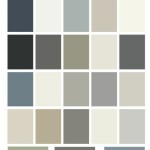
Neutral colors, by definition, lack strong chromatic saturation. They provide a backdrop that allows other elements within a space – furniture, artwork, textiles – to take center stage. This lack of inherent color makes them exceptionally adaptable. A neutral palette can be easily warmed up with wood tones and earth-toned accessories or cooled down with metallic accents and shades of blue and green. This flexibility is a key reason for the enduring popularity of neutrals; they provide a blank canvas upon which diverse design visions can be realized.
Furthermore, neutral colors often evoke feelings of calmness, serenity, and spaciousness. They can contribute to a sense of visual openness, particularly in smaller rooms. These psychological effects contribute to their desirability in homes and offices alike. Choosing the right neutral can transform a space, making it feel brighter, more inviting, and more conducive to relaxation or productivity. The perception of size and light is a powerful tool in interior design, and neutrals are often employed to maximize these effects.
The Reign of Off-White and Cream
While pure white can sometimes feel sterile or overly stark, off-white and cream tones offer a softer, warmer alternative. These shades are incredibly versatile, complementing a wide range of architectural styles and interior design aesthetics. The subtle undertones present in off-whites and creams can subtly influence the overall feel of a room. For instance, an off-white with a slight yellow undertone will create a warmer, more inviting atmosphere, while one with a hint of gray will feel cooler and more modern.
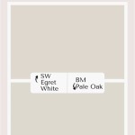
Specific examples of popular off-white and cream shades include Benjamin Moore's "Cloud White" and Sherwin-Williams' "Alabaster." These colors consistently rank among the best-selling neutrals, praised for their balanced undertones and ability to work well in various lighting conditions. The key to choosing the right off-white or cream is to consider the existing elements in the room, such as flooring, furniture, and trim, and to select a shade that complements these elements without clashing. Experimenting with paint samples under different lighting conditions is crucial to ensuring a harmonious and visually appealing result.
The popularity of off-whites and creams extends beyond residential interiors. They are frequently used in commercial spaces, healthcare facilities, and educational institutions due to their ability to create a clean, calming, and professional environment. The subtle variations within this color family allow for customization and personalization while maintaining a sense of neutrality and understated elegance. Furthermore, off-white and cream paints tend to reflect light well, contributing to energy efficiency and reducing the need for artificial lighting during daylight hours.
The Enduring Appeal of Gray
Gray has become a dominant force in interior design over the past decade, solidifying its position as a highly sought-after neutral. Its versatility stems from the vast spectrum of shades available, ranging from light and airy grays to deep and dramatic charcoals. The undertones present in gray paints can significantly impact their overall appearance, with some leaning towards blue for a cooler feel and others incorporating hints of beige or green for added warmth.
Gray is often perceived as a sophisticated and modern color, lending a sense of understated elegance to any space. Lighter shades of gray can create a serene and calming atmosphere, while darker grays can add depth and drama. The choice of gray depends on the desired mood and the specific characteristics of the room. For example, a light gray with warm undertones might be ideal for a living room, while a cool, crisp gray might be better suited for a bathroom or kitchen.
Popular gray paint colors include Sherwin-Williams' "Agreeable Gray" and Benjamin Moore's "Revere Pewter." These shades are often described as "greige," a blend of gray and beige, offering a warm and inviting alternative to cooler grays. Their versatility makes them suitable for a wide range of interior styles, from traditional to contemporary. The use of gray extends beyond walls; it is also a popular choice for cabinets, furniture, and flooring, further demonstrating its widespread appeal and adaptability.
The psychological effect of gray is often associated with neutrality, balance, and sophistication. It can create a sense of order and calm, making it a suitable choice for spaces where relaxation and focus are desired. However, it is important to avoid using too much gray, as this can create a feeling of monotony or coldness. Introducing pops of color through accessories, artwork, and textiles can help to break up the monotony and add visual interest to a gray-dominated space. The key is to create a balance between the neutral backdrop and the accent colors, ensuring a harmonious and visually stimulating environment.
Beige: The Timeless Classic
Beige, often considered a foundational neutral, has maintained its popularity for generations. Ranging from pale sand tones to richer camel hues, beige offers a warm and comforting alternative to cooler neutrals. Its natural, earthy undertones evoke a sense of groundedness and create a welcoming atmosphere. While sometimes perceived as a safe or even mundane choice, beige's versatility and timeless appeal continue to make it a favored option for homeowners and designers alike.
The strength of beige lies in its ability to complement a wide range of architectural styles and design sensibilities. It pairs well with natural materials like wood, stone, and linen, enhancing the organic feel of a space. Beige also serves as an excellent backdrop for bolder colors, allowing them to stand out without overwhelming the overall aesthetic. The key to selecting the right beige shade is to consider the undertones and ensure that they align with the existing elements in the room.
Specific examples of popular beige paint colors include Benjamin Moore's "Manchester Tan" and Sherwin-Williams' "Accessible Beige." These shades are known for their balanced undertones and ability to create a warm and inviting atmosphere. They are often used in living rooms, bedrooms, and hallways, where a sense of comfort and relaxation is desired. The use of beige extends beyond walls; it is also a common choice for carpets, upholstery, and window treatments, further contributing to its enduring appeal.
The psychological effect of beige is often associated with warmth, comfort, and serenity. It can create a sense of groundedness and stability, making it a suitable choice for spaces where relaxation and rejuvenation are prioritized. Beige is also a versatile color that can be easily adapted to different design styles, from traditional to modern. By incorporating different textures, patterns, and accessories, beige can be transformed to suit a wide range of individual preferences. The key is to use beige as a foundation and build upon it with other elements to create a cohesive and visually appealing space.
Ultimately, determining the single most popular neutral paint color is an exercise in identifying consistent trends and widely favored choices. While preferences evolve and new shades emerge, off-white and cream variants, adaptable grays, and the timeless appeal of beige consistently remain at the forefront of popular choices in both residential and commercial settings. The key to selecting the right neutral is to consider the specific characteristics of the space, the desired mood, and the existing elements within the room. By carefully evaluating these factors, individuals can choose a neutral that enhances their environment and creates a visually harmonious and inviting atmosphere. Properly sampling paint colors under varying lighting conditions is paramount to ensuring that the final result aligns with the intended aesthetic.

8 Best Warm Beige Paint Colors For 2025 Color Concierge

The Best 15 Neutral Paint Colors For 2025 Turquoise Home

The Best Neutral Paint Colors By Allison Crawford

The Best Neutral Paint Colors Midwest Life And Style Blog

The Best Sherwin Williams Neutral Paint Colors

Top 10 Most Popular Neutral Paint Colors 2024 Agape Home Services

Best Neutral Paint Colors

The Trick To Choosing Right Paint Color 12 Perfect Neutral Colors

The Best Neutral Paint Colors For Every Room Colorfully Behr

The Most Popular Neutral Colors Were Just Revealed They Re So Relaxing
Related Posts