What Is The Most Popular White Paint Color For Living Room?
Selecting the perfect white paint color for a living room is a common yet complex decision for homeowners and interior designers alike. White paint, often perceived as a simple choice, offers an expansive spectrum of undertones and finishes, each capable of dramatically impacting the ambiance of a space. While pinpointing the "most" popular white is challenging due to regional preferences and evolving trends, understanding the characteristics of widely favored options provides valuable insight for informed decision-making. This article will explore several leading white paint colors, analyzing their undertones, suitability for various lighting conditions, and overall impact on the living room environment.
The appeal of white paint lies in its versatility and timelessness. It serves as a blank canvas, allowing furniture, artwork, and textiles to take center stage. White walls reflect light, making smaller spaces feel larger and brighter. Moreover, white complements a wide array of design styles, from minimalist and modern to traditional and rustic. However, the sheer number of white paint options can be overwhelming. To navigate this landscape effectively, it's crucial to understand the nuances that differentiate one white from another.
Examining the Undertones of Popular White Paint Colors
The key to differentiating white paint colors lies in identifying their undertones. Undertones are subtle hues that influence how the white appears under different lighting conditions. Understanding these undertones is essential for selecting a white that harmonizes with the existing décor and desired aesthetic. Common undertones found in white paint include warm tones like yellow, red, and brown, and cool tones like blue, green, and gray.
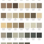
One frequently cited popular white is "Chantilly Lace" by Benjamin Moore. This white is often described as a true white, meaning it has very minimal undertones. It's considered a clean and crisp white that works well in modern spaces and provides a neutral backdrop for bolder color accents. Its almost pure white character means it doesn't lean heavily warm or cool, making it exceptionally versatile.
"Simply White" by Benjamin Moore is another consistently popular choice. As its name suggests, it aims for simplicity, but unlike Chantilly Lace, it has a subtle warm undertone. This slight warmth prevents it from feeling sterile and can make a room feel more inviting and comfortable. It's a good option for rooms that receive less natural light or for those seeking a softer, more traditional feel.
Sherwin-Williams' "Snowbound" is a frequently discussed option. While classified as a white, it possesses a noticeable gray undertone. This soft, muted quality makes it a good choice for those wanting a calming, sophisticated atmosphere. The gray undertone helps to create a sense of depth and can pair well with both cool and warm-toned furnishings. It avoids the starkness sometimes associated with pure whites.
Another popular selection from Sherwin-Williams is "Alabaster." This white leans heavily towards warm undertones, specifically a creamy off-white with hints of yellow or beige. Alabaster is favored for its ability to create a cozy and welcoming ambiance. It works particularly well in rooms with abundant natural light, as it enhances the warmth and creates a comfortable glow. It's a suitable choice for those who prefer a richer, more traditional white.
Farrow & Ball's "Wimborne White" is a sophisticated off-white with a slightly creamy and warm undertone. Described as a soft, chalky white, it brings a serene and timeless quality to a space. It has a depth of color that sets it apart from starker whites, making it a beautiful choice for creating a relaxed and inviting living room.
Another Farrow & Ball favorite, "Pointing," is also a warm white with a delicate touch of yellow. It is known for its ability to create a cozy and inviting atmosphere. Its subtle pigmentation provides depth and interest, making it an ideal choice for those seeking a white that is not overly bright or stark.
Considering Lighting Conditions and Room Orientation
The lighting within a living room plays a crucial role in how a white paint color appears. Natural light, both direct and indirect, interacts with the paint's undertones, influencing its perceived hue. Artificial lighting, including incandescent, fluorescent, and LED bulbs, can also significantly alter the color's appearance. Understanding the room's orientation and the type of lighting it receives is fundamental to selecting the most suitable white paint.
Rooms facing north tend to receive cooler, indirect light. In these spaces, whites with warm undertones, such as "Simply White" or "Alabaster," can help to counteract the coolness and create a more inviting atmosphere. These warm whites will appear less yellow in cooler light than they would in a south-facing room.
South-facing rooms, on the other hand, are bathed in warm, abundant sunlight. In these spaces, cooler whites with gray or blue undertones, like "Snowbound," can balance the warmth and prevent the room from feeling overly bright or washed out. A true white like "Chantilly Lace" can also work well in a south-facing room, as the natural light will enhance its crispness and clarity.
East-facing rooms receive warm morning light and cooler light in the afternoon. West-facing rooms experience the opposite, with cooler light in the morning and warm light in the afternoon. For these rooms, a more neutral white, like "Chantilly Lace," or a white with subtle undertones, like "Wimborne White" or "Pointing," may be the most versatile option, as they can adapt to the changing light throughout the day.
Artificial lighting also needs to be considered. Incandescent bulbs cast a warm, yellow light, which can enhance the warm undertones in a white paint color. Fluorescent bulbs, on the other hand, emit a cooler, blueish light, which can make warm whites appear more neutral and cool whites appear even colder. LED bulbs offer a wider range of color temperatures, so it's important to choose bulbs with a color temperature that complements the chosen white paint. Testing paint samples under different lighting conditions is essential to ensure the desired effect is achieved.
The Impact of Finishes on Appearance
Beyond the color itself, the paint finish significantly impacts how a white paint appears in a living room. Different finishes reflect light in varying degrees, affecting the perceived color and sheen. The most common paint finishes for interior walls include flat, matte, eggshell, satin, semi-gloss, and gloss.
Flat and matte finishes are non-reflective and absorb light, creating a soft, velvety appearance. They are ideal for hiding imperfections on walls but are less durable and harder to clean. These finishes are often preferred for living rooms aiming for a relaxed, understated aesthetic.
Eggshell and satin finishes have a slight sheen and are more durable and easier to clean than flat or matte finishes. They offer a good balance between aesthetics and practicality, making them a popular choice for living rooms that experience moderate traffic. The slight sheen reflects some light, which can also help to brighten the room.
Semi-gloss and gloss finishes are highly reflective and extremely durable. They are typically used for trim, doors, and cabinets but can also be used on walls for a more dramatic effect. However, high-gloss finishes can accentuate imperfections on walls, so they are best suited for smooth, well-prepared surfaces.
Choosing the right finish depends on the desired aesthetic, the level of traffic in the living room, and the condition of the walls. For example, a matte finish in a warm white can create a cozy and inviting atmosphere, while a satin finish in a cool white can create a more modern and sophisticated look.
Ultimately, selecting the "most popular" white paint color for a living room is a subjective process based on individual preferences, the room's specific characteristics, and the desired overall aesthetic. By understanding the nuances of undertones, considering the impact of lighting conditions, and carefully choosing the appropriate finish, homeowners can make informed decisions and create a living room that reflects their personal style and enhances their living experience. The examples provided represent widely used and admired choices, offering a solid foundation for exploring the diverse world of white paint.

The Best White Paint Colors For Interiors Life On Virginia Street

The Best White Paint Colors For 2024 Thistlewood Farm

The 12 Best White Paint Colors According To Experts Young House Love

30 Living Room Paint Colors Inspiration For An Inviting Space Benjamin Moore

What Is The Most Popular Color For Interior Walls Buy Wall Art

Top White Paint Colors For Every Style Colorfully Behr

White Paint Colors Expert Picks Sherwin Williams

How To Choose The Best White Paint Color Turquoise Home

Most Popular Paint Colors Benjamin Moore

Top 5 White Paint Colors The Beauty Revival
Related Posts