What is the Lightest Gray Behr Paint Color?
Selecting a paint color can be a complex process, especially when aiming for neutrality. Gray, in particular, offers a vast spectrum of shades, each with subtle undertones that can dramatically impact a space. When the objective is to maximize light and create an airy atmosphere, identifying the lightest gray becomes paramount. Behr, a prominent paint manufacturer, offers a range of gray tones, necessitating a careful examination of their color palette to pinpoint the most suitable option. This article will explore several contenders for the lightest gray in the Behr collection, delving into their Light Reflectance Values (LRV) and subtle color characteristics.
The Light Reflectance Value (LRV) is a crucial metric in determining how light or dark a paint color appears. LRV is measured on a scale of 0 to 100, where 0 represents absolute black (absorbing all light) and 100 represents pure white (reflecting all light). Therefore, the higher the LRV of a paint color, the more light it reflects, making it appear brighter and lighter. When searching for the lightest gray, the focus should be on colors with the highest possible LRV within the gray range. However, it's important to acknowledge that true gray has no undertones; most "gray" paints have hints of blue, green, purple, or beige, which influence their overall appearance in varying lighting conditions.
While the precise "lightest" gray can be somewhat subjective depending on individual perception and specific lighting conditions within a room, several Behr colors consistently rank high in terms of lightness and neutrality. These options typically fall within the LRV range of 70-90, indicating a significant degree of light reflectance. Identifying these colors involves a detailed comparison of LRV values and consideration of any inherent undertones that may affect their perceived lightness.
Key Point 1: Identifying Top Contenders for the Lightest Gray
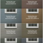
Several Behr paint colors are frequently cited as contenders for the lightest gray. These paints share a relatively high LRV and offer a subtle, almost ethereal, quality. One prominent example is "Ethereal Mood" (PR-W14). Although Behr does not publicly disclose numerical LRV values for its paints, "Ethereal Mood" is widely recognized for its delicate, airy feel. Its name itself suggests a lightness and transparency, hinting at its high reflectance properties. It is often described as a very pale gray with a hint of warmth, preventing it from feeling cold or sterile.
Another potential candidate is "Silver Drop" (790C-2). This color is a slightly more defined gray than "Ethereal Mood," but its inherent lightness still makes it a suitable choice for brightening a space. "Silver Drop" often appears as a near-white color with a subtle gray cast, offering a more distinct gray tone than some of the lighter options. It is a versatile color that works well in various lighting conditions, maintaining a clean and crisp appearance.
A third option worth considering is "Pale Oak" (OC-20). While technically categorized as an off-white, "Pale Oak" possesses a strong gray influence, particularly in certain lighting conditions. Depending on the room's orientation and the type of light it receives, "Pale Oak" can present as a very light, warm gray. It is a sophisticated and nuanced color that introduces a touch of warmth while maintaining a sense of airiness. Its versatility makes it a popular choice for those seeking a light and inviting neutral.
It is critical to test paint samples in the actual space where they will be applied. The surrounding environment, including existing furniture, flooring, and natural light sources, can significantly impact the way a paint color is perceived. Painting a small area and observing it at different times of day will provide a more accurate representation of the color's true appearance.
Key Point 2: The Influence of Undertones on Perceived Lightness
Undertones play a crucial role in how a gray paint color is perceived. Even the lightest grays can exhibit subtle hints of other colors, which can affect their overall warmth or coolness. A gray with a slight blue undertone, for example, will generally appear cooler and more crisp, while a gray with a beige or greige (gray-beige) undertone will feel warmer and more inviting. These undertones are more pronounced under certain lighting conditions, making it essential to consider the specific lighting in the intended space.
For instance, a gray with a slight green undertone may appear particularly soothing and natural, making it a good choice for bedrooms or living rooms. However, this undertone may not be desirable in spaces where precise color accuracy is required, such as art studios or photography studios. Similarly, a gray with a hint of purple can create a sophisticated and elegant atmosphere, but it may also make a room appear colder if not balanced with warmer accents.
When seeking the lightest gray, it is generally advisable to opt for colors with minimal or neutral undertones. Paints that lean too heavily towards a specific undertone may not achieve the desired effect of maximizing light and creating a sense of spaciousness. Instead, they may introduce unwanted color casts or appear too warm or too cool for the intended aesthetic. Selecting a gray that is as close to a true neutral as possible will typically result in a brighter and more versatile space.
The interplay between natural and artificial light can also influence the perception of undertones. Natural light tends to enhance the true color of a paint, while artificial light can alter it significantly. Incandescent lighting, for example, often casts a warm, yellow glow, which can accentuate warm undertones in gray paints. Fluorescent lighting, on the other hand, tends to emit a cooler, bluer light, which can highlight cool undertones. Understanding how different types of lighting affect paint colors is essential for making an informed decision.
Key Point 3: Testing and Evaluating Paint Samples
Before committing to a specific paint color, it is imperative to test and evaluate samples in the intended space. This crucial step allows for a more accurate assessment of the color's appearance under various lighting conditions and within the context of the existing décor. Testing paint samples involves painting small areas of the wall and observing them at different times of day, as well as under both natural and artificial light.
It is recommended to paint the samples on multiple walls within the room to account for variations in light exposure. The size of the sample should be large enough to provide a realistic representation of the color, ideally at least 12 inches by 12 inches. It is also important to apply two coats of paint to ensure accurate color saturation. Observe the samples for several days to gain a comprehensive understanding of how the color changes throughout the day.
In addition to observing the color under different lighting conditions, it is also helpful to compare the paint samples to other elements in the room, such as furniture, flooring, and artwork. This will help determine whether the chosen gray complements the existing décor and achieves the desired overall aesthetic. Experiment with different lighting options, such as lamps and overhead fixtures, to see how they affect the color's appearance.
Furthermore, consider the sheen of the paint. Different sheens reflect light in different ways, which can impact the perceived brightness of a color. Higher sheen levels, such as gloss or semi-gloss, reflect more light, making colors appear brighter. However, high-sheen paints are also more prone to showing imperfections on the wall. Matte or eggshell sheens, on the other hand, reflect less light and are better at concealing imperfections, but they may also make colors appear slightly darker. Selecting the appropriate sheen level is an important consideration when choosing a paint color.
By meticulously testing and evaluating paint samples, individuals can make an informed decision and select the lightest gray Behr paint color that best suits their specific needs and aesthetic preferences. This process minimizes the risk of disappointment and ensures that the final result is a bright, airy, and visually appealing space.

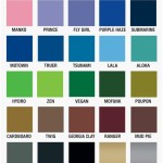
Behr S 50 Shades Of Grey Colorfully Blog

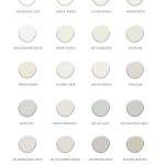
This Color Is Behr S Best Muted Blue And No Else Using It Mod Mood

This Color Is Behr S Best Muted Blue And No Else Using It Mod Mood

Behr S 50 Shades Of Grey Colorfully Blog

Mineral Grays Colorfully Behr Blog

This Color Is Behr S Best Muted Blue And No Else Using It Mod Mood

Light Gray All The Way Color Scheme Palettes Schemecolor Com

This Color Is Behr S Best Muted Blue And No Else Using It Mod Mood

This Color Is Behr S Best Muted Blue And No Else Using It Mod Mood

Nine Gray Paint Colors We Put To The Test For Your Home Within Grove
Related Posts