```html
What Colour Paint For Walls: A Comprehensive Guide
Choosing the right colour paint for walls is a critical decision that significantly impacts the ambiance and perceived size of a room. It’s more than just aesthetics; colour influences mood, productivity, and even the perceived temperature of a space. Therefore, careful consideration must be given to various factors, from natural light availability to existing furniture and desired atmosphere, before settling on a final paint colour.
The selection process often begins with defining the purpose of the room. Is it a bedroom meant for relaxation and restful sleep? Or is it a home office designed for focus and creativity? The intended use case should heavily influence the colour palette. Additionally, the size of the room plays a crucial role. Darker colours can make a large room feel cozier but can also overwhelm a smaller space. Conversely, lighter colours can make a small room feel more expansive, but may appear sterile in a large, sparsely furnished area.
Furthermore, the existing features of the room, such as flooring, furniture, and architectural details, must be considered. The paint colour should complement these elements, creating a cohesive and visually appealing environment. Undertones, which are subtle hues within a colour, can either enhance or clash with existing elements, so careful evaluation is paramount.
Understanding Colour Theory and Psychology
A foundational understanding of colour theory is invaluable when selecting wall paint. The colour wheel, comprised of primary, secondary, and tertiary colours, provides a framework for understanding colour relationships and creating harmonious palettes. Primary colours (red, yellow, blue) are pure and cannot be created by mixing other colours. Secondary colours (green, orange, purple) are created by mixing two primary colours. Tertiary colours are created by mixing a primary and a secondary colour.
Complementary colours, located opposite each other on the colour wheel (e.g., red and green, blue and orange, yellow and purple), create a vibrant and dynamic contrast when used together. Analogous colours, located next to each other on the colour wheel (e.g., blue, blue-green, green), create a harmonious and calming effect. Monochromatic palettes, using different shades and tints of a single colour, offer a subtle and sophisticated look.
Beyond the technical aspects, the psychology of colour plays a significant role in interior design. Different colours evoke different emotions and psychological responses. For instance, blue is often associated with calmness, serenity, and stability, making it a popular choice for bedrooms and bathrooms. Green is associated with nature, growth, and tranquility, suitable for living rooms and areas intended for relaxation. Yellow is associated with energy, optimism, and happiness, often used in kitchens and playrooms. Red is associated with passion, energy, and excitement, and should be used sparingly as it can be overwhelming in large doses. Purple is associated with luxury, creativity, and sophistication, suitable for bedrooms and studies. Orange is associated with enthusiasm, warmth, and creativity, often used in kitchens and dining rooms. Neutral colours like white, gray, beige, and greige provide a versatile backdrop and can be paired with accent colours to create a balanced and harmonious space.
The intensity and saturation of colour also affect the overall impact. Muted colours are less intense and create a more subtle and calming atmosphere, while vibrant colours are more stimulating and attention-grabbing. The choice between muted and vibrant colours should align with the intended mood and purpose of the room.
Assessing Light and Space
The amount and type of light a room receives significantly influence how paint colours appear. Natural light, particularly daylight, provides the most accurate representation of colour. However, rooms with limited natural light may require lighter colours to maximize brightness. Artificial light, such as incandescent, fluorescent, and LED lighting, can also alter the perceived colour of paint. Incandescent light tends to cast a warm, yellow glow, while fluorescent light can cast a cool, bluish tint. LED lighting offers a wider range of colour temperatures, allowing for greater control over the overall lighting ambiance.
Before committing to a specific paint colour, it is crucial to test it in the room under different lighting conditions. Paint small swatches of the desired colours on the wall in various locations and observe them throughout the day and night. This will help determine how the colour appears under different light sources and whether it complements the room's existing features. Consider using paint samples with different sheens to see how the light reflects off of the surface.
The size of the room also plays a critical role in colour selection. Lighter colours tend to make a small room feel more spacious by reflecting light. Conversely, darker colours can make a large room feel cozier and more intimate. However, using dark colours in a small room can make it feel cramped and claustrophobic. To create the illusion of height, paint the ceiling a lighter colour than the walls. To make a long, narrow room feel wider, paint the shorter walls a darker colour than the longer walls. Vertical stripes can also visually heighten a room, while horizontal stripes can visually widen it.
The orientation of the room also affects the light it receives. North-facing rooms tend to receive cooler, indirect light, which can make colours appear more muted. South-facing rooms tend to receive warmer, brighter light, which can make colours appear more vibrant. East-facing rooms receive warm, golden light in the morning and cooler light in the afternoon. West-facing rooms receive warm light in the afternoon and cooler light in the morning. Understanding the orientation of the room and the type of light it receives is essential for selecting paint colours that will look their best throughout the day.
Considering Existing Elements and Personal Style
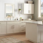
The existing elements within a room, such as flooring, furniture, and architectural details, should be carefully considered when selecting paint colours. The paint colour should complement these elements, creating a cohesive and harmonious design. For example, if the room has warm-toned wooden floors, warm paint colours such as beige, cream, or gold may be a good choice. If the room has cool-toned gray floors, cool paint colours such as blue, green, or gray may be more suitable.
The style of the furniture should also be taken into account. Modern furniture often pairs well with neutral colours or bold accent colours. Traditional furniture often pairs well with classic colours such as ivory, taupe, or navy. Eclectic furniture allows for more experimentation with different colours and patterns.
Architectural details such as crown molding, wainscoting, and fireplaces can also influence paint colour selection. These details can be highlighted by painting them a contrasting colour or subtly emphasized by painting them a shade lighter or darker than the walls. Consider the overall architectural style of the home when selecting paint colours. Victorian homes often feature rich, saturated colours, while minimalist homes often feature neutral colours and clean lines.
Ultimately, the choice of paint colour should reflect personal style and preferences. While it's helpful to consider trends and design principles, the most important factor is to choose colours that make the space feel comfortable, inviting, and reflective of the individuals who inhabit it. It's advisable to collect inspiration from magazines, online resources, and real-life spaces. Create a mood board with fabric samples, paint chips, and images that capture the desired aesthetic. Don't be afraid to experiment with different colours and combinations until the perfect palette is found.
In conclusion, selecting the right wall paint involves a multi-faceted approach. Understanding colour theory, assessing light and space, and considering existing elements are all crucial steps. By carefully considering these factors, it's possible to choose paint colours that create a beautiful, functional, and personalized living space.
```
3 Wall Paint Colours To Transform Your Home Interiors Indigo Paints

Bright Paint Colors Colours For Room Indigo Paints

95 Best Wall Paint Colour Combination Ideas In 2024 Bedroom Colors

A Guide To Colour Blocking When Choosing Wall Paint Colours Berger Blog

10 Paint Colors That Go Well With Shades Of Blue For Home Space Nippon

30 Lovely Living Room Paint Ideas Colour Schemes Wall

18 Wall Paint Color Ideas For Home Trending In 2024

Dulux Living Room Paint Colours

35 Best House Painting Ideas For Every Room In Your Home 2024

Stunning Wall Painting Colors For Your Home
Related Posts