What Color To Paint Walls With White Cabinets: A Comprehensive Guide
White cabinets offer a timeless and versatile foundation for any kitchen or bathroom design. Their neutrality allows for a wide range of wall color pairings, enabling homeowners to personalize their spaces effectively. Selecting the right wall color, however, requires careful consideration of several factors, including the desired aesthetic, the amount of natural light, and the existing architectural details.
This article provides a comprehensive guide to choosing wall colors that complement white cabinets, exploring various color palettes and their impact on the overall ambiance of a room. It delves into the nuances of undertones, lighting, and design principles to assist in making informed decisions that enhance the beauty and functionality of a space.
Understanding the Nuances of White
While seemingly simple, white is a complex color with numerous variations. Understanding the undertones within a specific shade of white is crucial for selecting a complementary wall color. White cabinets can lean towards warm, cool, or neutral undertones, influencing the perceived color harmony of the room.
Warm whites possess yellow, cream, or beige undertones, creating a cozy and inviting atmosphere. These whites pair well with warm wall colors like soft yellows, earthy greens, and muted reds. Cool whites, on the other hand, exhibit blue, gray, or violet undertones, lending a crisp and clean feel. These whites harmonize with cool wall colors such as blues, grays, and greens. Neutral whites offer minimal undertones and provide a balanced canvas for a wider range of wall color options.
Consider the specific shade of white used for the cabinets. Is it a bright, stark white, or a softer, antique white? Obtain paint samples of the cabinet color and compare them to various wall color swatches under different lighting conditions. This process helps identify the undertones and ensures a cohesive color scheme.
Exploring Color Palette Options
The choice of wall color dramatically impacts the overall mood and style of a room with white cabinets. Different color palettes evoke distinct emotions and create unique visual impacts. This section explores several popular color palettes and their suitability for different design aesthetics.
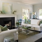
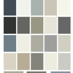
Neutral Palette: A neutral palette offers timeless elegance and versatility. Gray, beige, greige (a blend of gray and beige), and off-white shades create a sophisticated and calming atmosphere. These colors allow the white cabinets to remain the focal point of the room, while providing a subtle backdrop that complements various design styles. Lighter neutral shades can expand the perceived size of the room, while darker neutrals add depth and drama.
Cool Palette: Cool colors like blue, green, and violet create a serene and refreshing ambiance. Light blues and greens evoke a sense of tranquility and airiness, making them ideal for bathrooms and kitchens. Deeper blues and greens add a touch of sophistication and can be used to create a focal point wall. When using cool colors, consider the undertones of the white cabinets. Cool whites pair well with cool-toned blues and greens, while neutral whites can accommodate a wider range of cool shades.
Warm Palette: Warm colors such as yellow, orange, and red create a cozy and inviting atmosphere. Soft yellows and oranges add a touch of sunshine and warmth to a room, while muted reds provide a sophisticated and grounding effect. When using warm colors, be mindful of the intensity and saturation. Highly saturated warm colors can be overwhelming in large doses. Balance them with neutral accents and ample natural light.
Bold Palette: For those seeking a more adventurous look, a bold color palette can be a striking choice. Deep blues, greens, purples, and even black can create a dramatic and sophisticated effect. However, it is crucial to carefully consider the room's size, lighting, and architectural details before committing to a bold color. Balance bold colors with white accents and ample natural light to prevent the room from feeling too dark or cramped.
Monochromatic Palette: A monochromatic palette utilizes different shades and tints of a single color to create a cohesive and harmonious look. For example, pairing white cabinets with varying shades of gray can create a sophisticated and modern aesthetic. The key to a successful monochromatic palette is to introduce texture and depth to prevent the room from feeling flat or monotonous.
Considering Lighting and Room Size
Lighting and room size significantly influence the perceived color of paint. It is crucial to consider these factors when selecting a wall color to complement white cabinets. Natural light enhances the vibrancy of colors, while artificial light can alter their appearance.
Natural Light: Rooms with ample natural light can handle bolder and darker wall colors. Natural light tends to wash out colors, so a slightly darker shade than initially intended may be necessary to achieve the desired effect. Conversely, rooms with limited natural light benefit from lighter and brighter wall colors. These colors reflect light and create a more open and airy feel. Consider the direction of sunlight entering the room. South-facing rooms receive warm sunlight, while north-facing rooms receive cooler light. Adjust the wall color accordingly to balance the overall temperature of the room.
Artificial Light: Artificial lighting can significantly alter the appearance of wall colors. Incandescent lighting tends to cast a warm yellow glow, while fluorescent lighting can cast a cool blue tint. Test paint samples under both natural and artificial lighting conditions to ensure the color looks appealing in all situations. LED lighting offers a more neutral and consistent light source, but it is still important to test paint samples under this type of lighting as well. Consider the color temperature of the light bulbs used in the room. Warmer color temperatures (2700K-3000K) enhance warm colors, while cooler color temperatures (4000K-5000K) enhance cool colors.
Room Size: Lighter wall colors can make a small room feel larger and more open. Conversely, darker wall colors can make a large room feel cozier and more intimate. Consider the proportions of the room when selecting a wall color. In small rooms, avoid using overly dark or saturated colors, as they can make the space feel cramped and claustrophobic. In large rooms, consider using a combination of light and dark colors to create visual interest and define different areas of the space.
In addition to these considerations, the existing architectural details of the room, such as trim, flooring, and countertops, should also influence the choice of wall color. Ensure that the wall color complements these elements to create a cohesive and harmonious design.
Testing Paint Samples and Undertones
Prior to committing to a specific wall color, it is essential to test paint samples in the room under various lighting conditions. Paint colors can appear drastically different depending on the light, time of day, and surrounding elements.
Purchase small paint samples of several colors that are being considered. Paint large swatches (at least 2 feet by 2 feet) on different walls in the room. Observe the swatches throughout the day under various lighting conditions, including natural light, artificial light, and at different times of the day. Pay attention to how the colors interact with the white cabinets and other elements in the room.
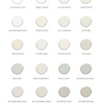
Pay close attention to the undertones of the paint colors. Undertones are subtle color nuances that can significantly impact the overall appearance of the color. For example, a gray paint may have blue, green, or purple undertones. These undertones can clash with the undertones of the white cabinets or other elements in the room, resulting in an undesirable color scheme.
To identify undertones, compare the paint swatches to white paper or other neutral surfaces. This will help reveal the subtle color nuances that may not be immediately apparent. Consider the overall aesthetic goal for the room. Do you want a warm and inviting atmosphere or a cool and serene ambiance? Choose paint colors with undertones that align with the desired aesthetic.
Consider the reflectance value or LRV of the paint. The Light Reflectance Value (LRV) measures the percentage of light a paint color reflects. Colors with a high LRV (close to 100) reflect more light and make a room feel brighter, while colors with a low LRV (close to 0) absorb more light and make a room feel darker. Choosing a paint with appropriate LRV based on lighting conditions is important.
Ultimately, the best way to determine the ideal wall color for white cabinets is to experiment and observe. Take the time to test paint samples and consider the factors discussed in this article to create a space that reflects personal style and enhances the beauty and functionality of the room.
Choosing the right wall color to complement white cabinets is a nuanced process that requires careful consideration of several factors. By understanding the undertones of white, exploring various color palettes, considering lighting and room size, and testing paint samples thoroughly, homeowners can create a space that is both visually appealing and functionally sound. The versatility of white cabinets allows for a wide range of design possibilities, making it a popular choice for kitchens and bathrooms alike.

25 Popular Kitchen Paint Colors With White Cabinets For 2024

The Best Paint Colors For Kitchens With White Cabinets Zhush

Best Paint Colors For Kitchens With White Cabinets

Our Favorite White Kitchen Cabinet Paint Colors Christopher Scott Cabinetry

Best Paint Colors For Kitchens With White Cabinets Jenna Kate At Home

25 Popular Kitchen Paint Colors With White Cabinets For 2024

The Best Paint Colors For Kitchens With White Cabinets Zhush

Kitchen Paint Colors With White Cabinets Infinity

21 Best Paint Colors For Kitchens With White Cabinets Home Like You Mean It

15 Paint Colors That Go With White Kitchen Cabinets Hunker
Related Posts