What Are Neutral Paint Colors?
Neutral paint colors refer to a range of hues that lack strong saturation and tend to blend seamlessly with other colors in a space. These colors are characterized by their ability to act as a backdrop, allowing other elements in a room, such as furniture, artwork, and accessories, to take center stage. Unlike bolder, more vibrant shades, neutrals possess a quality of understated elegance and versatility that makes them a popular choice for interior and exterior design.
The spectrum of neutral colors extends beyond simple white and black to encompass a variety of shades, including grays, beiges, creams, and off-whites. Certain muted tones of green, blue, and even pink can also be classified as neutrals depending on their undertones and relative saturation. The key distinguishing factor is their capacity to harmonize with a wide array of other colors without overpowering them.
Understanding the nuances of neutral paint colors is crucial for achieving a cohesive and balanced aesthetic in any design project. The subtle differences in undertones can significantly influence the overall feel of a room, affecting its perceived warmth, coolness, and spaciousness. Therefore, careful consideration should be given to factors such as natural lighting, existing architectural features, and desired mood when selecting a neutral color palette.
The Role of Undertones in Neutral Colors
Undertones are the subtle colors that lie beneath the surface of a neutral paint. These undertones can be warm, cool, or neutral, and they play a significant role in how a particular neutral appears in different lighting conditions and alongside other colors. A seemingly simple beige, for instance, might have a pink, yellow, or even green undertone, which can drastically alter its perceived color when paired with different elements in a room.
Warm undertones, such as those found in certain beiges and creams, tend to create a cozy and inviting atmosphere. These colors often contain hints of yellow, red, or orange, which impart a sense of warmth and comfort. Warm neutrals are particularly well-suited for spaces that lack natural sunlight or for creating a more intimate and enveloping feel.
Cool undertones, on the other hand, are characterized by hints of blue, green, or gray. These colors evoke a sense of calmness and serenity and are often used to create a more spacious and airy environment. Cool neutrals are effective in balancing out warm light or in spaces where a clean and modern aesthetic is desired.
Neutral undertones are the most subtle and versatile, containing very little discernible color. These colors are often described as "true neutrals" and tend to work well in a variety of settings. They provide a blank canvas that allows other colors and textures to shine without competing for attention. Choosing a neutral with a truly neutral undertone is often the safest choice when unsure of the impact of lighting or existing finishes. However, even these perceived neutral undertones can lean slightly warm or cool, so testing is always recommended.
Identifying and understanding the undertones of neutral paint colors is essential for creating a harmonious color scheme. It is recommended to test paint samples in the actual space where they will be used, observing how the color shifts under different lighting conditions. By carefully considering the undertones, one can ensure that the chosen neutral complements the existing elements in the room and achieves the desired aesthetic.
Popular Types of Neutral Paint Colors
Within the broad category of neutral paint colors, there are several distinct subcategories that are commonly used in interior and exterior design. Each type of neutral offers a unique set of characteristics and can be used to achieve different effects.
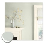
White is perhaps the most classic and versatile of all neutral colors. It is often used to create a sense of spaciousness, cleanliness, and simplicity. However, white is not a monolithic color; it encompasses a wide range of shades, from bright, stark whites to softer, more muted off-whites. Different whites can have warm, cool, or neutral undertones, impacting the overall feel of a space. For instance, a pure white with blue undertones can appear crisp and modern, while an off-white with yellow undertones can feel warmer and more inviting.
Gray is another popular neutral that has gained prominence in recent years. It offers a sophisticated and versatile alternative to white and can be used to create a variety of moods, from cool and contemporary to warm and inviting. Like white, gray comes in a range of shades, from light, airy grays to deep, dramatic charcoals. The undertones of gray can also vary, with some grays having hints of blue, green, or even purple. Selecting the right shade of gray with the appropriate undertones is crucial for achieving the desired effect.
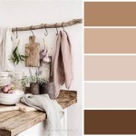
Beige is a classic neutral that evokes a sense of warmth and comfort. It is a versatile color that can be used in a variety of settings, from traditional to modern. Beige typically has warm undertones, such as yellow or brown, which contribute to its inviting character. However, some beiges can also have cooler undertones, such as gray or green, which can create a more sophisticated and understated look. Understanding the undertones of beige is essential for ensuring that it complements the other elements in the room.
Cream is a soft and elegant neutral that is often used to create a warm and inviting atmosphere. It is a versatile color that can be used in a variety of settings, from traditional to contemporary. Cream typically has warm undertones, such as yellow or peach, which contribute to its soft and soothing character. This color works exceptionally well in rooms that lack natural light, as it reflects light effectively.
Greige, a portmanteau of gray and beige, is a hybrid neutral color that combines the warmth of beige with the coolness of gray. It is a popular choice for those seeking a versatile and sophisticated neutral that can work well in a variety of settings. Greige can have warm or cool undertones, depending on the specific mix of gray and beige. Its versatility makes it a practical choice for many design projects.
Applications of Neutral Paint Colors in Design
Neutral paint colors are widely used in both residential and commercial design due to their versatility and ability to create a timeless and elegant aesthetic. They can be used in a variety of ways to achieve different effects, from creating a spacious and airy feel to adding warmth and sophistication to a space.
In residential design, neutral paint colors are often used as a backdrop for furniture, artwork, and accessories. They allow these elements to take center stage and create a cohesive and balanced look. Neutral walls provide a canvas that can be easily updated with changing trends and personal preferences. This makes them a practical choice for homeowners who want to create a versatile and long-lasting design.
Neutral colors are also frequently employed to enhance the perceived size and spaciousness of a room. Light and airy neutrals, such as white and light gray, reflect light effectively, making a room feel brighter and more open. This is particularly useful in smaller spaces or rooms with limited natural light. Darker neutrals, on the other hand, can create a sense of intimacy and drama, particularly in larger rooms.
In commercial design, neutral paint colors are often used to create a professional and inviting atmosphere. They can be used to enhance a brand's identity and create a consistent look across different spaces. Neutral walls can also provide a calming and uncluttered backdrop for displays and marketing materials.
The use of neutral colors extends beyond walls. They are frequently used on trim, ceilings, and even furniture. A neutral trim color, such as white or off-white, can provide a clean and crisp contrast to colored walls. Neutral ceilings can help to create a sense of spaciousness and openness. Neutral furniture can provide a versatile base that can be easily updated with different accents and accessories.
Ultimately, the application of neutral paint colors in design is limited only by imagination. By carefully considering the undertones, lighting conditions, and desired aesthetic, one can create a space that is both visually appealing and highly functional.

A Word About Neutrals Colorfully Behr Blog

The Best Neutral Paint Colors Midwest Life And Style Blog

The Best Neutral Paint Colors For Home Love Remodeled

11 Neutral Paint Colors For Your Home Artsy Rule

My Top 20 Favorite Neutral Paint Colors Jess Klein Studio

Neutral Paint Colors And How They Can Bring Appeal Into Your Home

Pin On Neutral Home Decor

Top 20 Neutral Paint Colors For Interiors That Designers Use Foyr

20 Best Neutral Paint Colors West Magnolia Charm

Latest Free Of Charge Neutral Paint Coloring Concepts Even If You Ve Always Dreamed Living In Colors For Home Light
Related Posts