What Are Good Neutral Paint Colors?
Neutral paint colors serve as a foundational element in interior design, offering a versatile backdrop for various styles and personal preferences. They provide a sense of calm, spaciousness, and adaptability, allowing furniture, artwork, and other decorative elements to take center stage. The selection of a suitable neutral paint color requires careful consideration of several factors, including the room's lighting, size, and intended use, as well as the desired overall aesthetic. This article explores different categories of neutral paint colors, their characteristics, and how to choose the right one for any given space.
Understanding the Spectrum of Neutral Colors
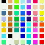
The term "neutral" encompasses a wide range of shades beyond just white, beige, and gray. It also includes colors with subtle undertones that can lean warm, cool, or even slightly colorful. These undertones play a crucial role in how a neutral paint color interacts with the surrounding environment and influences the overall mood of a room. A thorough understanding of these nuances is essential for making an informed decision.
Pure neutrals, such as true white, black, and gray, lack any discernible undertones. They offer a clean and minimalist aesthetic, often used in contemporary or modern designs. However, they can sometimes feel sterile or cold, particularly in rooms with limited natural light. Tinted neutrals, on the other hand, incorporate subtle hints of other colors, such as yellow, blue, green, or pink. These undertones can significantly impact the overall feel of a space, creating a warmer, cooler, or more vibrant atmosphere.
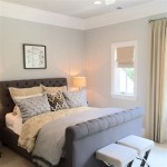
Warm neutrals, characterized by undertones of yellow, orange, or red, tend to create a cozy and inviting ambiance. These colors are well-suited for rooms that receive little natural light or spaces where a sense of warmth and comfort is desired, such as living rooms or bedrooms. Cool neutrals, with undertones of blue, green, or violet, often evoke a sense of serenity and spaciousness. They are commonly used in bathrooms, bedrooms, or areas where a calming and relaxing atmosphere is preferred. Greige, a blend of gray and beige, represents a versatile neutral option that balances warmth and coolness, making it suitable for a wide range of applications.
The intensity or saturation of a neutral paint color also influences its overall effect. Lighter, more muted neutrals tend to create a brighter and more spacious feel, while darker, more saturated neutrals can add depth and drama to a room. The choice between these options depends on the desired aesthetic and the specific characteristics of the space.
Factors Influencing the Choice of Neutral Paint Color
Selecting the right neutral paint color involves considering several key factors that impact how the color will appear and function within a given space. These factors include the room's lighting conditions, size, existing architectural features, and the desired overall aesthetic.
Lighting is arguably the most critical factor to consider. Natural light can significantly alter the appearance of a paint color, accentuating its undertones and influencing its perceived warmth or coolness. Rooms that receive ample natural light can often handle cooler neutrals without feeling cold, while rooms with limited natural light may benefit from warmer neutrals to create a more inviting atmosphere. Artificial lighting, such as incandescent, fluorescent, or LED, can also affect the perceived color. Incandescent lights tend to cast a warm, yellowish glow, while fluorescent lights can often create a cooler, bluish tone. It is essential to test paint samples under both natural and artificial lighting conditions to accurately assess their appearance.
The size of a room also plays a role in determining the appropriate neutral paint color. Lighter neutrals tend to make small rooms feel more spacious and airy, while darker neutrals can make large rooms feel more intimate and cozy. However, using dark neutrals in small rooms can sometimes create a claustrophobic effect, so it's crucial to balance the color's intensity with the room's dimensions.
Existing architectural features, such as trim, moldings, and flooring, should also be considered when selecting a neutral paint color. The paint color should complement these existing elements and create a cohesive and harmonious look. For example, if a room has warm-toned wood trim, a warm neutral paint color may be a better choice than a cool neutral. Similarly, if a room has cool-toned tile flooring, a cool neutral paint color may be more appropriate.
Finally, the desired overall aesthetic should guide the selection of a neutral paint color. Whether the goal is to create a minimalist, modern, traditional, or eclectic space, the paint color should support the overall design vision. Consider the intended use of the room and the mood that is desired. A bedroom, for example, may benefit from a calming and serene neutral, while a living room may benefit from a more vibrant and inviting neutral.
Specific Neutral Paint Color Recommendations
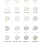
While the best neutral paint color ultimately depends on the specific context of a room, there are several popular and versatile options that tend to work well in a variety of situations. These colors represent a range of warm, cool, and balanced neutrals, offering options for different preferences and design styles.
White: A classic and timeless choice, white offers a clean and minimalist aesthetic. However, the vast array of white paint colors can be overwhelming. Consider the undertones when selecting a white. For example, "Chantilly Lace" by Benjamin Moore is a pure white with minimal undertones, suitable for modern spaces. "White Dove" by Benjamin Moore is a softer white with slightly warm undertones, creating a more inviting feel. "Simply White" by Benjamin Moore is another popular choice, offering a versatile and adaptable white hue.
Beige: Beige offers warmth and sophistication, providing a comfortable backdrop for various design styles. "Manchester Tan" by Benjamin Moore is a classic beige with subtle green undertones, creating a versatile and calming atmosphere. "Edgecomb Gray" by Benjamin Moore, despite its name, leans towards the beige side and is a popular choice for its adaptability and subtle warmth. "Accessible Beige" by Sherwin-Williams is another well-regarded beige, known for its versatility and ability to complement various color palettes.
Gray: Gray offers a contemporary and sophisticated aesthetic, providing a neutral backdrop that allows other colors to pop. "Revere Pewter" by Benjamin Moore is a popular warm gray that works well in a variety of spaces. "Agreeable Gray" by Sherwin-Williams is a versatile and adaptable gray that complements various lighting conditions. "Repose Gray" by Sherwin-Williams is a slightly cooler gray that creates a serene and calming atmosphere.
Greige: Greige offers a balanced blend of gray and beige, providing a versatile neutral that works well in a variety of settings. "Balboa Mist" by Benjamin Moore is a popular greige that offers a subtle warmth and sophistication. "Worldly Gray" by Sherwin-Williams is another well-regarded greige known for its versatility and ability to complement various color palettes. "Collingwood" by Benjamin Moore leans slightly more towards gray than some other greiges and provides a sophisticated, understated look.
Off-White: This category includes colors that are slightly darker than pure white and often incorporate subtle hints of other colors. "Swiss Coffee" by Benjamin Moore is a popular off-white with a creamy, warm undertone, making it a good choice for creating a cozy and inviting atmosphere. "Pale Oak" by Benjamin Moore is a light, airy off-white with subtle warm undertones, adding a touch of elegance and sophistication to any space.
Ultimately, the selection of a neutral paint color is a personal decision that should be based on careful consideration of the room's lighting, size, existing architectural features, and the desired overall aesthetic. Testing paint samples in the actual space is crucial to ensure that the chosen color complements the environment and achieves the desired effect. The recommendations listed above serve as a starting point for exploration and experimentation, but the perfect neutral paint color is the one that best reflects individual preferences and design goals.

The Best Neutral Paint Colors For Home Love Remodeled

The Best Neutral Paint Colors Midwest Life And Style Blog

A Word About Neutrals Colorfully Behr Blog

Nearly Perfect Neutral Paint Colors

The 10 Best Warm Neutral Paint Colors For Your Entire Home Kylie M Interiors

My Top 20 Favorite Neutral Paint Colors Jess Klein Studio

20 Best Neutral Paint Colors West Magnolia Charm

20 Best Neutral Paint Colors West Magnolia Charm Popular For Living Room

Best Neutral Paint Colors By Family Lebanon Decorating

The Best Neutral Paint Colors For Any Home Allisa Jacobs
Related Posts