```html
Top Interior Paint Colors 2024: Sherwin Williams
Sherwin-Williams, a leading paint manufacturer, consistently sets the tone for interior design trends with its annual color forecasts. Predicting the most sought-after shades for the coming year is a complex process, informed by global influences ranging from fashion and technology to socio-economic shifts and environmental concerns. Understanding these influences, Sherwin-Williams curates a palette that resonates with consumers seeking to update their homes and reflect current aesthetic values. This article will delve into some of the top interior paint colors from Sherwin-Williams expected to dominate in 2024, offering insights into their potential applications and the design sensibilities they represent.
Predicting color trends is more than just identifying pleasing hues. It involves analyzing the collective mood and aspirations of society. As societal priorities shift, so too does the desire for specific colors within the home. For instance, a renewed emphasis on sustainability might drive the popularity of earthy greens and natural browns, while a desire for optimism and energy could result in a resurgence of vibrant blues and yellows. Sherwin-Williams' color forecasting teams spend countless hours researching these trends, ensuring their palettes are both timely and relevant.
The colors discussed below are projected to be popular choices for homeowners and interior designers alike. These shades offer versatility and can be incorporated into various design styles, from minimalist and modern to traditional and eclectic. The selections reflect a balanced approach, encompassing both bold statements and subtle, calming tones, acknowledging the diverse preferences of homeowners.
Earthy Neutrals and Warm Terracottas: Grounding the Home
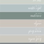
In 2024, a return to nature is expected to heavily influence interior design. This translates to a preference for earthy neutrals and warm terracotta tones. These colors evoke a sense of groundedness, stability, and comfort, providing a soothing backdrop for everyday life. Sherwin-Williams offers a diverse range of options within this category, each with its unique character and undertones.
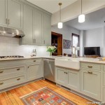
Colors like 'Redend Point' (SW 9081) have been highlighted by Sherwin-Williams and anticipate a strong presence. This sophisticated blush-beige is a warm and inviting neutral that provides a sense of comfort and sophistication. Its versatility allows it to work well in various settings, from living rooms and bedrooms to kitchens and dining areas. It complements natural materials like wood and stone, further enhancing the connection to nature.
Other popular choices within this category include variations of greige (a blend of gray and beige) with warmer undertones, providing a more welcoming alternative to cooler grays. These nuanced neutrals offer a sophisticated backdrop that pairs well with a wide range of accent colors and furniture styles. They create a sense of calm and serenity, making them ideal for spaces designed for relaxation and rest. The selection of the specific neutral will depend on the amount of natural light as colors will appear different depending on the lighting conditions around it.
The resurgence of terracotta shades reflects a broader interest in natural materials and textures. These warm, earthy tones add depth and character to a space, creating a sense of warmth and authenticity. Terracotta works particularly well in kitchens and dining areas, adding a touch of rustic charm and creating a welcoming atmosphere for gatherings. Consider using terracotta as an accent wall or in smaller details like decorative pottery to add visual interest without overwhelming the space. When incorporating stronger colors it is best to start small before getting into large projects. This will help to determine if the color is going to work well in the setting and if the color blends well with the current furniture and design.
Calming Blues and Greens: Embracing Tranquility
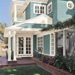
Blue and green hues, consistently associated with tranquility and peace, are projected to remain popular choices in 2024. These colors evoke feelings of serenity and connection to the natural world, making them ideal for creating relaxing and restorative spaces. Sherwin-Williams offers an extensive range of blues and greens, from soft, muted shades to bolder, more saturated tones.
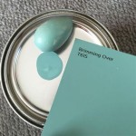
Soft, muted blues, such as 'Upward' (SW 6239), Sherwin-Williams' 2024 Color of the Year, are excellent choices for bedrooms and bathrooms, promoting a sense of calm and tranquility. These colors create a soothing atmosphere that encourages relaxation and restful sleep. They also work well in living rooms, creating a peaceful and inviting space for socializing and unwinding. Muted blues pair beautifully with natural materials like linen and cotton, enhancing the sense of comfort and serenity. The key is to create a space that reflects the owner and provides the best environment for them.
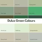
Green is another color strongly associated with nature and well-being. Lighter, more subtle greens are perfect for creating a sense of freshness and vitality in any room. These colors evoke feelings of growth and renewal, making them ideal for spaces where creativity and inspiration are encouraged. They also work well in home offices and studios, promoting focus and productivity. Deeper, more saturated greens can add a touch of drama and sophistication to a space, particularly when used as accent colors or in smaller details.
When selecting blues and greens, consider the amount of natural light in the room. Lighter shades will work best in darker spaces, while deeper tones can be used to create a cozy and intimate atmosphere in rooms with ample natural light. Also, think about the existing furniture and décor, and choose colors that complement and enhance the overall aesthetic. The incorporation of textures and patterns can add depth and dimension to a space, further enhancing the sense of tranquility and visual interest.
Unexpected Brights: Injecting Energy and Personality
While earthy neutrals and calming blues and greens are expected to dominate, there is also a growing interest in incorporating unexpected brights to inject energy and personality into the home. These bold and vibrant colors can add a touch of excitement and individuality to any space, reflecting a desire for self-expression and optimism.
Colors like vibrant yellows, energetic oranges, and playful pinks are expected to be used as accent colors or in smaller details to add pops of color and visual interest. These colors can be used to highlight architectural features, create focal points, or simply add a touch of whimsy to a room. A colorful piece of furniture or a bold piece of artwork can instantly transform a space, adding personality and character.
When incorporating bright colors, it is important to exercise restraint and balance. Too much color can be overwhelming and create a sense of chaos. A good rule of thumb is to use bright colors sparingly, balancing them with neutral tones to create a harmonious and visually appealing space. Consider using bright colors in rooms where you want to create a sense of energy and excitement, such as home gyms or entertainment spaces.
Experimentation is key when it comes to incorporating unexpected brights. Don't be afraid to try new things and play with different color combinations. Consider using color blocking techniques to create bold and graphic statements, or use different shades of the same color to create a sense of depth and dimension. Ultimately, the goal is to create a space that reflects your personal style and brings you joy.
Beyond these specific colors, Sherwin-Williams offers a vast array of options to suit any taste and design preference. Their online tools and in-store consultants can help homeowners navigate the color selection process and find the perfect shades for their homes. Understanding the underlying trends and design principles can empower individuals to create spaces that are not only visually appealing but also reflective of their personal values and aspirations.
Consider the finish as well. Matte finishes are generally preferred for walls as they hide imperfections and provide a softer look. Satin and eggshell finishes are more durable and easier to clean, making them ideal for kitchens and bathrooms. High-gloss finishes can be used to highlight architectural details or create a dramatic effect, but they are best used sparingly.
The lighting within a space dramatically affects how a color appears. Natural light will showcase a color's true tone, while artificial light can alter its appearance, making it appear warmer or cooler. It is always recommended to test paint colors in the actual space before committing to a full-scale project. This can involve painting small swatches on the wall or using peel-and-stick paint samples. Observing the color at different times of day and under different lighting conditions will ensure that it is the right choice for the space.
```
Kylie M S 5 Colors Of The Year 2024 Collection Interiors

Best 2024 Paint Colors You Need To Know About Porch Daydreamer
.jpg?strip=all "Exploring The Hottest Interior Color Trends Of 2024")
Exploring The Hottest Interior Color Trends Of 2024

Top 10 Whole House Paint Colors For 2024 Designers Revealed

Kylie M S 5 Colors Of The Year 2024 Collection Interiors

Top Interior House Paint Colors Of 2024

Upward Sherwin Williams Color Of The Year 2024 Whole House Palette Paint Coastal Idea

2024 Paint Color Trends Best New Neutrals Porch Daydreamer

Sherwin Williams 2024 Colors 48 Hues You Re Going To Love Postcards From The Ridge

Sherwin Williams 2024 Color Of The Year Home Paint Scheme Wall Decor Kitchen Colors Exterior Palette Diy In Trending
Related Posts