The Beauty of Medium Blue Paint: A Versatile and Timeless Choice
Medium blue paint occupies a unique and valuable space within the spectrum of color choices for interior and exterior design. It is a shade that balances the calming properties of lighter blues with the depth and sophistication often associated with darker hues. This balance makes it a remarkably versatile option, suitable for a wide range of applications and design aesthetics. The beauty of medium blue lies not only in its pleasing visual impact but also in its ability to evoke specific moods and complement various architectural styles and decorative elements.
The selection of a specific medium blue paint is a process that demands careful consideration of several factors. These factors include the amount of natural light available in the space, the existing color palette, and the desired overall ambiance. Different undertones within the medium blue range – leaning towards green, gray, or violet – can dramatically alter the feeling of a room. A medium blue with green undertones, for example, might lend a space a more organic and tranquil feel, while one with gray undertones could create a sophisticated and contemporary atmosphere. The undertone must be carefully considered to ensure harmony with existing elements within the space, such as flooring, furniture, and artwork.
Furthermore, the sheen of the paint plays a crucial role in how the color is perceived. Matte finishes tend to absorb light, resulting in a softer, more muted appearance, while glossier finishes reflect light, enhancing the vibrancy and depth of the color. The choice of sheen often depends on the intended purpose of the space and the desired level of durability. For instance, a matte finish might be suitable for a bedroom wall, where a soft and calming atmosphere is desired, while a satin or semi-gloss finish might be more appropriate for a kitchen or bathroom, where moisture resistance and ease of cleaning are paramount.
The Psychological Impact of Medium Blue
Color psychology plays a significant role in how individuals perceive and react to their environment. Medium blue is generally associated with feelings of calmness, serenity, and stability. It evokes a sense of tranquility and peace, making it an excellent choice for spaces intended for relaxation and contemplation, such as bedrooms, living rooms, and meditation rooms. The color is also linked to productivity and focus, which can make it suitable for home offices or study areas. However, it is important to consider the specific shade of medium blue and its intensity, as excessively dark or saturated blues can sometimes feel somber or even oppressive if used in large quantities or in poorly lit environments.
The association of blue with trustworthiness and competence is also significant. This makes medium blue a popular choice for corporate branding, office spaces, and other environments where professionalism and reliability are important. In interior design, it can be used to create a sense of stability and order, particularly when paired with neutral colors and clean lines. The psychological impact of medium blue extends beyond its immediate visual effect, influencing mood, behavior, and overall well-being.
Furthermore, the cultural significance of blue varies across different societies. In Western cultures, blue is often associated with masculinity, while in some Eastern cultures, it can represent immortality and spirituality. These cultural nuances can influence the interpretation and application of medium blue in design, particularly when creating spaces that cater to diverse audiences or reflect specific cultural identities.
Versatility in Design Styles
One of the key advantages of medium blue paint is its remarkable versatility in adapting to various design styles. It can seamlessly integrate into a wide range of aesthetics, from classic and traditional to modern and contemporary. In traditional settings, medium blue can be paired with rich wood tones, antique furniture, and ornate details to create a sense of timeless elegance and sophistication. In modern spaces, it can be used as a bold accent color against a backdrop of neutral grays, whites, and blacks to add depth and visual interest.
In coastal or nautical-themed interiors, medium blue serves as a natural complement to sandy beiges, crisp whites, and natural textures like rope and wood. It evokes the feeling of the ocean and the sky, creating a serene and refreshing atmosphere. In minimalist designs, medium blue can be used sparingly to add a touch of color without overwhelming the space, maintaining a sense of simplicity and clean lines. The adaptability of medium blue extends to various architectural styles as well, complementing both modern and historic buildings.
The incorporation of metallic accents, such as gold, silver, or bronze, can further enhance the aesthetic appeal of medium blue. Gold accents can add warmth and luxury, while silver accents can create a cool and contemporary feel. The specific metallic finish should be carefully selected to complement the undertones of the medium blue and the overall design scheme. Similarly, the use of different textures, such as velvet, linen, or silk, can add depth and complexity to the space, creating a more visually appealing and tactile experience.
Pairing Medium Blue with Other Colors
The success of any color scheme hinges on the careful selection of complementary colors. Medium blue offers a wide range of possibilities for color pairings, allowing for the creation of diverse and harmonious palettes. One classic and timeless combination is medium blue with white. This pairing creates a clean, crisp, and refreshing look that is suitable for a variety of spaces, from bedrooms and bathrooms to kitchens and living rooms. The contrast between the cool blue and the bright white creates a sense of balance and airiness.
Another popular pairing is medium blue with shades of gray. This combination creates a sophisticated and contemporary aesthetic, particularly when using different tones of gray to add depth and dimension. Medium blue also works well with natural wood tones, creating a warm and inviting atmosphere. The combination of the cool blue and the warm wood creates a balanced and harmonious feel that is both calming and comforting. Earthy tones like beige, tan, and brown can also be paired with medium blue to create a more grounded and organic look.
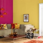
For a more vibrant and energetic palette, medium blue can be paired with complementary colors such as orange or yellow. These contrasting colors create a sense of excitement and visual interest. However, it is important to use these colors sparingly to avoid overwhelming the space. Accent colors like coral, pink, or green can also be used to add pops of color and create a more playful and dynamic atmosphere. The selection of complementary colors should be based on the desired mood and the overall design scheme.
Ultimately, the choice of medium blue paint and its accompanying color palette depends on the individual preferences and the specific characteristics of the space. By carefully considering the undertones, sheen, and complementary colors, it is possible to create a beautiful and harmonious environment that reflects the desired style and evokes the desired mood. The versatility and timeless appeal of medium blue make it a valuable asset in any design project, offering endless possibilities for creating unique and captivating spaces.

Blue Paint Colors Sherwin Williams

The Top 15 French Blue Paint Colors For Timeless Elegance Start At Home Decor

30 Living Room Paint Colors Inspiration For An Inviting Space Benjamin Moore

Blue Paint Colors Sherwin Williams

30 Living Room Paint Colors Inspiration For An Inviting Space Benjamin Moore

30 Living Room Paint Colors Inspiration For An Inviting Space Benjamin Moore

The Best Benjamin Moore Blue Paint Colors

Unsaturated To Saturated Medium Blues

Behr Marquee 1 Qt M510 2 Life At Sea Satin Enamel Interior Paint Primer 745004 The Home Depot

Diving Into The Diffe Shades Of Turquoise Color Kbm D3signs
Related Posts