Popular Colors To Paint The Interior Of Your House
Selecting the right colors for the interior of a house is a crucial aspect of home design, influencing the overall aesthetic, mood, and perceived space. Colors evoke emotions and can significantly impact how individuals experience a room. Staying abreast of current color trends and understanding their potential effects is essential for creating a visually appealing and harmonious living environment. This article examines popular interior paint colors, exploring their attributes, suitability for different spaces, and potential pairings with other design elements.
Neutral Tones: The Enduring Choice
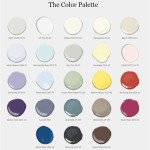
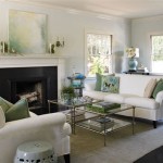
Neutral tones, encompassing shades of white, gray, beige, and greige (a blend of gray and beige), remain consistently popular for interior painting. Their versatility extends across various architectural styles and interior design preferences. These colors offer a blank canvas upon which homeowners can layer textures, patterns, and pops of color through furnishings, artwork, and accessories. The calming and understated nature of neutrals contributes to a sense of serenity and spaciousness.
White: White paint offers the ultimate in versatility. It reflects light effectively, making rooms appear larger and brighter. Various shades of white exist, ranging from cool whites with blue undertones to warm whites with yellow undertones. Cool whites work well in rooms with ample natural light, while warmer whites can counteract the coolness of north-facing rooms. White walls provide a sharp backdrop for showcasing colorful furniture and artwork. Examples include Benjamin Moore's "Chantilly Lace" (a true white) and Sherwin-Williams' "Alabaster" (a warm white).
Gray: Gray has gained significant popularity in recent years, evolving from a purely industrial aesthetic to a sophisticated and versatile shade. Like white, gray comes in a spectrum of tones, from light, airy grays to deep, dramatic charcoals. Light grays can create a calming and elegant atmosphere, while darker grays add depth and a sense of intimacy. Gray pairs well with both warm and cool accent colors. "Repose Gray" by Sherwin-Williams and "Chelsea Gray" by Benjamin Moore are popular choices.
Beige: Beige provides a warmer alternative to gray and white, offering a classic and comforting feel. It complements natural materials like wood and stone particularly well. Beige can range from light, sandy tones to deeper, more saturated hues. It is a versatile choice for creating a cozy and inviting atmosphere. Examples include Sherwin-Williams' "Accessible Beige" and Benjamin Moore's "Edgecomb Gray" (which leans towards beige).
Greige: Greige, a blend of gray and beige, offers the best of both worlds. It provides a neutral backdrop with subtle warmth, making it highly adaptable to various lighting conditions and design styles. Greige is a sophisticated choice that complements both warm and cool accents. Sherwin-Williams' "Agreeable Gray" and Benjamin Moore's "Revere Pewter" are well-regarded greige options.
Neutral colors are not limited to walls. They can also be employed on ceilings, trim, and doors for a cohesive and unified look. To add visual interest, consider using different sheens of the same color. For example, a matte finish on walls, a satin finish on trim, and a gloss finish on doors can create subtle variations and highlight architectural details.
Earthy Tones: Bringing the Outdoors In
Earthy tones, inspired by nature, continue to be a popular choice for interior paint colors. These colors evoke a sense of grounding, warmth, and tranquility. Earthy tones encompass shades of green, brown, terracotta, and muted yellows, creating a connection to the natural world within the home.
Green: Green is associated with nature, growth, and tranquility. It is a versatile color that can be used in a variety of spaces, from living rooms and bedrooms to kitchens and bathrooms. Different shades of green evoke different moods. Light, airy greens create a sense of freshness and vitality, while deeper, more muted greens offer a sense of calm and sophistication. Olive green, sage green, and forest green are popular choices. Examples include Benjamin Moore's "October Mist" (a muted sage green) and Sherwin-Williams' "Evergreen Fog" (a sophisticated mid-tone green).
Brown: Brown provides a sense of warmth, stability, and comfort. It can be used to create a cozy and inviting atmosphere, particularly in living rooms and bedrooms. Different shades of brown offer different effects. Light browns provide a natural and understated look, while darker browns add depth and richness. Consider using brown in combination with natural materials like wood and leather to enhance its earthy appeal. Examples include Sherwin-Williams' "Umber" and Benjamin Moore's "Kendall Charcoal" (a deep brown-gray).
Terracotta: Terracotta, derived from the Italian word for "baked earth," is a warm and inviting color reminiscent of clay and sun-baked deserts. It adds a touch of rustic charm and can be used to create a cozy and welcoming atmosphere. Terracotta pairs well with natural materials like wood, stone, and linen. It is a popular choice for accent walls, kitchens, and bathrooms. Examples include Farrow & Ball's "Red Earth" and Dunn-Edwards' "Terra Cotta Rose."
Muted Yellows: Muted yellows offer a subtle warmth and cheerfulness without being overwhelming. They can add a touch of sunshine to a room without becoming too bright or garish. Muted yellows work well in kitchens, dining rooms, and bedrooms. Consider using them in rooms with limited natural light to brighten the space. Examples include Benjamin Moore's "Pale Oak" (a light beige with yellow undertones) and Sherwin-Williams' "White Duck" (a warm white with yellow undertones).
When incorporating earthy tones into interior design, it's important to consider the lighting conditions of the room. Natural light will enhance the warmth and vibrancy of these colors, while artificial light may alter their appearance. It's also important to choose complementary colors for furnishings and accessories to create a harmonious and balanced look.
Bold and Accent Colors: Adding Personality
While neutral and earthy tones provide a foundation for interior design, bold and accent colors allow homeowners to express their personality and add visual interest to their homes. These colors can be used sparingly to create focal points or more extensively to make a statement. Careful consideration should be given to the size and lighting of the room before selecting bold and accent colors.
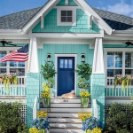
Blue: Blue is associated with calmness, serenity, and intellect. It is a versatile color that can be used in a variety of spaces, from bedrooms and bathrooms to living rooms and home offices. Different shades of blue evoke different moods. Light blues create a sense of airiness and relaxation, while darker blues add depth and sophistication. Navy blue, teal, and powder blue are popular choices. Examples include Benjamin Moore's "Hale Navy" (a classic navy blue) and Sherwin-Williams' "Sea Salt" (a light, calming blue-green).
Pink: Pink has evolved from a predominantly feminine color to a sophisticated and versatile choice for interior design. Dusty pinks and blush tones offer a subtle warmth and elegance, while brighter pinks add a touch of playfulness and vibrancy. Pink can be used in bedrooms, living rooms, and even kitchens. Consider pairing it with neutrals or metallics for a balanced look. Examples include Farrow & Ball's "Setting Plaster" (a dusty pink) and Benjamin Moore's "Pink Bliss" (a brighter, more vibrant pink).
Orange: Orange is associated with energy, enthusiasm, and creativity. It is a bold and vibrant color that can add a touch of warmth and excitement to a room. Orange works well in kitchens, dining rooms, and living rooms. However, it should be used sparingly as it can be overpowering. Consider using orange as an accent color on walls, furniture, or accessories. Examples include Sherwin-Williams' "Cavern Clay" (a muted terracotta orange) and Benjamin Moore's "Pumpkin Patch" (a bright, energetic orange).
Deep Jewel Tones: Jewel tones such as emerald green, sapphire blue, and ruby red offer a luxurious and sophisticated aesthetic. These colors add depth, richness, and drama to a space. They are particularly well-suited for rooms with ample natural light or for creating a cozy and intimate atmosphere in smaller spaces. Consider using jewel tones on accent walls, furniture, or accessories to add a touch of glamour.
When incorporating bold and accent colors, it's important to consider the color scheme of the entire house. Choose colors that complement each other and create a cohesive and harmonious look. Use a color wheel to identify complementary colors and create balanced and visually appealing spaces. Before committing to a specific color, it's also advisable to test it in the room with different lighting conditions to ensure that it looks as intended.

The 5 Best Interior Paint Colors For Feeling Refreshed And Relaxed Metzler Home Builders

14 Popular Paint Colors For Small Rooms Life At Home Trulia Blog

Lake House Interior Colors The Lilypad Cottage

25 Of The Best Paint Colors For Whole House Welsh Design Studio

Best Interior Paint Colors Whole House Color Scheme Abby Organizes

How To Choose Paint Colors Tips Follow And Mistakes Avoid This Old House

Top Paint Colors To A House Jefferson County Real Estate Shine Realty

51 Best Bedroom Paint Color Ideas For 2024

2025 Color Collection Of The Year Home By Sherwin Williams

Choosing The Best Interior Paint Colors For Your Home In Fair Oaks Ranch
Related Posts