Paint Colours For Inside Walls: A Comprehensive Guide
Selecting paint colours for the interior walls of a home or office is a multifaceted decision that significantly impacts the overall ambiance and aesthetic appeal of a space. The chosen colours influence mood, perception of size, and even the perceived temperature of a room. This article explores a range of considerations, including color psychology, undertones, lighting, room function, and current trends, to provide a comprehensive guide to navigating the selection process.
The sheer number of paint colours available can be overwhelming. Understanding the basics of colour theory and the factors that contribute to a successful colour scheme is essential for achieving the desired outcome. Beyond personal preference, careful consideration of the interplay between colours and the architecture of the space is vital.
Understanding Colour Psychology
Colour psychology examines the effects of different hues on human emotions and behaviour. While individual responses to colour can vary based on personal experiences and cultural background, certain general associations exist and are commonly used in interior design. Being aware of these associations can help in selecting colours that support the intended function and atmosphere of each room.
Red: Red is often associated with energy, excitement, and passion. In interior design, it can be used sparingly to add a pop of vibrancy to a space, such as in an accent wall or decorative elements. However, an overabundance of red can be overwhelming and potentially create feelings of agitation.
Blue: Blue is generally perceived as calming, serene, and peaceful. It is often used in bedrooms and bathrooms to create a relaxing and tranquil environment. Lighter shades of blue can make a room feel more spacious, while darker shades can evoke a sense of sophistication and depth.
Green: Green is associated with nature, growth, and harmony. It promotes feelings of balance, refreshment, and well-being. Green is a versatile colour that can be used in various rooms, from living rooms to kitchens, to create a sense of connection to the outdoors.
Yellow: Yellow is associated with optimism, happiness, and creativity. It can brighten a space and evoke feelings of cheerfulness. However, too much yellow can be overpowering and potentially cause fatigue. It is often used as an accent colour or in rooms that lack natural light.
Orange: Orange is a vibrant and energetic colour associated with enthusiasm, warmth, and sociability. It can stimulate conversation and create a welcoming atmosphere. Orange is often used in dining rooms and kitchens, but it should be used judiciously to avoid overwhelming the space.
Purple: Purple is associated with royalty, luxury, and creativity. Lighter shades of purple, such as lavender, can be calming and sophisticated, while darker shades can evoke a sense of drama and mystery. Purple is often used in bedrooms and living rooms to create a sense of elegance.
Neutral colours (white, gray, beige): Neutral colours provide a versatile backdrop for a variety of interior design styles. They are often used as a base colour for walls and can be paired with bolder accent colours to create visual interest.
White is often associated with cleanliness, simplicity, and purity. It can make a room feel more spacious and brighter. However, too much white can feel sterile and cold. Different shades of white exist, each with its own undertones, influencing the warmth or coolness of the space.
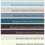
Gray is a sophisticated and versatile neutral that can range from cool to warm tones. It provides a calming backdrop and can be paired with a variety of colours. Light gray can make a room feel more spacious, while darker gray can add a sense of drama and depth.
Beige is a warm and inviting neutral that provides a comfortable and timeless backdrop. It is often used in living rooms and bedrooms to create a cozy atmosphere. Different shades of beige exist, each with its own undertones, influencing the overall warmth or coolness of the space.
Understanding Undertones and Lighting
Undertones are the subtle hues that lie beneath the surface colour of a paint. These undertones can significantly impact how a colour appears in a room, especially under different lighting conditions. Neglecting to consider undertones can lead to unexpected and undesirable results.
Identifying Undertones: The simplest way to identify a paint colour's undertone is to compare it to other colours in the same family. For example, compare several shades of white. One white might appear warmer with yellow or pink undertones, while another might appear cooler with gray or blue undertones. Similarly, compare different grays; some may lean towards green, blue, or purple.
The Impact of Lighting: Natural and artificial lighting significantly influence how a paint colour appears. Natural light, particularly from different exposures (north, south, east, west), can alter the perception of a colour. Artificial lighting, such as incandescent, fluorescent, and LED, also casts different hues that can impact the overall appearance.
Rooms with northern exposure tend to receive cooler, indirect light, which can enhance cool undertones in paint colours. To counteract this, consider using warmer colours or whites with yellow or beige undertones to create a more inviting atmosphere.
Rooms with southern exposure receive warm, direct sunlight throughout the day. This can make warmer colours appear even more intense. Consider using cooler colours to balance the warmth and prevent the space from feeling overly hot.
Rooms with eastern exposure receive warm sunlight in the morning and cooler light in the afternoon. This can cause colours to shift throughout the day. Consider using neutral colours that can adapt to different lighting conditions.
Rooms with western exposure receive warm sunlight in the afternoon and evening. This can make colours appear more vibrant in the evening. Consider using cooler colours to balance the warmth and prevent the space from feeling overly intense during these times.
When selecting paint colours, it is crucial to test them in the actual room under different lighting conditions before committing to a full application. Paint a large sample area on the wall and observe how the colour changes throughout the day and night.
Considerations for Room Function and Flow
The function of a room should be a primary consideration when selecting paint colours. Different rooms have different purposes and require different atmospheres. The colours chosen should support the intended use of the space.
Bedrooms: Bedrooms are typically designed for rest and relaxation. Calming colours such as blues, greens, and soft neutrals are often used to create a peaceful and tranquil environment. Avoid using overly bright or stimulating colours, as they can interfere with sleep.
Living Rooms: Living rooms are often used for socializing and relaxation. A variety of colours can be used in living rooms, depending on personal preference and the desired atmosphere. Warmer colours, such as yellows and oranges, can create a welcoming and inviting space, while cooler colours, such as blues and greens, can create a more relaxing and serene environment. Neutral colours can provide a versatile backdrop for a variety of design styles.
Kitchens: Kitchens should be functional and inviting. Lighter colours can make a kitchen feel more spacious and brighter, while darker colours can add a sense of drama and sophistication. Consider using colours that complement the kitchen’s cabinetry and appliances.
Bathrooms: Bathrooms should be clean and refreshing. Lighter colours can make a bathroom feel more spacious and brighter, while darker colours can add a sense of luxury and spa-like atmosphere. Consider using colours that complement the bathroom’s fixtures and tiles.
The overall flow of colours throughout a home is also an important consideration. Aim for a cohesive colour palette that creates a sense of harmony and continuity. Consider using a limited number of base colours throughout the home and varying the accent colours in each room to create visual interest.
One approach is to use a neutral colour for the main hallways and then branch out with different variations of that colour, or complementary colours, in the individual rooms. This creates a sense of flow while still allowing each room to have its distinct personality.
Pay attention to the transition between rooms. Consider how the colours in one room will look when viewed from another. Choose colours that complement each other and create a pleasing visual transition. Use doorways and archways as visual breaks and consider using different colours on the walls on either side to create a sense of definition.
In addition to room function and colour flow, consider the size and shape of the room. Darker colours can make a large room feel cozier and more intimate, while lighter colours can make a small room feel more spacious and airy. Consider using vertical stripes to make a room feel taller or horizontal stripes to make a room feel wider.
Furniture, textiles, and accessories should also be considered when selecting wall paint colours. Consider the existing décor and choose colours that complement and enhance the overall design style. Bring samples of fabrics, rugs, and other accessories to the paint store to ensure that the chosen colours coordinate well.
Selecting paint colours for inside walls is an intricate process that requires careful consideration of colour psychology, undertones, lighting, room function, and colour flow. By understanding these factors, it is possible to create a harmonious and visually appealing interior space that reflects personal style and meets practical needs.

The Top 8 Grey Wall Paint Colours For A Timeless Interior

The 5 Best Interior Paint Colors For Feeling Refreshed And Relaxed Metzler Home Builders

How Paint Colours Affects Mood Nipponpaints

10 Best Trending 2024 Interior Paint Colors To Inspire Décor Aid

2025 Color Collection Of The Year Home By Sherwin Williams

Best Colour Combination Ideas For Interior Walls Indigo Paints

Popular Interior Schemes Dulux

Favorite Paint Colors Sherwin Williams Repose Gray

Top 70 Interior Colour Combinations For Walls Wall Combination Living Room Painting

5 Tips For Selecting Interior Colours Home Indigo Paints
Related Posts