Paint Colours For House Interior: A Comprehensive Guide
Selecting paint colours for a house interior is a crucial step in creating a comfortable, aesthetically pleasing, and personalized living space. The choices made can significantly impact the mood, perceived size, and overall ambiance of each room. Careful consideration should be given to various factors, including natural light, existing furnishings, the intended use of the room, and personal preferences. This article provides an in-depth guide to navigating the world of interior paint colours, offering practical advice and insights to help make informed decisions.
Understanding the Colour Wheel and Colour Harmony
The foundation of successful colour selection lies in understanding the colour wheel, a visual representation of colours arranged according to their chromatic relationship. The colour wheel consists of primary colours (red, yellow, and blue), secondary colours (green, orange, and violet – created by mixing two primary colours), and tertiary colours (created by mixing a primary and a secondary colour). Understanding these relationships allows for the creation of harmonious colour schemes.
Several basic colour harmonies can be employed to achieve a visually appealing interior. These include:
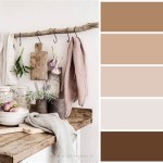
Monochromatic: This scheme uses variations of a single colour, incorporating different tints, shades, and tones. For example, varying shades of blue can be used throughout a room to create a calming and cohesive atmosphere. The monochromatic scheme is often regarded as simple, refined, and soothing.
Analogous: This harmony involves colours that are located next to each other on the colour wheel. For instance, combining blue, blue-green, and green can create a serene and nature-inspired aesthetic. Analogous schemes are typically harmonious and relaxing, offering a sense of unity.
Complementary: This scheme uses colours that are opposite each other on the colour wheel, such as red and green or blue and orange. Complementary colours create high contrast and can be visually stimulating and vibrant. However, it's crucial to use them carefully, striking a balance to avoid overwhelming the space. One colour typically dominates, while the other acts as an accent.
Triadic: This approach involves three colours that are equally spaced on the colour wheel, such as red, yellow, and blue. Triadic schemes are bold and energetic, offering a balanced yet dynamic visual impact. As with complementary schemes, careful consideration must be given to the proportion and intensity of each colour.
Tetradic (Double Complementary): This scheme uses two pairs of complementary colours, providing a rich and complex palette. For example, blue and orange paired with yellow and violet. Tetradic schemes are best suited for spaces where a vibrant and multi-layered look is desired.
Considering Light and Room Size
Light plays a crucial role in how paint colours appear. Natural light, artificial light, and the direction the room faces all influence the perceived colour. It's essential to test paint samples in the room under different lighting conditions before making a final decision.
Natural Light: Rooms with ample natural light can generally handle darker or more saturated colours without feeling cramped. However, be mindful that very bright sunlight can wash out certain colours, making them appear lighter or less vibrant.
Artificial Light: Incandescent bulbs emit a warm, yellowish light, which can enhance warm colours and make cool colours appear duller. Fluorescent bulbs, on the other hand, produce a cooler, bluer light, which can make warm colours appear harsher and cool colours appear brighter. LED lighting offers a wider range of colour temperatures, allowing more control over the overall ambiance.
Room Orientation: North-facing rooms tend to receive cool, indirect light, which can make colours appear cooler and less vibrant. Warm colours can help to counteract this effect and create a more inviting atmosphere. South-facing rooms receive warm, direct light, which can intensify colours and make them appear brighter. Cool colours can help to balance this warmth and create a more relaxing environment. East-facing rooms receive warm morning light and cooler afternoon light, while west-facing rooms receive cool morning light and warm afternoon light. This variation requires careful consideration of how the room will be used at different times of the day.
The size of a room also influences the choice of paint colours. Lighter colours generally make a room feel larger and more open, while darker colours can make a room feel smaller and more intimate. However, dark colours can also be used effectively in small spaces to create a dramatic and sophisticated atmosphere.
For small rooms, consider using light, neutral colours such as white, cream, or pale grey. These colours reflect light and create a sense of spaciousness. To add visual interest, incorporate accent colours through accessories, artwork, or a single painted wall.
Larger rooms can handle bolder and more saturated colours. However, it's essential to avoid overwhelming the space. Consider using a feature wall in a strong colour to create a focal point, while keeping the remaining walls in a more neutral tone.
Choosing Colours for Specific Rooms
The function of a room should also influence the choice of paint colours. Different rooms have different purposes and require different atmospheres. Consider the following guidelines when selecting colours for specific rooms:
Living Room: As the primary gathering space, the living room should be inviting and comfortable. Neutral colours such as beige, grey, or off-white are popular choices for creating a versatile backdrop that can be easily personalized with furniture and accessories. Warmer tones like terracotta or golden yellow can create a cozy and welcoming atmosphere, while cooler tones like blue or green can create a more relaxing and sophisticated ambiance. Consider the amount of natural light and the existing furnishings when making a decision.
Bedroom: The bedroom should be a restful and relaxing sanctuary. Soft, muted colours are generally preferred for creating a calming atmosphere. Blues, greens, and greys are popular choices, as they are associated with serenity and tranquility. Avoid overly bright or stimulating colours, such as red or orange, which can disrupt sleep. Consider using a darker shade on the wall behind the bed to create a focal point and add depth to the room.
Kitchen: The kitchen is often the heart of the home and should be a functional and inviting space. Light and airy colours such as white, cream, or pale yellow are popular choices for creating a clean and bright atmosphere. Brighter colours such as red, orange, or green can be used as accents to add energy and personality. Consider the colour of the cabinets, countertops, and appliances when selecting paint colours to ensure a cohesive and harmonious look.
Bathroom: The bathroom should be a clean and refreshing space. Light and bright colours such as white, blue, or green are popular choices for creating a spa-like atmosphere. Consider using a darker shade on the lower half of the walls to protect against moisture and stains. Accent colours can be incorporated through towels, accessories, or a painted vanity.
Dining Room: The dining room should be a welcoming and elegant space. Warmer colours such as red, orange, or yellow can stimulate appetite and create a convivial atmosphere. Cooler colours such as blue or green can create a more formal and sophisticated ambiance. Consider the style of the furniture and the overall design of the house when selecting paint colours.
Home Office: The home office should be a productive and inspiring space. Neutral colours such as grey, beige, or off-white are popular choices for creating a calm and focused atmosphere. Cooler colours such as blue or green can promote concentration and creativity. Avoid overly stimulating colours, such as red or orange, which can be distracting. Consider using a brighter colour on a single wall to add energy and personality.
Beyond specific rooms, consider the flow of colour throughout the house. Transitions between rooms should be harmonious and visually appealing. Using a consistent colour palette or repeating certain colours in different rooms can create a sense of unity and coherence.
Ultimately, the best paint colours for a house interior are those that reflect personal taste and create a comfortable and inviting living space. By understanding the principles of colour theory, considering the influence of light and room size, and choosing colours appropriate for specific rooms, it is possible to create a beautiful and harmonious home.
Choosing The Perfect Interior Paint Color Artisan Builders
The 5 Best Interior Paint Colors For Feeling Refreshed And Relaxed Metzler Home Builders
You Ll See These Interior Paint Colors Everywhere In 2024
Choosing The Best Interior Paint Colors For Your Home In Fair Oaks Ranch
Lake House Interior Colors The Lilypad Cottage
How To Choose Interior Paint Colors For Your Home
2024 Best Interior Paint Colors To Your House Homeadvisor
20 Of The Best Paint Colors For Whole House Welsh Design Studio Living Room Interior
10 Best Trending 2024 Interior Paint Colors To Inspire Décor Aid
Bright Paint Color Ideas To Consider Forbes Home
Related Posts