Paint Colors For Family Room 2024 Trends
The family room serves as the central hub of many homes, a space where relaxation, entertainment, and connection converge. Selecting the right paint color is crucial to creating the desired atmosphere and reflecting the personality of the inhabitants. In 2024, paint color trends for family rooms emphasize comfort, versatility, and a connection to the natural world. This article explores the key trends influencing color choices for family rooms in the coming year, providing insights into popular shades and their applications.
Understanding the underlying factors that drive these trends is essential for making informed decisions. A growing emphasis on well-being and mindfulness influences the preference for calming and restorative colors. Simultaneously, the desire for spaces that feel both inviting and stylish leads to the exploration of more nuanced and sophisticated color palettes. Furthermore, sustainability and eco-consciousness are impacting the selection of paint products and their associated color trends, with a growing focus on natural pigments and low-VOC options.
Earthy Neutrals and Warm Tones
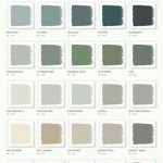
Earthy neutrals remain a cornerstone of family room design, offering a versatile backdrop that complements a wide range of furniture styles and decorative accents. In 2024, these neutrals trend towards warmer and more inviting shades, moving away from stark, clinical whites towards beige, taupe, and greige variations that exude comfort and sophistication. These colors provide a sense of grounding and stability, fostering a relaxing atmosphere conducive to family gatherings and quiet evenings.
Beige, with its subtle warmth, offers a classic and timeless appeal. It works well in both traditional and contemporary settings, providing a neutral canvas for layering textures and patterns. Taupe, a sophisticated blend of brown and gray, adds a touch of elegance to the family room. Its muted nature makes it ideal for creating a serene and calming environment. Greige, a popular hybrid of gray and beige, combines the coolness of gray with the warmth of beige, creating a versatile neutral that adapts to various lighting conditions and design schemes.
Complementing these earthy neutrals are warm tones such as terracotta, rust, and ochre. These colors bring a sense of organic warmth and richness to the family room, evoking feelings of comfort and connection. Terracotta, with its earthy red-brown hue, adds a touch of rustic charm and natural beauty. Rust, a deeper and more saturated shade of terracotta, creates a cozy and inviting atmosphere. Ochre, a muted yellow-brown, brings a touch of sunshine and warmth to the space, creating a cheerful and uplifting environment.
These warm tones can be used as accent colors to add depth and visual interest to a neutral backdrop. They can be incorporated through accent walls, decorative accessories, or upholstered furniture. When using warmer tones, it’s important to consider the existing lighting conditions and the size of the room. In smaller spaces, lighter shades of these colors will help to create a sense of openness and airiness, while in larger rooms, deeper and more saturated shades can be used to add drama and warmth.
The use of natural materials, such as wood, stone, and woven textiles, further enhances the warmth and organic feel of these earthy neutral and warm color palettes. Combining these elements creates a cohesive and inviting family room that reflects a connection to the natural world.
Calming Blues and Greens
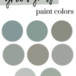
Blues and greens continue to be popular choices for family rooms, reflecting a growing desire for spaces that promote relaxation and well-being. In 2024, these colors trend towards softer, more muted shades that evoke feelings of tranquility and connection to nature. These colors are often associated with serenity, peace, and harmony, making them ideal for creating a relaxing and restorative family room environment.
Soft blues, such as sky blue, powder blue, and pale turquoise, create a sense of spaciousness and airiness. They evoke feelings of calmness and tranquility, making them ideal for creating a relaxing and inviting atmosphere. These colors work well in both small and large family rooms, providing a sense of openness and serenity.
Muted greens, such as sage green, olive green, and eucalyptus green, bring a touch of nature indoors, creating a calming and restorative environment. These colors are often associated with growth, renewal, and harmony, making them ideal for creating a relaxing and inviting family room. Sage green, with its soft and muted hue, creates a sense of tranquility and balance. Olive green, with its earthy and sophisticated tone, adds a touch of elegance and depth. Eucalyptus green, with its cool and refreshing hue, brings a touch of the outdoors in.
The versatility of blues and greens allows them to be used in a variety of ways, from accent walls to entire room palettes. They pair well with natural materials such as wood, stone, and linen, creating a cohesive and inviting space. Combining these colors with warm neutrals, such as beige or greige, can create a balanced and harmonious color scheme.
Incorporating plants into the family room further enhances the connection to nature and complements the calming effect of blue and green color palettes. Plants not only add visual appeal but also improve air quality and create a more inviting and relaxing environment.
Bold Accents and Unexpected Pops of Color
While neutral and calming palettes dominate family room trends in 2024, the incorporation of bold accents and unexpected pops of color provides opportunities for personalization and creative expression. These accent colors add visual interest and energy to the space, preventing it from feeling monotonous or bland. Strategic use of bold colors can highlight architectural features, create focal points, and reflect the unique personality of the inhabitants.
Deep jewel tones, such as emerald green, sapphire blue, and amethyst purple, add a touch of luxury and sophistication to the family room. These colors are rich and saturated, creating a sense of drama and opulence. They work well as accent colors on walls, furniture, or decorative accessories.
Warm, vibrant hues, such as coral, mustard yellow, and burnt orange, bring energy and excitement to the space. These colors are bright and cheerful, creating a welcoming and inviting atmosphere. They can be used to add pops of color to a neutral backdrop or to create a bold and statement-making accent wall.
Unexpected color combinations, such as pairing a bold blue with a muted orange or a deep green with a bright pink, can create a unique and memorable family room. These unexpected pairings challenge conventional color schemes and add a touch of individuality to the space. Experimentation is key when exploring unexpected color combinations; consider using color swatches to visualize how different shades will interact in the room's lighting conditions.
When using bold accents and unexpected pops of color, it’s important to maintain balance and harmony. Too much color can overwhelm the space, while too little can make it feel bland. Consider using the 60-30-10 rule of color proportion: 60% of the room should be the dominant color, 30% should be the secondary color, and 10% should be the accent color. This rule helps to create a balanced and visually appealing color scheme.
Furthermore, the selection of accent colors should complement the existing furniture and décor. Consider the colors and textures of the furniture, rugs, and artwork when choosing accent colors. This will help to create a cohesive and harmonious family room that reflects the personal style of the inhabitants.
Ultimately, the choice of paint colors for the family room is a personal decision that should reflect the individual preferences and lifestyle of the inhabitants. By understanding the key trends influencing color choices in 2024, homeowners can create a family room that is both stylish and inviting, a space where they can relax, connect, and create lasting memories.

The Hottest Color Trends Of 2024 Might Leave You With Déjà Vu
:max_bytes(150000):strip_icc()/sherwin-williams-colormix-hero-2023jpg-8ae4eed8a03c4fc0b7be77960135c8e9.jpg?strip=all "Sherwin Williams Releases 2024 Color Palettes")
Sherwin Williams Releases 2024 Color Palettes
:max_bytes(150000):strip_icc()/BEHR_23.04_COTY_LIVING_KM_001-41cfe1e102df42f7a9b21e7792d0aeb8.jpg?strip=all "Every 2024 Color Of The Year We Know So Far")
Every 2024 Color Of The Year We Know So Far
:strip_icc()/bhg-hgtv-sw-2024-living-room-7643139-6631c03cac4f40b797f7af259912e193.jpg?strip=all "The Home By Sherwin Williams Color Of Year 2024 Pick Brings Coziness To Life")
The Home By Sherwin Williams Color Of Year 2024 Pick Brings Coziness To Life

Sherwin Williams Says This Is The Home Color Palette Of 2024 And Beyond Architectural Digest

2024 Colors And Palettes Of The Year From Every Paint Brand

These Benjamin Moore Paint Color Trends For 2024 Janovic

Every Color Of The Year For 2024 So Far

Sherwin Williams Reveals Its 2024 Trend Forecast Color Palettes And They Re All About Well Being

5 Living Room Paint Colors Going Out Of Style In 2024
Related Posts