Most Popular Warm Gray Paint Colors from Sherwin-Williams
Warm gray paint colors have become increasingly popular choices for interior and exterior design, offering a versatile and sophisticated aesthetic that bridges the gap between cool grays and warmer neutrals. Sherwin-Williams, a leading paint manufacturer, offers a wide array of warm gray shades, each with unique undertones and characteristics. Selecting the right warm gray can significantly impact the overall ambiance of a space, influencing its perceived size, brightness, and overall feeling. This article explores some of the most popular warm gray paint colors available from Sherwin-Williams, delving into their nuances and suggesting optimal applications for achieving desired design outcomes.
Understanding the subtle differences between warm gray paint colors is crucial for making informed decisions. While all warm grays share a common ground – a gray base infused with warmer undertones such as beige, brown, or even subtle hints of red or yellow – the specific proportions of these undertones can dramatically alter the final appearance. Factors such as lighting conditions (natural and artificial), existing décor, and personal preferences all play a significant role in determining which warm gray will best complement a particular space.
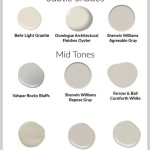
Grepige Elegance: Sherwin-Williams Repose Gray (SW 7015)
Sherwin-Williams Repose Gray (SW 7015) is a highly versatile and widely favored warm gray. It is considered a light, neutral gray with subtle warm undertones, making it suitable for a vast range of applications, from living rooms and bedrooms to kitchens and bathrooms. Its Light Reflectance Value (LRV) of 58 places it in the mid-tone range, meaning it reflects a decent amount of light without being overly bright. This characteristic contributes to its ability to create a calm and inviting atmosphere.
Repose Gray's understated warmth allows it to pair well with both cool and warm color palettes. It complements natural wood tones, creating a harmonious and organic feel. When combined with cooler accents like blues and greens, Repose Gray provides a grounding neutral backdrop that prevents the space from feeling too stark or sterile. Its neutrality also makes it a reliable choice for open-concept living spaces, where it can seamlessly connect different areas without clashing with varying décor styles.
Consider using Repose Gray in areas where a sense of tranquility and sophistication is desired. Its subtle warmth makes it an excellent choice for bedrooms, creating a relaxing and restful environment. In living rooms, it can act as a backdrop to bolder furniture pieces and artwork, allowing these elements to take center stage. When using Repose Gray in rooms with limited natural light, be mindful of the potential for it to appear slightly cooler. Compensate by incorporating warmer lighting fixtures and accent colors to maintain the desired warmth.
Sophisticated Depth: Sherwin-Williams Agreeable Gray (SW 7029)
Sherwin-Williams Agreeable Gray (SW 7029) is another immensely popular warm gray, known for its slightly deeper tone and richer undertones compared to Repose Gray. Agreeable Gray leans towards a more greige (gray-beige) aesthetic, offering a more substantial warmth that can create a cozy and inviting atmosphere. Its LRV of 60 is close to that of Repose Gray, making it equally versatile, but its richer undertones provide a greater sense of depth and dimension.
Agreeable Gray's versatility stems from its balanced combination of gray and beige. This balance allows it to work well with a wide variety of design styles, from traditional to modern. It complements both warm and cool tones, making it a forgiving choice for spaces with existing furniture and décor. Its added warmth makes it a particularly suitable option for north-facing rooms, which tend to receive cooler, less direct sunlight. In these spaces, Agreeable Gray can counteract the coolness and create a more welcoming environment.
When used in kitchens, Agreeable Gray pairs beautifully with white cabinetry, creating a classic and timeless look. It also works well with natural stone countertops, enhancing their inherent warmth and texture. In living rooms, Agreeable Gray can create a sophisticated backdrop for a mix of textures and patterns. Consider pairing it with plush fabrics, natural wood elements, and metallic accents to create a layered and visually appealing space. For bedrooms, its warmth can contribute to a sense of comfort and relaxation, especially when paired with soft textiles and layered bedding.
Understated Luxury: Sherwin-Williams Worldly Gray (SW 7043)
Sherwin-Williams Worldly Gray (SW 7043) offers a more complex and nuanced take on warm gray. It possesses a subtle earthiness and depth that distinguishes it from simpler shades like Repose Gray or Agreeable Gray. Worldly Gray has stronger warm undertones, making it a good choice when you want a gray that leans more heavily towards the beige side of the spectrum. Its LRV of 57 positions it in the same general range as Repose Gray and Agreeable Gray, but its richer undertones will make it appear slightly darker in some lighting conditions.
The complexity of Worldly Gray lies in its ability to adapt to its surroundings. In rooms with ample natural light, it can appear brighter and more luminous, showcasing its subtle variations in tone. In darker rooms, it can take on a more muted and sophisticated character, creating a sense of depth and intimacy. This adaptability makes it a versatile choice for a wide range of spaces, from formal living rooms to cozy bedrooms.
Worldly Gray pairs exceptionally well with natural materials such as wood, stone, and leather. It can enhance the warmth and texture of these materials, creating a sense of organic harmony. Consider using it in spaces where you want to create a sense of connection to the natural world. In living rooms, it can act as a grounding neutral for furniture with natural wood frames or leather upholstery. In kitchens, it complements natural stone countertops and wood cabinetry beautifully. When using Worldly Gray, pay attention to the undertones of your existing décor to ensure that it creates a cohesive and harmonious look. Avoid pairing it with colors that have strong opposing undertones, as this can create a jarring effect.
The Importance of Sampling and Lighting
Prior to committing to a specific warm gray paint color, it is imperative to obtain samples and test them in the actual space where the paint will be applied. Paint colors can appear drastically different depending on the lighting conditions, the size of the room, and the surrounding décor. What looks appealing on a small paint chip or in a photograph may not translate well to a larger space.
To accurately assess a paint color, paint a large swatch on a piece of poster board or directly on the wall in an inconspicuous area. Observe the swatch at different times of day, under different lighting conditions (natural and artificial), to see how the color changes. Pay attention to the undertones of the paint color and how they interact with the existing colors in the room. Consider the overall mood you are trying to create and whether the chosen paint color aligns with your vision.
Lighting plays a critical role in how warm gray paint colors are perceived. Natural light tends to enhance the warmth of the undertones, while artificial light can sometimes mute them. Different types of light bulbs can also affect the appearance of paint colors. Warm-toned light bulbs (those with a lower Kelvin temperature) tend to enhance the warmth of warm grays, while cool-toned light bulbs (those with a higher Kelvin temperature) can make them appear slightly cooler. Experiment with different types of light bulbs to see how they affect the chosen paint color.
In conclusion, choosing the right warm gray paint color from Sherwin-Williams requires careful consideration of various factors, including undertones, lighting conditions, and existing décor. By understanding the nuances of each shade and testing samples in the actual space, individuals can confidently create a warm, inviting, and stylish environment that reflects their personal taste and design preferences.

The Best Warm Gray Paint Colors Life On Virginia Street

The Top 10 Warm Gray Paint Colors Sherwin Williams Kylie M Interiors

The 4 Best Warm Gray Quasi Greige Paint Colours Sherwin Williams Kylie M Interiors

9 Amazing Warm Gray Paint Shades From Sherwin Williams The Flooring Girl

The 17 Best Sherwin Williams Warm Gray Colors Paint Color Project

The 12 Best Gray Greige Paint Colours Sherwin Williams Kylie M Interiors

The Best Sherwin Williams Gray Paint Colors West Magnolia Charm

9 Amazing Warm Gray Paint Shades From Sherwin Williams The Flooring Girl

The 17 Best Sherwin Williams Warm Gray Colors Paint Color Project

Best Gray And Greige Paint Colors From Sherwin Williams So Much Better With Age
Related Posts