Most Popular Paint Colors 2024: A Ground-Level Perspective
Predicting the "most popular" paint colors for any given year is a complex undertaking, traditionally dominated by trend forecasters and color specialists associated with major paint manufacturers. These experts analyze fashion trends, economic indicators, cultural shifts, and even global events to identify hues poised to gain prominence. However, this article offers a different perspective, one grounded in real-world observations and the practical experiences of homeowners, designers, and contractors. It eschews the theoretical pronouncements of trend forecasts and instead examines the emerging patterns and enduring favorites shaping the color palettes of homes in 2024.
This analysis focuses on the colors that are demonstrably gaining traction, driven by consumer choices and project implementations. It considers factors such as regional variations, architectural styles, and the evolving preferences for creating specific atmospheres within living spaces. The aim is to provide a realistic and actionable guide to the paint colors that are effectively defining interior and exterior aesthetics in the current year.
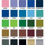
The Enduring Appeal of Warm Neutrals
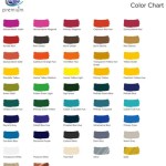
While bolder colors may capture headlines and garner attention in design magazines, warm neutrals continue to hold a dominant position in the realm of paint choices. These hues, encompassing shades of beige, cream, off-white, and greige (a blend of gray and beige), offer a versatile and adaptable foundation for a wide range of interior design styles. Their enduring popularity stems from their ability to create a sense of calm, sophistication, and spaciousness, making them particularly well-suited for open-plan living areas and bedrooms.
Within the warm neutral category, specific variations are exhibiting particular strength. For instance, soft, creamy whites with subtle undertones of yellow or peach are favored for their ability to infuse rooms with a sense of warmth and light, especially in spaces with limited natural illumination. These shades prevent rooms from feeling sterile or cold, creating a welcoming and inviting atmosphere. They also serve as an excellent backdrop for showcasing artwork and furniture, allowing other elements of the décor to take center stage.
Greige, a remarkably adaptable color, remains a popular choice for its ability to bridge the gap between warm and cool tones. Its neutrality makes it compatible with a variety of accent colors and design styles, from modern minimalist to traditional farmhouse. Greige can appear warmer or cooler depending on the lighting and surrounding elements, making it a versatile option for different rooms and geographic locations. This chameleon-like quality is a key reason for its continued appeal among homeowners and designers alike. The subtle gray undertones also add a touch of sophistication and modernity, preventing the space from appearing dated or overly traditional.
The continued popularity of warm neutrals is also fueled by their practical advantages. They are easy to coordinate with existing furniture and décor, making them a safe and reliable choice for homeowners undertaking renovation projects. Furthermore, neutral walls provide a blank canvas for expressing personal style through accessories and artwork, allowing for easy updates and transformations without requiring a complete repainting of the entire space. The inherent flexibility of these colors makes them a practical and cost-effective choice for long-term design.
The Rise of Earth Tones and Nature-Inspired Hues
Reflecting a growing desire for connection with the outdoors and a renewed appreciation for natural materials, earth tones and nature-inspired hues are steadily gaining prominence in interior and exterior design. These colors, ranging from muted greens and browns to terracotta and warm oranges, evoke a sense of grounding, tranquility, and organic beauty. Their increasing popularity reflects a broader cultural shift towards sustainability, wellness, and biophilic design, which seeks to incorporate elements of nature into the built environment.
Specifically, greens in various shades are becoming increasingly favored. Soft, muted greens, reminiscent of sage or eucalyptus, are used to create calming and restorative spaces, particularly in bedrooms and home offices. Deeper, more saturated greens, such as forest green or olive green, are employed as accent colors or for feature walls, adding depth and visual interest to living rooms and dining areas. The subtle connection to nature that green provides makes it a comforting and aesthetically pleasing choice.
Browns and terracotta are also experiencing a resurgence, often used to create a sense of warmth, earthiness, and rustic charm. Light browns, such as taupe or sand, are used as neutral alternatives to gray or white, providing a softer and more inviting backdrop for furniture and décor. Terracotta, with its warm, reddish-brown tones, is used to add a touch of character and personality to spaces, particularly in kitchens and bathrooms. These earthy tones evoke a sense of grounding and connection to the natural world, creating a comfortable and inviting atmosphere.
The appeal of earth tones extends beyond their aesthetic qualities. They also contribute to a sense of well-being and relaxation. Studies have shown that exposure to natural colors can reduce stress, improve mood, and enhance cognitive function. By incorporating these hues into their homes, individuals are seeking to create sanctuaries that promote health, balance, and a deeper connection with the environment. This focus on wellness is a driving factor behind the increasing popularity of earth tones and nature-inspired palettes.
Unexpected Pops of Color and Accent Walls
While neutral and earth-toned palettes provide a foundation for many interiors, the strategic use of unexpected pops of color and accent walls continues to be a popular method for injecting personality and visual interest into living spaces. This approach allows homeowners to express their individual style and create focal points within a room without committing to an overly bold or overwhelming color scheme. The key lies in selecting accent colors that complement the existing neutral or earth-toned backdrop and create a sense of harmony and balance.
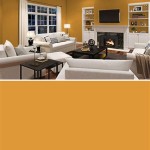
In 2024, certain accent colors are proving particularly popular. Deep blues, such as navy or indigo, are used to create a sense of sophistication and depth, often paired with warm neutrals or light wood tones. Mustard yellow, with its cheerful and optimistic vibe, is used to add a touch of warmth and energy to spaces, particularly in living rooms and kitchens. The contrast between the bold accent color and the more subdued background creates a visually striking effect that elevates the overall aesthetic.
Accent walls remain a favored technique for incorporating pops of color. By painting a single wall in a contrasting hue, homeowners can create a focal point without overwhelming the entire room. This approach is particularly effective in bedrooms, where a boldly colored accent wall behind the bed can add drama and visual interest. In living rooms, an accent wall behind the sofa or entertainment center can serve as a backdrop for artwork or decorative objects.
The use of unexpected color combinations is also gaining traction. Pairing seemingly disparate hues, such as teal and terracotta or lavender and mustard yellow, can create a unique and visually arresting effect. This approach requires careful consideration of color theory and balance, but when executed effectively, it can result in a truly personalized and stylish interior. The willingness to experiment with unconventional color pairings reflects a growing desire for self-expression and individuality in interior design.
Furthermore, the trend towards incorporating texture into accent walls is becoming more prevalent. This can be achieved through the use of textured paint, wallpaper, or even natural materials such as wood or stone. By adding a tactile element to the accent wall, homeowners can create a more engaging and visually dynamic space. The combination of bold color and intriguing texture elevates the accent wall from a simple design element to a statement piece that reflects personal style and creativity.
Ultimately, the most popular paint colors of 2024 are not dictated by a single trend forecast, but rather by the collective choices of homeowners, designers, and contractors seeking to create comfortable, stylish, and personalized living spaces. The enduring appeal of warm neutrals, the growing popularity of earth tones, and the strategic use of unexpected pops of color all contribute to a diverse and evolving color landscape that reflects the changing needs and preferences of individuals and families.
Best 2024 Paint Colors You Need To Know About Porch Daydreamer
Best 2024 Paint Colors You Need To Know About Porch Daydreamer
2024 Wall Color Trends West Magnolia Charm
Color Of The Year 2024 Dutch Boy
Exploring The Hottest Interior Color Trends Of 2024 Trico Painting
Best 2024 Paint Colors You Need To Know About Porch Daydreamer
The Most Popular 2024 Paint Color Trends
The Most Popular 2024 Paint Color Trends
The Most Popular 2024 Paint Color Trends
2024 Color Of The Year Round Up From Popular Paint Brands Building Bluebird
Related Posts