Most Popular Neutral Paint Colors by Sherwin Williams
Neutral paint colors are a popular choice for interior design because they create a sense of calm and serenity. They are also versatile and can be paired with a wide range of accent colors and furniture styles. Sherwin Williams offers a wide variety of neutral paint colors, and some of the most popular choices are known for their ability to adapt to different lighting conditions and complement various design aesthetics. In this article, we will explore some of the most popular neutral paint colors offered by Sherwin Williams, delving into their specific characteristics and how they can be incorporated into different spaces.
Agreeable Gray (SW 7029)
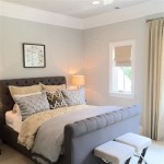
Agreeable Gray is a versatile light gray that leans slightly cool. It is a popular choice for living rooms, bedrooms, and kitchens because it creates a calming and inviting atmosphere. Agreeable Gray pairs well with both warm and cool tones, making it a perfect neutral for a wide range of design styles. Its subtle cool undertones prevent it from feeling too stark or masculine, while its light hue allows it to make a space feel larger and airier. Agreeable Gray works especially well in spaces with natural light, as it reflects the light beautifully and creates a soft and inviting ambiance. It can also be paired with bold accents for a more dramatic look or with soft pastels for a more delicate touch.
Repose Gray (SW 7015)
Repose Gray is another popular neutral paint color from Sherwin Williams. This slightly warm gray is often described as a "greige", meaning it blends gray and beige tones. Repose Gray is a versatile color that can be used in a variety of spaces, including bedrooms, living rooms, and even kitchens. It is a warm and inviting color that can create a cozy and comfortable atmosphere. Repose Gray is a popular choice for homeowners who want a neutral color that is not too stark but still provides a clean and modern feel. Its warmth makes it suitable for spaces with limited natural light, as it can prevent the room from feeling too cold or sterile. When paired with pops of color or natural textures, Repose Gray can create a sophisticated and elegant ambiance.
Alabaster (SW 7008)
Alabaster, a warm white with hints of beige, offers a classic and timeless appeal. It is a highly versatile choice that can be used in various spaces, from entryways and hallways to bedrooms and kitchens. Alabaster's warm undertones contribute to a welcoming and inviting environment, making it a popular choice for spaces where comfort is paramount. Its light hue helps to maximize natural light and create a sense of spaciousness, making it effective in smaller rooms or spaces with limited light. Alabaster works well with a wide range of décor styles, from traditional to modern. Its versatility allows homeowners to easily change the ambiance with accent colors, furniture, and décor without having to repaint the entire space.
Accessible Beige (SW 7036)
Accessible Beige is a light, warm beige that is a popular choice for both traditional and modern homes. It is a versatile color that can be used in a variety of spaces, including living rooms, bedrooms, and kitchens. Accessible Beige is a very forgiving color that can be paired with a wide range of accents, making it a great choice for those who are unsure about their design style. It's a neutral that blends seamlessly with both cool and warm tones, creating a harmonious and balanced environment. Its warmth can make a space feel more inviting and cozy, while its light tone allows it to create a sense of spaciousness, especially when paired with lighter furniture and accents.
Popular Gray (SW 7071)
Popular Gray is a light, cool gray that is a popular choice for modern and contemporary homes. It is a versatile color that can be used in a variety of spaces, including living rooms, bedrooms, and kitchens. Popular Gray is a sophisticated and elegant color that can create a sense of calm and serenity. Its cool undertones create a clean and crisp look, making it ideal for homeowners who desire a minimalist aesthetic. Popular Gray can also be used to accentuate architectural features or create visual interest in a space. Its light hue allows it to reflect light beautifully, making it suitable for rooms with limited natural light. It is also a perfect backdrop for displaying artwork or showcasing statement furniture.
These are just a few of the most popular neutral paint colors from Sherwin Williams. With so many options available, homeowners can find the perfect neutral color to create a space that is both stylish and inviting. When choosing a neutral paint color, it is important to consider the size and shape of the room, the natural light, and the overall design style of the home. By taking these factors into account, homeowners can create a space that is truly their own.

The Best Sherwin Williams Neutral Paint Colors

The Best Neutral Paint Colors Midwest Life And Style Blog

Sherwin Williams 6 Best Neutral Beige Paint Colors With A Bit More Depth Kylie M Interiors

The Best Sherwin Williams Neutral Paint Colors

Sherwin Williams 6 Best Neutral Beige Paint Colors With A Bit More Depth Kylie M Interiors

Top 50 Besting Paint Colors At Sherwin Williams Setting For Four Interiors

Popular Sherwin Williams Paint Colors Dvd Interior Design Deborah Von Donop

9 Best Sherwin Williams White Paint Colors Thetarnishedjewelblog

9 Best Sherwin Williams White Paint Colors Thetarnishedjewelblog

My Top 20 Favorite Neutral Paint Colors Jess Klein Studio
Related Posts