Is Red A Hard Color To Paint Walls With White Trim And Ceiling?
The use of red paint for interior walls is often perceived as a challenging design choice, particularly when coupled with the ubiquitous white trim and ceiling. This perception stems from several factors including red's inherent intensity, its potential to clash with other design elements, and the specific techniques required for its successful application. While red can create a dramatic and visually appealing space, understanding the nuances of its application is crucial to achieving the desired aesthetic.
The challenge presented by red paint is not insurmountable, but it requires careful consideration of several key aspects. These aspects range from selecting the appropriate shade of red itself to the preparation techniques needed to ensure a smooth and even finish. Furthermore, the compatibility of red with white trim and ceilings depends heavily on the specific undertones of the chosen red and the overall design style of the room.
One primary reason red is considered difficult is its high pigmentation. This level of pigmentation, while contributing to red's vibrancy, also necessitates multiple coats for complete coverage. Imperfect preparation or application can lead to uneven color distribution and a visually jarring result. White trim, in particular, can highlight any imperfections in the red paint job, drawing unwanted attention to areas that are not perfectly smooth or consistently colored.
Moreover, red possesses a significant psychological impact. Its association with energy, passion, and even danger can overwhelm a space if not carefully balanced. A poorly executed red room can feel claustrophobic, aggressive, or simply visually uncomfortable. The interaction between red walls and white trim needs to be thoughtfully planned to mitigate these potential negative effects. White, acting as a neutralizing element, can help to temper the intensity of the red, but its effectiveness hinges on the correct shade pairing and the overall proportion of each color in the room.
The interplay between natural and artificial light also significantly impacts the appearance of red. Different light sources can alter the perceived shade, emphasizing certain undertones and potentially creating unintended color variations. A red that appears warm and inviting under natural daylight may appear harsh or even garish under artificial lighting. This necessitates careful observation of the chosen red under various lighting conditions before committing to its application.
Understanding the Challenges of Red Pigmentation
The exceptional pigmentation of red paint poses a specific set of challenges during application. Unlike lighter, more translucent colors, red pigment particles tend to be larger and less evenly distributed in the paint base. This inherent characteristic leads to a higher risk of streaking and uneven color coverage, particularly when using lower-quality paints or improper painting techniques. The necessity of multiple coats adds to the overall time and effort required for a successful red wall painting project.
Furthermore, the high pigment load makes red paint more susceptible to "burnishing," a phenomenon where certain areas of the painted surface become noticeably shinier than others due to excessive rubbing or polishing. This is especially problematic in high-traffic areas or areas subjected to frequent cleaning. To avoid burnishing, it's crucial to use a high-quality paint specifically formulated for optimal durability and resistance to wear. Careful application techniques are also vital, minimizing unnecessary rubbing or pressure during the painting process.
The type of primer used beneath the red paint also plays a critical role. A poorly chosen primer can exacerbate the pigmentation issues, leading to even more coats being required for consistent coverage. A tinted primer, specifically formulated to complement the chosen shade of red, can significantly improve the final result. This helps to create a uniform base for the red paint, reducing the amount of product needed and minimizing the risk of uneven color distribution.
Moreover, the tools used for application can impact the pigmentation challenges. High-quality rollers and brushes designed for use with thicker paints are essential. These tools help to ensure an even and consistent application, minimizing streaks and brushstrokes. Avoid using cheap or worn-out tools, as they can contribute to uneven coverage and increase the overall difficulty of the project.
Mitigating the Psychological Impact of Red
Red's powerful psychological associations require careful consideration when using it in interior spaces. Its inherent intensity can be overwhelming if not balanced effectively with other design elements. The key to mitigating this impact lies in understanding how to use red strategically and in conjunction with complementary colors and textures.
One important approach is to use red as an accent color rather than the dominant hue. This can be achieved by painting only one wall red or using red in smaller doses through accessories, such as throw pillows, artwork, or curtains. This strategy allows for the inclusion of red's energetic qualities without overwhelming the space. The placement of these red accents is also important, considering sight lines and focal points to create a balanced and visually appealing arrangement.
The specific shade of red chosen also influences its psychological impact. Brighter, more saturated reds tend to be more stimulating and attention-grabbing, while deeper, more muted reds can create a sense of warmth and sophistication. Consider the overall mood and purpose of the room when selecting the appropriate shade of red. A bedroom, for instance, might benefit from a softer, more subdued red, while a dining room might be able to handle a bolder, more vibrant hue.
The use of white trim and ceilings plays a significant role in tempering the intensity of red. White provides a visual break, preventing the red from dominating the space and creating a sense of balance. The proportion of white to red is crucial. A higher proportion of white can significantly reduce the perceived intensity of the red, while a lower proportion can amplify its impact. Carefully consider the architectural features of the room and the desired overall aesthetic when determining the optimal balance between red and white.
The incorporation of other neutral colors, such as gray, beige, or cream, can further soften the impact of red. These colors can be used in furniture, flooring, or textiles to create a more harmonious and balanced environment. The interplay between red, white, and these neutral tones can significantly influence the overall mood and atmosphere of the room.
Achieving Harmony Between Red Walls, White Trim, and Ceiling
The successful integration of red walls with white trim and ceilings requires a thoughtful approach to color selection, application techniques, and overall design coordination. The goal is to create a cohesive and visually appealing space where the red complements the white, rather than clashing with it.
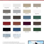
Choosing the right shade of red is paramount. Not all reds are created equal, and some shades are inherently more compatible with white than others. Reds with warm undertones, such as those leaning towards orange or brown, tend to work well with warmer whites, such as those with a hint of yellow or cream. Conversely, reds with cool undertones, such as those leaning towards blue or pink, often pair well with cooler whites, such as those with a hint of gray or blue. Sampling different shades of red and white together in the actual room, under various lighting conditions, is crucial for making an informed decision.
The specific type of white used for the trim and ceiling also impacts the overall aesthetic. Bright, stark whites can create a high-contrast look, which can be visually striking but also potentially jarring. Softer, more muted whites can create a more subtle and harmonious effect. Consider the style of the room and the desired overall mood when selecting the appropriate shade of white.
The application of the red paint requires meticulous attention to detail. Proper surface preparation, including cleaning, sanding, and priming, is essential for ensuring a smooth and even finish. Using high-quality paint and applying it in thin, even coats helps to minimize streaks and uneven color distribution. Cutting in carefully around the white trim is crucial for creating a clean and professional look. Using painter's tape can help to protect the trim and ensure crisp, clean lines.
The overall design style of the room should also be considered. Red walls can work well in a variety of styles, from traditional to modern. However, the specific shade of red and the way it is paired with white should be tailored to the overall design aesthetic. In a traditional setting, a deeper, more muted red might be appropriate, while in a modern setting, a brighter, more vibrant red might be preferred. The furniture, accessories, and artwork in the room should also complement the red walls and white trim to create a cohesive and harmonious design.

Should You Paint Your Ceiling The Same Color As Walls We Ask Experts

Bathroom Paint Color Ideas Inspiration Benjamin Moore

What Goes With Red Walls

Does Dark Paint Make Your Ceiling Appear Lower The Decorologist

Perfect Paint Color 5 Tips For Getting It Right

Painting The Trim And Walls Same Color Why I Love It

Should My Ceiling Color Match Trim Or Walls Part 1

Should My Ceiling Color Match Trim Or Walls Part 1

Covering Red Paint On Walls In Half The Time Uptothetest Diy Village

Painting A Bathroom Ceiling And Adding Trim Young House Love
Related Posts