Is Red A Hard Color To Paint Walls Or Not?
Red, a color often associated with passion, energy, and excitement, is a bold choice for interior wall paint. Its intensity can transform a room, creating a focal point and injecting personality. However, the decision to paint walls red often triggers questions about its ease of application and suitability. Whether red is a difficult color to work with depends on several factors, including the specific shade of red, the existing wall surface, the quality of paint, and the painting techniques employed.
The perception of red as a challenging color stems from its unique pigment characteristics and the way it interacts with light. Red pigments, particularly those used in less expensive paints, can be less opaque than those found in other colors. This lack of opacity can result in the need for multiple coats to achieve even coverage and a true color representation. Furthermore, different shades of red behave differently. Some, like deeper burgundies, may offer better coverage than brighter, more vibrant reds. The existing color of the wall also plays a significant role. Painting red over a dark or heavily patterned surface will invariably require more effort and potentially more coats than painting it over a light, neutral base.
Beyond the technical aspects of paint coverage, the psychological impact of red in a space also influences its perceived difficulty. A room painted entirely in a saturated red can feel overwhelming or stimulating, which may be undesirable for bedrooms or relaxation areas. Consequently, careful consideration needs to be given to the intended use of the room and the overall design aesthetic. The choice of red is not simply a matter of applying paint; it requires thoughtful planning and execution to achieve the desired effect. A poorly executed red wall can appear amateurish and detract from the overall appeal of the space.
Coverage and Opacity Challenges of Red Paint
One of the primary reasons red paint is often considered difficult to work with is its inherent lack of opacity compared to other colors. Pigments used to create red paint frequently have larger particle sizes and less hiding power. This means that the underlying color of the wall can bleed through, requiring multiple coats to achieve solid, even coverage. Cheaper red paints are particularly prone to this issue, as they often use lower-quality pigments and binders, further reducing their opacity.
The type of base also influences the final result. If the existing wall is a dark color, such as deep blue or brown, it will be substantially harder to cover with red. The darker the base, the more coats of red paint required to neutralize it and achieve a true, vibrant red. This can significantly increase both the time and cost associated with the painting project. Similarly, if the wall has a busy pattern or texture, the imperfections may show through the red paint, even after multiple coats.
To mitigate these challenges, several strategies can be employed. Priming the wall with a high-quality primer is crucial. A tinted primer, specifically one that is close to the desired red color, can significantly improve the coverage of the red paint. This essentially creates a neutral base, reducing the amount of red paint needed to achieve the desired color. Choosing a high-quality red paint formulated for excellent coverage is also essential. Although more expensive, premium paints often contain a higher concentration of pigments and superior binders, resulting in better hiding power and a more durable finish. Furthermore, applying thin, even coats of paint is more effective than applying thick, uneven coats, which can lead to drips, runs, and uneven drying.
Selecting the Right Shade of Red
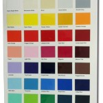
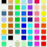
The vast spectrum of the color red presents a multitude of options, each with its own unique characteristics and impact. From deep, rich crimson to bright, vibrant scarlet, the choice of red can dramatically alter the mood and atmosphere of a room. While some shades may be easier to work with than others, the key lies in selecting a red that complements the space and aligns with the desired aesthetic.
Deeper, more muted reds, such as burgundy or brick red, generally offer better coverage than brighter, more vibrant reds. These shades often contain a higher proportion of darker pigments, which contribute to their opacity. They also tend to be more forgiving, concealing minor imperfections on the wall surface. In contrast, brighter reds, particularly those with orange or yellow undertones, can be more translucent and require more coats to achieve solid coverage. These shades can also be more prone to highlighting imperfections, making proper surface preparation even more critical.
Consideration should also be given to the existing color palette of the room. Red is a powerful color that can easily clash with other hues. Therefore, it's important to choose a shade that harmonizes with the furniture, flooring, and accessories. A small sample of the chosen red should be painted onto the wall and observed under different lighting conditions to ensure it complements the overall design scheme. Furthermore, the finish of the paint can impact the perceived intensity of the red. Matte finishes tend to soften the color, while glossy finishes can amplify its vibrancy. The choice of finish should be carefully considered based on the desired effect and the intended use of the room.
Psychological and Design Considerations
Beyond the technical challenges of applying red paint, the psychological impact of the color on the room and the individuals inhabiting the space requires careful consideration. Red is a highly stimulating color that can evoke a range of emotions, from excitement and passion to anger and anxiety. Therefore, using red in interior design should be approached with thoughtful planning and a clear understanding of its potential effects.
In large doses, red can be overwhelming and create a sense of restlessness. This is particularly true for bedrooms or relaxation areas, where a calming and serene atmosphere is desired. However, in smaller doses, red can be a powerful accent color, adding warmth, energy, and personality to a space. For example, a feature wall painted red can create a focal point in a living room or dining room, drawing the eye and adding visual interest. Similarly, red accents, such as pillows, artwork, or accessories, can inject pops of color into a neutral-toned room without overwhelming the space.
The placement of red in a room is also crucial. Red should be used strategically to highlight positive features and minimize negative ones. For example, painting a dark or narrow wall red can make it appear more prominent, while painting a large, open wall red can make the room feel smaller and more intimate. The overall goal is to create a balanced and harmonious space that reflects the desired mood and aesthetic. Furthermore, the choice of lighting can significantly impact the perceived intensity of red. Warm lighting can enhance the warmth and vibrancy of red, while cool lighting can create a more subdued and sophisticated effect. Experimenting with different lighting options can help achieve the desired atmosphere and ensure that the red paint complements the overall design scheme.

Difficult Colors To Paint Over

Red Wall Paint Combinations For Your Home Design Cafe

Red Wall Paint Combinations For Your Home Design Cafe

96 Years Young I See A Red Wall And Want It Painted Any Other Color But
:strip_icc()/101647594-ffb4da0245e64f80af02b4ac23231187.jpg?strip=all "26 Tips To Use Statement Room Paint Colors For A Space You Love")
26 Tips To Use Statement Room Paint Colors For A Space You Love

How To Use Bold Paint Colors In Your Living Room Decorilla Interior Design

Rust Color Trend And How To Use It In Interiors

Color For Difficult Spaces Sherwin Williams

How To Decorate With Earthy Terracotta Paint Colours Edward Bulmer Natural

How To Utilize Color Drenching In Your Home The Rural Legend
Related Posts