How To Read a Paint Colour Chart
Selecting the right paint color can be a daunting task, especially when faced with an overwhelming array of shades and hues displayed on a paint color chart. These charts, also known as color decks or fan decks, are essential tools for both professional painters and homeowners, providing a standardized system for identifying and specifying paint colors. Understanding how to navigate and interpret a paint color chart is crucial for achieving the desired aesthetic outcome in any painting project. This article delves into the key aspects of reading and interpreting a paint color chart, enabling informed decisions and successful color selections.
Paint color charts are carefully curated collections of colors, organized to showcase the variations and relationships between different hues. These charts are not merely random selections; they are structured systems designed to communicate color accurately and consistently. Each color on the chart is assigned a unique code or identifier, which facilitates precise matching and ordering of the specific shade. This identifier is particularly important when ordering more paint, ensuring the exact color can be replicated.
The arrangement of colors on a paint color chart typically follows a logical progression, often based on hue, saturation, and value. Understanding these three core elements of color theory is fundamental to interpreting the chart effectively. Hue refers to the pure color, such as red, blue, or green. Saturation, also known as chroma, defines the intensity or purity of the color, ranging from dull or muted to bright and vivid. Value, or lightness, describes the color's relative darkness or lightness, from black to white.
Understanding Color Organization: Hue, Value, and Chroma
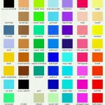
Most paint color charts organize colors by hue. This means that the chart is generally divided into sections, each dedicated to a specific family of colors, such as yellows, reds, blues, greens, and neutrals. Within each hue family, the colors are further organized by value and chroma. Typically, the lighter shades are placed towards the top of the chart, gradually darkening as one moves down. Similarly, colors might be arranged by their saturation, with the most intense versions of the hue grouped together, gradually fading to more muted tones.
The organization by hue allows for a systematic exploration of color families, enabling the user to easily compare different variations of the same hue. For instance, one can compare different shades of blue, from pale sky blue to deep navy blue, all within the same section of the chart. This organized structure facilitates informed decisions based on the specific desired color family.
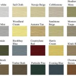
Value organization is another crucial aspect of reading a paint color chart. The value scale ranges from pure white to pure black, with all the shades of gray in between. When a paint color chart is organized by value, the lighter shades are typically displayed towards the top of the chart, while the darker shades are placed towards the bottom. This arrangement makes it easier to visualize how a color will appear under different lighting conditions.
The saturation, or chroma, of a color refers to its intensity or purity. A highly saturated color is bright and vivid, while a low-saturation color is muted and dull. Paint color charts often organize colors by saturation, with the most intense colors grouped together and the less intense colors grouped together. This organization helps in understanding how a particular color will appear in conjunction with other colors in a room.
Decoding Color Codes and Names
Each paint color on a chart is identified by a unique code or name. This is a crucial element for accurate communication and replication of the desired paint color. The coding system can vary between paint manufacturers, but it usually includes a combination of letters and numbers that refer to specific pigments or formulas used in creating the color.
Paint names are often evocative and descriptive, such as "Caribbean Breeze" or "Mountain Mist." While these names can be helpful in visualizing the color, they should not be relied upon entirely. The color code is the definitive identifier and should be used whenever ordering or specifying the paint color. Some manufacturers provide a brief description alongside the name, such as "light blue with a hint of gray," which can further clarify the color's nuances.
The color codes themselves are often organized in a logical manner. For example, a paint manufacturer might use a system where the first part of the code indicates the hue family (e.g., "BL" for blue, "GN" for green), and the subsequent numbers indicate the value and chroma. Understanding the coding system used by a particular manufacturer can greatly simplify the process of selecting and ordering paint colors.
When comparing colors from different manufacturers, it is essential to rely on visual assessment rather than solely comparing color names or descriptions. While some manufacturers may attempt to create similar colors, the exact formulations and pigments used can vary, resulting in subtle differences in the final appearance. Always obtain paint samples and test them in the actual space where they will be applied to ensure the desired effect is achieved.
Considering Lighting and Undertones
Lighting plays a significant role in how a paint color appears in a room. Natural light, artificial light, and the surrounding environment can all influence the perceived color. It is essential to consider these factors when selecting a paint color from a chart.
Natural light varies throughout the day, from the warm hues of sunrise and sunset to the cooler tones of midday. A color that appears vibrant under warm morning light might look subdued under cool afternoon light. Similarly, the direction of the light can affect the way a color is perceived. North-facing rooms tend to receive cooler, more diffused light, while south-facing rooms receive warmer, more direct light. Colors should be evaluated under the specific lighting conditions present in the room where they will be applied.
Artificial light also influences color perception. Incandescent lighting casts a warm, yellowish glow, while fluorescent lighting tends to be cooler and bluer. LED lighting offers a range of color temperatures, from warm to cool. The type of artificial lighting used in a room should be taken into account when selecting paint colors.
Furthermore, it is important to be aware of undertones. Undertones are subtle hues that are present within a color, often influencing its overall appearance. For example, a seemingly neutral gray might have a subtle blue or green undertone. These undertones can become more apparent under certain lighting conditions or when the color is paired with other colors. To accurately assess the undertone, it is helpful to compare the color to a pure white sheet of paper or to other colors in the same hue family.
Testing paint samples is crucial for evaluating how a color will appear under different lighting conditions and for identifying any hidden undertones. Paint a small area of the wall and observe it throughout the day, under both natural and artificial light. This will provide a more accurate representation of the color's true appearance in the space.
In conclusion, mastering the art of reading a paint color chart involves understanding the organization by hue, value and chroma, decoding color codes, and considering the impact of lighting and undertones. Applying these principles facilitates informed color choices, ensuring that the final paint selection aligns with the desired aesthetic outcome.
Richard Schmid S Color Chart Exercise Saved My Art Career
Richard Schmid S Color Chart Exercise Saved My Art Career
How To Find Your Custom Color Codes With Paint Depict Data Studio
Richard Schmid S Color Chart Exercise Saved My Art Career
Richard Schmid S Color Chart Exercise Saved My Art Career
How To Read A Daniel Smith Watercolour Colour Chart Unleashing The Power Of Informed Choices Bromleys Art Supplies
How To Read A Daniel Smith Watercolour Colour Chart Unleashing The Power Of Informed Choices Bromleys Art Supplies
How To Read A Mun Color Chart System Matching From Company
Color Mixing Chart Digital Natural Earth Paint
How To Use A Colour Wheel Dulux
Related Posts