How To Read A Paint Color Wheel Network Diagram
Understanding the paint color wheel is fundamental to achieving visually harmonious and aesthetically pleasing results in painting projects, interior design, and graphic arts. While the traditional color wheel is a useful tool, a color wheel network diagram provides a more nuanced understanding of color relationships, offering insights into complex color schemes and how different hues interact. This article elucidates how to effectively read and interpret a paint color wheel network diagram, enabling the development of sophisticated and balanced color palettes.
A paint color wheel network diagram expands upon the basic color wheel by illustrating various color relationships and how each color relates to others within a more complex framework. Unlike a simple color wheel, it often incorporates multiple layers, gradients, and connections to show subtle variations and harmonious combinations. The network effect suggests that the relationships between colors are interconnected and influence each other, providing a deeper understanding of color theory beyond simple primary, secondary, and tertiary colors.
Understanding the Core Components
Before delving into the intricacies of the network diagram, it is essential to revisit the core components of a standard color wheel. These components form the basis for understanding the more complex relationships represented in the network diagram.
Primary Colors: These are the foundational colors that cannot be created by mixing other colors together. They are red, yellow, and blue. These colors are strategically placed on the color wheel, equidistant from each other.
Secondary Colors: These are created by mixing two primary colors. They are green (yellow + blue), orange (red + yellow), and violet (red + blue). These colors sit between the primary colors on the color wheel.
Tertiary Colors: These are created by mixing a primary color with a neighboring secondary color. Examples include red-orange, yellow-orange, yellow-green, blue-green, blue-violet, and red-violet. These colors further refine the transitions between the primary and secondary colors, creating a smoother spectrum.
Hue: This refers to the pure color itself, without any tints, shades, or tones added. It is the distinct characteristic that differentiates one color from another.
Value: This refers to the lightness or darkness of a color. Adding white creates a tint, increasing the value, while adding black creates a shade, decreasing the value.
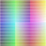
Saturation: This refers to the intensity or purity of a color. A highly saturated color is vivid and bright, while a desaturated color is more muted and grayed.
Interpreting the Network Connections
The defining feature of a color wheel network diagram is its interconnectedness. Lines, arrows, or gradients connect various colors, illustrating relationships and harmonies. Understanding these connections is crucial for effective color palette selection.
Complementary Colors: These are colors located directly opposite each other on the color wheel. Examples include red and green, blue and orange, and yellow and violet. Complementary colors create high contrast and visual excitement when used together. The network diagram often highlights these connections with a direct line or a particularly bold arrow.
Analogous Colors: These are groups of three or more colors that are adjacent to each other on the color wheel. Examples include yellow, yellow-green, and green, or red, red-orange, and orange. Analogous colors create a sense of harmony and tranquility, with a low degree of contrast. The network diagram usually displays these colors as being closely clustered and connected, often with subtle connecting lines that indicate their harmonious relationship.
Triadic Colors: These are three colors that are evenly spaced around the color wheel, forming an equilateral triangle. Examples include red, yellow, and blue, or green, violet, and orange. Triadic color schemes offer balance and vibrancy, although they require careful management to avoid feeling overwhelming. The network diagram visualizes these relationships by showing connections that form a triangular pattern.
Tetradic Colors: Also known as rectangular or double complementary, this color scheme uses four colors arranged into two complementary pairs. They form a rectangle on the color wheel. Examples include blue and orange, and red and green. Tetradic color schemes offer a wider range of possibilities, with more visual interest and complexity. The network diagram typically shows connections that form a rectangular shape, linking the two complementary pairs.
Monochromatic Colors: A monochromatic color scheme uses different values and saturations of a single hue. This creates a cohesive and unified look. The network diagram often portrays these colors ranging along a gradient, showcasing variations in value and saturation within the same hue family.
Furthermore, the network diagram may indicate the strength of the relationships between colors. Thicker lines or bolder arrows might signify stronger harmonies or more effective contrasts, while thinner lines or lighter arrows could suggest subtler connections and more nuanced relationships. The density of connections around a particular color can also be an indicator of its versatility and its ability to work well with multiple other colors.
Analyzing Value and Saturation Gradients
Beyond just hue relationships, a color wheel network diagram often incorporates information about value and saturation. This adds another layer of complexity and allows for a more refined approach to color palette creation. Understanding these gradients is vital for creating depth, dimension, and visual interest in designs and paintings.
Value Gradients: These represent the range of lightness and darkness within a specific hue. The diagram might show a color progressively lightening towards white (adding tints) or darkening towards black (adding shades). These gradients are useful for creating subtle variations and highlights or shadows within a design.
Saturation Gradients: These illustrate the range of intensity or purity for each hue. The diagram may show a color moving from its most vibrant and saturated state towards a more muted or desaturated state, often approaching gray. Understanding these gradients helps in creating balanced compositions by preventing colors from overpowering one another.
By analyzing the value and saturation gradients within the network diagram, users can identify colors that will create specific effects. For example, a dark shade of a complementary color can be used to create intense contrast without being overwhelming, while a desaturated version of a vibrant hue can add a subtle touch of color without dominating the composition.
The representation of value and saturation can also vary depending on the specific network diagram. Some diagrams may use numerical values to indicate the degree of lightness or saturation, while others may rely on visual cues like the size or brightness of the color swatch. Learning to interpret these visual and numerical cues is crucial for effectively using the diagram.
In conclusion, mastering the ability to read a paint color wheel network diagram unlocks significant advantages in color selection and design. By understanding the core components of the color wheel, interpreting the network connections, and analysing value and saturation gradients, individuals can create harmonious, balanced and visually compelling color palettes for various applications.

Splitcoaststampers Tutorials

Your Guide To Colors Color Theory The Wheel How Choose A Scheme

Mun Hue 3 Dimensions Of Color System Matching From Company

Color Wheel Charts 14 Documents

Splitcoaststampers Tutorials

How To Use Color Psychology Give Your Business An Edge

Color Psychology In Marketing The Complete Guide

What Is Colour Theory Style At Home

6 Color Matching Techniques For WordPress Web Designers

A Quick Guide On Color Theory In Fashion And Garment Ion Techpacks Co
Related Posts

