How to Pick the Right Paint Colors For Your Home
Selecting paint colors for a home can be a daunting task. The sheer volume of options, coupled with the permanence of the decision, can lead to analysis paralysis. A fresh coat of paint can transform a room and significantly impact the overall aesthetic and mood of a home. Therefore, a strategic and informed approach is essential to ensure the chosen colors complement the space, align with personal preferences, and stand the test of time.
The process should begin with a careful assessment of the existing conditions and desired outcomes. Factors such as natural lighting, architectural style, and existing furniture should all be considered. Furthermore, understanding color theory and the psychological impact of different hues can contribute to a more successful and satisfying result. It is crucial to remember that paint colors appear differently under varying light conditions and in different sized spaces.
Consider the Lighting Conditions
The amount and type of light a room receives significantly impact the perceived color of the paint. Natural light, artificial light, and the direction the room faces all play a role. Rooms facing east or south tend to receive warmer light, which can amplify warm tones in the paint. Conversely, rooms facing north or west typically have cooler, more subdued light, which can accentuate cooler tones. Failure to account for these differences can lead to unexpected and undesirable results.
To mitigate this, it is advisable to test paint samples in the room at different times of the day. Observe how the color changes under morning light, afternoon light, and evening light. Natural daylight will reveal the true undertones of the paint, while artificial light, whether from incandescent bulbs, fluorescent tubes, or LEDs, can cast its own color bias. Incandescent bulbs emit a warm, yellow light, which can enhance warm colors, while fluorescent lights tend to have a cooler, bluer tone, which can make cool colors appear more vibrant.
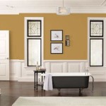
The intensity of light also affects color perception. A room with an abundance of natural light can handle darker, richer colors without feeling oppressive. Conversely, a room with limited natural light may benefit from lighter, more reflective colors to maximize the available light and create a brighter, more open feel. Matte finishes tend to absorb light, creating a softer, more muted effect, while glossier finishes reflect light, making the color appear more intense and vibrant. Careful consideration of both color and finish is therefore critical.
Furthermore, the colors of surrounding objects can influence the perception of the paint color. For instance, a room with a large, brightly colored rug can cast a hue onto the walls, altering the perceived shade. Similarly, the color of furniture, artwork, and even the landscaping outside the windows can impact how the paint color appears. Take these existing elements into account when selecting paint colors to ensure a cohesive and harmonious overall design.
Understand Color Theory and Psychology
Color theory provides a framework for understanding how colors interact with one another. Familiarizing oneself with the color wheel, which illustrates the relationships between primary, secondary, and tertiary colors, is a valuable starting point. Understanding concepts like complementary colors, analogous colors, and monochromatic color schemes can inform the selection process and help create visually appealing and balanced spaces.
Complementary colors, which are located opposite each other on the color wheel, such as blue and orange or red and green, create a sense of vibrancy and contrast when used together. Analogous colors, which are located adjacent to each other on the color wheel, such as blue, blue-green, and green, create a harmonious and cohesive effect. Monochromatic color schemes, which involve using different shades and tints of the same color, create a sophisticated and calming atmosphere.
Beyond aesthetics, color psychology explores the emotional and psychological impact of different hues. Certain colors are associated with specific feelings and moods. For example, blue is often associated with calmness and serenity, while red is associated with energy and excitement. Green is associated with nature and balance, while yellow is associated with optimism and happiness. Consider the intended function of the room and the desired mood when selecting paint colors.
In bedrooms, for example, calming and relaxing colors such as blues, greens, and neutrals are often preferred. In living rooms, more vibrant and energizing colors such as yellows, oranges, and reds may be appropriate, depending on personal preferences and the overall design aesthetic. In kitchens, clean and fresh colors such as whites, creams, and light blues can create a sense of hygiene and spaciousness. The goal is to create a space that feels welcoming, comfortable, and conducive to the intended activities.
However, it is important to note that individual responses to colors can vary depending on personal experiences and cultural background. What one person finds calming, another may find depressing. Conversely, what one person finds energizing, another may find overwhelming. Therefore, while color psychology can provide valuable insights, it is ultimately up to the individual to determine which colors resonate with them and create the desired emotional response.
Test Paint Samples Thoroughly
Once a few potential paint colors have been identified, it is essential to test them thoroughly before committing to a full room makeover. The small swatches found in paint stores can be misleading, as the color can appear different when applied to a larger surface. Therefore, it is advisable to purchase sample pots of the chosen colors and apply them to different areas of the room. Testing the samples on poster board can also be a good option, as it allows you to move the color around the room and see how it looks in different lighting conditions.
Apply the paint samples in a representative manner, using the same number of coats that will be applied to the walls. Observe the color at different times of the day, under different lighting conditions, and in different areas of the room. Pay attention to how the color interacts with the existing furniture, flooring, and other décor elements. Ask for feedback from trusted friends or family members to gain additional perspectives and insights.
Avoid testing the paint samples directly on the existing wall, as this can create a patchy and uneven surface. If necessary, apply the samples to a discreet area of the wall that will be hidden by furniture or covered by the new paint. Be sure to prime the area before applying the sample to ensure accurate color representation. Consider painting large squares or rectangles, at least two feet by two feet, to get a better sense of how the color will look on a larger scale.
Take your time during the testing process. Do not rush into a decision. Live with the paint samples for a few days, observing them under different conditions and in different moods. Compare the different colors side-by-side, and eliminate those that do not meet your expectations or clash with the existing décor. The goal is to find a color that you will be happy with for the long term, so it is worth investing the time and effort to make the right choice.
In addition to testing the color, also consider testing the paint finish. Different finishes have different levels of sheen and durability. Matte finishes are ideal for low-traffic areas and create a soft, velvety look. Eggshell finishes are slightly more durable and easier to clean, making them suitable for living rooms and bedrooms. Satin finishes are even more durable and offer a subtle sheen, making them a good choice for hallways and kitchens. Semi-gloss and gloss finishes are the most durable and easiest to clean, making them ideal for bathrooms and trim.
Finally, consider the environmental impact of the paint. Look for low-VOC (volatile organic compounds) or zero-VOC paints, which release fewer harmful chemicals into the air. These paints are better for your health and the environment, and they often perform just as well as traditional paints. By making informed choices about both color and composition, you can create a beautiful and healthy home environment.

How To Pick The Right Paint Colors For Your Home Little House Of Four Creating A Beautiful One Thrifty Project At Time

Interior Paint Ideas 12 Tips To Help You Get The Right Wall Color Extra Space Storage

How To Choose Paint Colors For Your Home Resources You Should Use

Tips For Choosing The Right Colors Your Home Interiors

How To Choose The Perfect Gray Paint For Your Home Blue I Style

How To Pick The Right Paint Colors For Your Home Little House Of Four Creating A Beautiful One Thrifty Project At Time

How To Choose Interior Paint Colors For Your Home

How To Pick The Right Paint Colors For Your Home Perfect Color Room

How To Choose The Right Paint Color For Your Home Mansion Global

9 Ways To Select The Perfect Home Colours For Your House
Related Posts