How to Choose the Perfect Paint Color From Menards For Walls and Trim
Selecting the appropriate paint color for walls and trim can significantly impact the overall aesthetic of a living space. Menards, a popular home improvement retailer, offers a wide array of paint options, making the selection process both exciting and potentially overwhelming. This article will provide a comprehensive guide to navigating the paint selection process at Menards, ensuring a harmonious and visually appealing result for both walls and trim.
The initial step in this process involves understanding the inherent differences between paints formulated for walls and those designed for trim. Wall paints are typically formulated for broader coverage and durability against everyday wear and tear. They often come in finishes like matte, eggshell, or satin, which offer varying degrees of sheen and washability. Trim paints, on the other hand, are engineered for enhanced durability and resistance to chipping and scratching, especially in high-traffic areas such as door frames, baseboards, and window casings. They usually have a higher sheen level, such as semi-gloss or gloss, which provides added protection and highlights the architectural details of the trim.
Furthermore, the selection of paint color should be intrinsically linked to the existing décor and lighting conditions of the room. Failing to consider these factors can result in a color scheme that clashes or a space that feels either too dark or too washed out. Therefore, a methodical approach that takes into account these elements is crucial for achieving a successful and satisfying outcome.
Key Point 1: Understanding the Undertones: A Critical Aspect of Color Selection
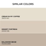
One of the most crucial, yet often overlooked, aspects of choosing paint colors is understanding undertones. Undertones are the subtle colors beneath the surface color, which significantly influence how the paint appears in different lighting conditions. A seemingly neutral beige, for example, might have a pink, yellow, or green undertone that becomes more apparent under certain lights. Similarly, a gray paint can have blue, green, or purple undertones.
To identify undertones, compare the paint sample to a true white or a pure black. This comparison will help reveal the underlying colors. For instance, placing a beige sample next to a white sheet might reveal a slight pink tint, indicating a pink undertone. It is also recommended to view the paint sample in the room where it will be applied, under both natural and artificial light. The same paint color can appear drastically different depending on the light source. Natural light tends to bring out cooler undertones, while artificial light can accentuate warmer tones. This is particularly important when selecting colors for rooms with limited natural light.
Menards offers paint chips and sample sizes that allow for this crucial evaluation. It is strongly advised to obtain several sample colors and paint small, inconspicuous areas of the wall or trim to observe how the color interacts with the room's lighting and existing furnishings. This step, while seemingly time-consuming, can prevent costly mistakes and ensure a harmonious color scheme.
When selecting coordinating colors for walls and trim, it is generally advisable to choose colors with similar undertones. For example, if the wall color has a warm undertone like yellow, the trim color should also lean towards warmer shades. Conversely, if the wall color has a cool undertone like blue, the trim color should complement it with cooler shades. Maintaining consistency in undertones will result in a more cohesive and balanced look.
Key Point 2: Navigating the Menards Paint Selection Process: Brands, Finishes, and Tools
Menards offers a diverse selection of paint brands, each with its own unique characteristics and price points. Popular brands available at Menards often include Dutch Boy, Valspar, and Pratt & Lambert, along with Menards' own in-house brand, Mastercraft. Each brand offers a range of finishes and sheens, catering to various needs and preferences. Before embarking on the selection process, it is beneficial to research the different brands and their respective reputations for quality, durability, and color accuracy.
As mentioned earlier, the choice of finish is critical. Matte finishes are typically used on walls in low-traffic areas, as they provide a soft, non-reflective surface that minimizes imperfections. Eggshell finishes offer slightly more sheen and durability, making them suitable for living rooms and bedrooms. Satin finishes are more durable and washable, making them a good choice for hallways, bathrooms, and kitchens. Semi-gloss and gloss finishes are primarily used for trim and doors, as they are highly durable, easy to clean, and provide a visually appealing contrast against the walls.
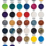
Menards provides several tools to aid in the paint selection process. These include color swatches, fan decks, and online color visualizers. Color swatches and fan decks provide a physical representation of the available colors, allowing for easy comparison and coordination. Online color visualizers allow users to upload a photo of their room and virtually apply different paint colors to the walls and trim. This can be a helpful tool for visualizing the final result before committing to a specific color.
Furthermore, Menards employs knowledgeable paint specialists who can provide expert advice and guidance. These specialists can assist in color matching, recommending appropriate finishes for different surfaces, and answering any questions regarding paint application. Customers should not hesitate to seek their assistance, as their expertise can be invaluable in navigating the complexities of paint selection.
Key Point 3: Understanding Color Psychology and Its Impact on Room Ambiance
Color psychology explores the emotional and psychological effects of different colors on human behavior and mood. Understanding the principles of color psychology can be instrumental in selecting paint colors that create the desired ambiance in a room. Different colors evoke different emotions and can influence the overall feeling of a space.
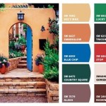
For example, blue is often associated with calmness, tranquility, and serenity. It is a popular choice for bedrooms and bathrooms, as it promotes relaxation and reduces stress. Green is associated with nature, growth, and harmony. It can create a sense of balance and freshness in a room, making it suitable for living rooms and kitchens. Yellow is associated with optimism, energy, and happiness. It can brighten up a space and create a cheerful atmosphere, making it a good choice for kitchens, dining rooms, and children's rooms. Red is associated with passion, energy, and excitement. It can add vibrancy and drama to a space, but it should be used sparingly, as it can be overwhelming in large doses.
Neutral colors, such as white, gray, beige, and greige (a combination of gray and beige), provide a versatile backdrop that allows for flexibility in décor and furnishings. These colors are timeless and can create a sense of spaciousness and sophistication. However, it is important to consider the undertones of neutral colors to ensure they complement the overall color scheme.
When selecting colors for small spaces, it is generally advisable to opt for lighter shades, as they reflect light and create the illusion of more space. Darker colors can make a small room feel even smaller and more enclosed. In larger spaces, darker colors can be used to create a sense of intimacy and warmth. It is also important to consider the amount of natural light in a room. Rooms with limited natural light benefit from lighter, brighter colors that reflect available light, while rooms with ample natural light can accommodate a wider range of colors.
Ultimately, the best approach to selecting paint colors is to combine an understanding of color theory and psychology with personal preferences and the specific characteristics of the room. By carefully considering these factors, individuals can create a space that is both visually appealing and emotionally fulfilling.
In addition to the above considerations, testing paint colors in a space before committing to a large purchase is essential. This can be achieved through paint samples, which allow individuals to observe how the color appears in different lighting conditions and alongside existing furniture and décor. Furthermore, it is important to consider the sheen of the paint, as this can significantly impact the overall look and feel of a space. Matte finishes are ideal for walls in low-traffic areas, as they provide a soft, non-reflective surface. Eggshell and satin finishes offer greater durability and are suitable for areas that require more frequent cleaning. Semi-gloss and gloss finishes are typically reserved for trim and doors, as they are highly durable and create a noticeable contrast against the walls.
Finally, before embarking on any painting project, proper preparation is crucial. This includes cleaning and priming the surfaces to be painted, as well as protecting surrounding areas with drop cloths and painter's tape. Taking the time to properly prepare the space will ensure a smooth and professional-looking finish.

Planning Our Paint Color Palette With The Simply Yours Tool Making It Lovely

One Room Challenge Week 2 Painting Tips R At Home

Menards Choose Your Own Color Adventure Dare

Planning Our Paint Color Palette With The Simply Yours Tool Making It Lovely

Reader Q Contrast Trim Colors Paint Sheen Nadine Stay

Color Of The Year Dutch Boy

Color Of The Year Dutch Boy

Color Of The Year Dutch Boy

Planning Our Paint Color Palette With The Simply Yours Tool Making It Lovely

White Paint Colors 5 Favorites For Shiplap The Harper House
Related Posts