How To Choose Paint Colors For Interior Spaces
Selecting paint colors for interior spaces is a critical aspect of interior design that profoundly impacts the ambiance, mood, and perceived dimensions of a room. A thoughtful approach, considering various factors, is essential to achieve the desired aesthetic outcome and create a cohesive and harmonious living environment. The process extends beyond simply picking favorite colors; it involves understanding the interplay of light, existing furnishings, and the psychological effects of color. This article provides a detailed guide to choosing paint colors effectively for interior spaces.
Understanding the Fundamentals of Color Theory
Before delving into the specifics of selecting paint colors, it is crucial to grasp the fundamentals of color theory. This understanding provides a framework for making informed decisions and creating visually appealing color schemes. Key aspects of color theory include the color wheel, color harmonies, and color temperature.
The color wheel is a visual representation of colors organized according to their chromatic relationship. It typically consists of primary colors (red, yellow, blue), secondary colors (green, orange, violet), and tertiary colors (combinations of primary and secondary colors, such as red-orange). This wheel serves as a guide for understanding how colors relate to each other and for creating color schemes. Understanding the positioning of colors on the wheel allows for informed decisions on complementary or contrasting palettes.
Color harmonies refer to aesthetically pleasing combinations of colors based on their relationship on the color wheel. Common color harmonies include: * Monochromatic: Using different shades, tints, and tones of a single color. This creates a cohesive and calming effect. * Analogous: Utilizing colors that are adjacent to each other on the color wheel, such as blue, blue-green, and green. This harmony results in a harmonious and serene atmosphere. * Complementary: Pairing colors that are opposite each other on the color wheel, such as red and green. This creates a vibrant and dynamic contrast. * Triadic: Choosing three colors that are equally spaced apart on the color wheel, such as red, yellow, and blue. This harmony can be visually stimulating and requires careful balancing. * Tetradic (or Double Complementary): Using two sets of complementary colors. This scheme is rich and complex and requires significant planning to execute effectively.
Color temperature refers to the perceived warmth or coolness of a color. Warm colors, such as reds, oranges, and yellows, tend to evoke feelings of energy, warmth, and excitement. Cool colors, such as blues, greens, and purples, tend to create a sense of calm, tranquility, and spaciousness. Considering the desired mood and atmosphere of a room is essential when selecting colors based on their temperature. Warmer tones can make a large space feel more intimate while cooler tones can visually expand a smaller room.
Analyzing the Space and its Existing Elements
A thorough analysis of the space that is to be painted is paramount. This involves assessing the room's size, lighting conditions (natural and artificial), architectural features, and existing furnishings. These factors significantly influence how paint colors will appear and ultimately affect the overall aesthetic.
Room Size and Shape: The size of the room plays a crucial role in color selection. Lighter colors tend to make a room appear larger and more open, while darker colors can make a room feel cozier and more intimate. For smaller rooms, it is generally advisable to use lighter, more reflective colors to maximize the perception of space. In larger rooms, darker or bolder colors can be used to create a sense of enclosure and visual interest. The shape of the room also influences color choices. For instance, in a room with low ceilings, painting the ceiling a lighter color than the walls can create the illusion of height.
Lighting Conditions: Natural and artificial light significantly impact how paint colors are perceived. Natural light can vary throughout the day and from season to season, affecting the appearance of colors. Rooms with abundant natural light can handle bolder and darker colors, while rooms with limited natural light require lighter, more reflective colors to brighten the space. Artificial lighting, such as incandescent, fluorescent, or LED, also influences color perception. Incandescent lighting tends to cast a warm, yellowish glow, while fluorescent lighting can cast a cooler, bluish tone. It is advisable to test paint samples under different lighting conditions to ensure the desired effect is achieved. Testing the colors at various times of day is also advisable to appreciate the range of subtle tones.
Architectural Features: Existing architectural features, such as trim, molding, flooring, and fireplaces, should be taken into consideration when selecting paint colors. The paint colors should complement these existing elements to create a cohesive and harmonious look. For example, if a room has intricate molding, a contrasting paint color can highlight these details. The color of the flooring also plays a role. Warm-toned wood floors often pair well with warm paint colors, while cool-toned floors complement cooler paint colors. Consider the undertones of the architectural features and choose paint colors that either harmonize with or provide a pleasing contrast.
Existing Furnishings: The existing furniture, artwork, and accessories in a room should also be considered when selecting paint colors. The paint colors should complement these elements and create a cohesive and balanced look. It is generally advisable to select paint colors that either harmonize with or provide a subtle contrast to the existing furnishings. If the furniture is bold and colorful, a neutral paint color can provide a calming backdrop. Conversely, if the furniture is neutral, bolder paint colors can add personality and visual interest. Consider the color schemes present in artwork and accessories to guide the selection of complementary or analogous paint colors.
Considering the Psychological Effects of Color
Colors have a profound impact on human emotions and behavior. Understanding the psychological effects of different colors is essential for creating a space that evokes the desired mood and atmosphere. Each color carries associations that can influence the perception and functionality of a room.
Red: Red is often associated with energy, passion, excitement, and stimulation. It can be a bold and dramatic choice for interior spaces, but it should be used sparingly, as it can also be overwhelming and anxiety-inducing. Red is best suited for accent walls or spaces where energy and stimulation are desired, such as dining rooms or home gyms.
Yellow: Yellow is associated with happiness, optimism, energy, and creativity. It can brighten up a room and create a cheerful atmosphere. However, too much yellow can be overwhelming and cause anxiety in some individuals. Yellow is well-suited for kitchens, bathrooms, and children's rooms.
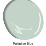
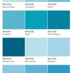
Blue: Blue is associated with calmness, tranquility, peace, and serenity. It can create a relaxing and soothing atmosphere, making it ideal for bedrooms and bathrooms. However, too much blue can feel cold and depressing. Varying shades and adding warmer accents can mitigate this effect.
Green: Green is associated with nature, balance, harmony, and growth. It can create a refreshing and calming atmosphere, making it ideal for living rooms and bedrooms. Green is a versatile color that can be used in a variety of settings.
Purple: Purple is associated with royalty, luxury, creativity, and spirituality. It can create a sophisticated and elegant atmosphere, but it should be used sparingly, as it can also be overwhelming. Lighter shades of purple, such as lavender, can be calming and soothing.
Orange: Orange is associated with enthusiasm, warmth, energy, and creativity. It can create a welcoming and cheerful atmosphere, making it ideal for kitchens and dining rooms. However, too much orange can be overwhelming. It often functions best as an accent color.
Neutral Colors (White, Gray, Beige): Neutral colors provide a versatile backdrop for any interior space. White is associated with cleanliness, purity, and simplicity. Gray is associated with sophistication, neutrality, and balance. Beige is associated with warmth, comfort, and practicality. Neutral colors can be used as a base color and paired with bolder accent colors.
When selecting paint colors, consider the intended function of the room and the desired mood. For example, a bedroom should ideally be painted in calming and soothing colors, such as blues, greens, or neutrals, while a home office could benefit from energizing colors, such as yellows or oranges (in moderation).
In summary,choosing paint colors is a multi-faceted process that involves understanding color theory, analyzing the existing space, and considering the psychological effects of color. By taking these factors into account, it is possible to create interior spaces that are visually appealing, harmonious, and conducive to the desired mood and atmosphere.
:strip_icc()/cdn.cliqueinc.com__cache__posts__277032__how-to-pick-paint-colors-277032-1549477716321-image.700x0c-355e170426eb47c7a70362985dc90dc2.jpg?strip=all "How To Pick Paint Colors According An Expert")
How To Pick Paint Colors According An Expert

Choosing The Perfect Interior Paint Color Artisan Builders

How To Choose Interior Paint Colors For Your Home

How To Choose An Interior Paint Color Shoreline Painting
:strip_icc()/cdn.cliqueinc.com__cache__posts__277032__how-to-pick-paint-colors-277032-1549477717179-image.700x0c-d1893d3eeff342bd9daf0a9d1d275e4b.jpg?strip=all "How To Pick Paint Colors According An Expert")
How To Pick Paint Colors According An Expert

How To Choose Paint Colors For Your Home Interior
:max_bytes(150000):strip_icc():format(webp)/GettyImages-LivingRoomColors-56f0d51e3df78ce5f83b802e.jpg?strip=all "Tips For Choosing Interior Paint Colors Holmes St Clair")
Tips For Choosing Interior Paint Colors Holmes St Clair

Interior Paint Ideas 12 Tips To Help You Get The Right Wall Color Extra Space Storage

Tips For Choosing Paint Colors The Interior Of Your Home Florence Pressure Washing

Tips For Choosing Interior Paint Colors Fsm Housing Limited
Related Posts