Exploring the Nuances of Grey Paint Colors from Sherwin-Williams
Grey has transcended its former reputation as a dull or neutral fallback and established itself as a sophisticated and versatile color choice for interiors and exteriors alike. Sherwin-Williams, a leading paint manufacturer, offers an extensive range of grey paint colors, each with its own unique undertones and characteristics. Selecting the perfect grey requires careful consideration of several factors, including the room's lighting, existing décor, and desired atmosphere. This article will delve into the diverse world of Sherwin-Williams grey paints, providing insights into their variations and offering guidance on how to effectively incorporate them into various design schemes.
The appeal of grey lies in its adaptability. It can serve as a calming backdrop, allowing other colors to take center stage, or it can be a statement color itself, exuding modern elegance. Unlike stark white, grey possesses depth and complexity, capable of creating a more inviting and nuanced space. Understanding the subtle differences between various grey shades is crucial for achieving the desired aesthetic. This involves paying close attention to the undertones – the subtle hints of other colors that influence how a grey will appear in different lighting conditions.
Understanding Undertones in Grey Paint
The most critical aspect of selecting a grey paint is understanding its undertone. Undertones are the subtle colors that are mixed into the grey base, influencing its overall appearance. Common undertones found in grey paints include blue, green, purple, brown, and even yellow. Identifying the undertone is essential because it dictates how the grey will interact with the light and other colors in the room. A grey with a blue undertone, for example, will feel cooler and more contemporary, while a grey with a brown undertone will create a warmer and more traditional atmosphere. Similarly, a grey with a green undertone can evoke a sense of nature and tranquility.
To identify the undertone, it is recommended to compare the paint swatch to a true neutral grey or white. Place the swatch against a white sheet of paper or a known neutral grey sample. This comparison will help reveal the subtle hues within the grey. Observe the paint in different lighting conditions, as artificial light and natural light can significantly alter the perceived undertone. North-facing rooms tend to have cooler, bluish light, which can accentuate cool undertones. South-facing rooms, on the other hand, receive warmer, yellowish light, which can bring out warm undertones. It's also a good practice to paint a large sample area on the wall and observe it over several days to see how the undertones change throughout the day.
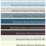
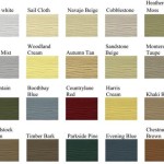
Popular Sherwin-Williams grey paints with cool undertones include colors like "Repose Gray" (SW 7015), which often reads slightly blueish-gray in certain lighting, and "Passive" (SW 7064), a lighter gray with a hint of blue. "Dovetail" (SW 7018) is a deeper, more sophisticated grey that can also lean slightly cool, depending on the lighting. For warmer grey options, consider "Agreeable Gray" (SW 7029), a highly versatile greige (grey-beige) that works well in various spaces, or "Worldly Gray" (SW 7043), another warm grey with subtle brown undertones. "Mindful Gray" (SW 7016) offers a balanced neutral, but can sometimes show subtle hints of green, especially in natural light.
Considering Lighting and Room Orientation
Lighting plays a crucial role in how a paint color appears. The amount and type of light in a room can drastically alter the perceived color, causing the undertones to become more or less pronounced. Natural light, artificial light (incandescent, fluorescent, LED), and the room's orientation all contribute to the overall lighting conditions. As previously noted, north-facing rooms receive cooler light, which can enhance cool undertones in grey paint. This can be advantageous if you want to create a cool and calming space, but it may make a warm grey appear more muted. South-facing rooms receive warmer light, which can bring out warm undertones and counteract cool undertones. This can make a warm grey feel even cozier, but it may also make a cool grey appear more neutral.
East-facing rooms receive warm light in the morning and cooler light in the afternoon, while west-facing rooms receive cooler light in the morning and warm light in the afternoon. The changing light conditions in east and west-facing rooms require careful consideration when selecting a grey paint. Experimenting with paint samples in these rooms at different times of the day is highly recommended. Artificial lighting also significantly impacts the appearance of paint colors. Incandescent bulbs emit a warm, yellowish light, while fluorescent bulbs emit a cooler, bluish light. LED bulbs offer a wider range of color temperatures, from warm to cool, so it's important to select the appropriate bulb temperature for the desired effect.
For rooms with limited natural light, it's generally best to opt for lighter shades of grey that reflect more light and brighten the space. Consider using a grey with a slight sheen or a reflective quality to maximize light reflection. In naturally well-lit rooms, you have more flexibility to experiment with darker shades of grey, which can create a dramatic and sophisticated atmosphere. However, be mindful of the undertones and how they will interact with the abundant natural light.
Pairing Grey with Other Colors and Design Elements
Grey is a remarkably versatile color that pairs well with a wide range of other colors and design elements. Its neutrality allows it to serve as a backdrop for bolder hues or to create a harmonious and understated palette. When selecting complementary colors for grey, consider the undertones of the grey and the desired aesthetic. For cooler greys with blue or green undertones, consider pairing them with other cool colors, such as blues, greens, purples, and even cooler shades of white. These combinations can create a serene and sophisticated atmosphere.
For warmer greys with brown or yellow undertones, consider pairing them with warm colors, such as reds, oranges, yellows, and warmer shades of white. These combinations can create a cozy and inviting space. Accent colors can be used to add pops of personality and visual interest to a grey room. Consider incorporating vibrant colors like teal, coral, mustard yellow, or emerald green to create a dynamic and eye-catching contrast. Metallics, such as gold, silver, and bronze, also pair beautifully with grey, adding a touch of elegance and sophistication.
The choice of trim color can also significantly impact the overall look of a grey room. For a classic and timeless look, consider pairing grey walls with crisp white trim. This combination creates a clean and fresh aesthetic that works well in various styles. For a more modern and monochromatic look, consider painting the trim a slightly lighter or darker shade of grey than the walls. This creates a subtle contrast and adds depth to the space. When selecting flooring, consider the overall color palette and the desired mood. Light-colored wood floors can brighten up a grey room and create a more airy feel, while dark-colored wood floors can add drama and sophistication. Neutral-colored carpets and rugs can provide a soft and comfortable foundation, while patterned rugs can add visual interest and personality. The addition of natural elements, such as wood, stone, and plants, can further enhance the beauty and versatility of grey, creating a space that is both stylish and inviting.

The 12 Best Gray Greige Paint Colours Sherwin Williams Kylie M Interiors

The Best Sherwin Williams Gray Paint Colors West Magnolia Charm

The 12 Best Gray Greige Paint Colours Sherwin Williams Kylie M Interiors

The Best Sherwin Williams Gray Paint Colors West Magnolia Charm

11 Awesome Cool Gray Paint Shades From Sherwin Williams The Flooring Girl

21 Cool Gray Paint Colors From Sherwin Williams Once

Best Gray And Greige Paint Colors From Sherwin Williams So Much Better With Age

20 Best Gray Paint Colors By Sherwin Williams 2024 The Morris Mansion

Sherwin Williams Color

The Best Warm Gray Paint Colors Life On Virginia Street
Related Posts