Gray-Tan Paint Color: A Guide To Achieving Perfect Shades
Gray-tan, often referred to as "greige," represents a versatile and increasingly popular color choice in interior design. This nuanced hue combines the neutrality of gray with the warmth of tan, creating a sophisticated and adaptable backdrop for a wide range of styles and aesthetics. Understanding the composition, undertones, and application of gray-tan paint is crucial for achieving the desired effect in any space.
The appeal of gray-tan lies in its ability to bridge the gap between cool and warm color palettes. It offers a softer alternative to stark gray while providing a more modern and refined look compared to traditional beige. This inherent adaptability makes it a practical choice for homeowners and designers seeking a color that complements both existing furnishings and evolving design trends.
However, selecting the perfect gray-tan shade can be more complex than it initially appears. The subtle variations in undertones and the way light interacts with the color can significantly impact the overall impression. A seemingly neutral gray-tan can lean distinctly towards gray, tan, or even exhibit hints of green, pink, or yellow depending on the specific formulation and the surrounding environment.
Understanding Undertones in Gray-Tan Paint
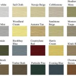
The concept of undertones is paramount when working with gray-tan paint. Undertones are the subtle colors that lie beneath the surface of the primary hue, influencing how the paint appears in different lighting conditions and when paired with other colors. Gray-tan paints can exhibit a variety of undertones, including:
Warm Undertones (Yellow, Red, Pink): Gray-tans with warm undertones tend to have a more inviting and cozy feel. They can create a sense of comfort and are often a good choice for spaces that lack natural light. However, it's important to be mindful of existing warm-toned elements in the room, such as wood furniture or accessories, to avoid creating an overly warm or dated appearance.
Cool Undertones (Blue, Green): Gray-tans with cool undertones lean more towards the gray spectrum. They offer a cleaner, more contemporary aesthetic and can create a sense of spaciousness and tranquility. These cool-toned gray-tans work well in rooms with abundant natural light and complement other cool-toned elements, such as stainless steel appliances or blue-gray fabrics.
Neutral Undertones: Some gray-tans are more balanced and exhibit relatively neutral undertones. These are often the most versatile options, as they tend to adapt well to different lighting conditions and color palettes. However, even seemingly neutral gray-tans can still exhibit subtle undertones that become apparent when compared to other colors.
Identifying the undertones in a gray-tan paint sample is crucial before committing to a full-scale application. The best way to do this is to compare the sample to other paint chips with known undertones. Place the gray-tan sample next to a pure gray, a warm beige, and a cool gray to see which color family it leans towards. Observing the sample in different lighting conditions throughout the day will also help reveal its true undertones.
Factors Influencing the Perception of Gray-Tan Paint
The appearance of gray-tan paint is not solely determined by its inherent color and undertones. Several external factors can significantly influence how the color is perceived in a space. These factors must be carefully considered to ensure the desired outcome.
Lighting: Natural and artificial lighting play a critical role in how any paint color appears. Natural light can be further categorized into warm (morning and late afternoon) and cool (midday) light. Warm natural light will accentuate the warm undertones in a gray-tan paint, while cool natural light will highlight the cool undertones. Similarly, the color temperature of artificial lighting (warm white, cool white, daylight) will influence the perceived color of the paint. It is advisable to test paint samples under various lighting conditions, including both natural and artificial light, before making a final decision.
Existing Colors and Materials: The surrounding colors and materials in a room can also impact the appearance of gray-tan paint. For example, a gray-tan with warm undertones may appear more beige when paired with cool-toned furniture or artwork. Conversely, a gray-tan with cool undertones may appear more gray when surrounded by warm-toned elements. The color of the flooring, upholstery, and window treatments should all be considered when selecting a gray-tan paint. Furthermore, the texture and sheen of the surrounding materials can also influence how the paint is perceived.
Sheen Level: The sheen level of the paint itself can also affect its appearance. Higher sheen levels, such as gloss or semi-gloss, reflect more light and tend to make colors appear brighter and more intense. Lower sheen levels, such as matte or eggshell, absorb more light and create a softer, more muted effect. When selecting a gray-tan paint, consider the desired level of reflectivity and the intended application. Higher sheen levels are generally recommended for areas that require frequent cleaning, such as kitchens and bathrooms, while lower sheen levels are often preferred for bedrooms and living rooms.
Room Size and Orientation: The size and orientation of a room can also influence the perceived color of gray-tan paint. In smaller rooms, lighter shades of gray-tan can help create a sense of spaciousness and openness. In larger rooms, darker shades can add depth and drama. Rooms with a northern exposure tend to receive cooler light, which may necessitate the selection of a gray-tan with warmer undertones to counteract the coolness. Conversely, rooms with a southern exposure tend to receive warmer light, which may be better suited for cooler-toned gray-tans.
Application Tips for Achieving a Flawless Finish
Even the most carefully selected gray-tan paint can fall short of expectations if not applied properly. Following best practices for surface preparation, application techniques, and tool selection is essential for achieving a professional and aesthetically pleasing finish.
Surface Preparation: Proper surface preparation is often the most overlooked but crucial step in the painting process. Before applying any paint, the surface must be clean, dry, and free of any loose paint, dirt, grease, or mildew. Fill any holes or cracks with spackle and sand smooth. Prime the surface with a high-quality primer, especially if painting over a dark color or a porous surface. Priming helps to create a uniform surface for the paint to adhere to, ensuring better coverage and color consistency.
Application Techniques: Proper application techniques are essential for achieving a smooth and even finish. Use a high-quality brush and roller to apply the paint. Apply thin, even coats, avoiding drips and runs. Allow each coat to dry completely before applying the next. When using a roller, work in a "W" or "M" pattern to ensure even coverage. Use painter's tape to create clean lines and protect trim and other surfaces. Remove the tape while the paint is still slightly wet to prevent it from peeling off the paint.
Tool Selection: The choice of painting tools can significantly impact the final result. Invest in high-quality brushes and rollers that are appropriate for the type of paint being used. Consider the nap length of the roller, as longer naps are better suited for textured surfaces, while shorter naps are ideal for smooth surfaces. Use a paint tray with a liner to make cleanup easier. Wear appropriate protective gear, such as gloves and a mask, to protect yourself from paint fumes and spills. Clean the tools thoroughly after each use to extend their lifespan.
Testing and Sampling: Before committing to painting an entire room, always test the paint color in a small, inconspicuous area. This will allow assessing how the color appears in different lighting conditions and when paired with other colors in the room. Paint a large enough area, at least 2 feet by 2 feet, to get a realistic impression of the color. Observe the painted area at different times of the day to see how the color changes under different lighting conditions. This step can save significant time and money by preventing costly mistakes.
By understanding the nuances of gray-tan paint, considering the various factors that influence its perception, and following best practices for application, one can successfully achieve a beautiful and lasting finish that enhances any space.

Best Greige Paint Colors 15 Shades Of

The Best Greige Paint Colors According To Experts Young House Love

The Best Warm Gray Paint Colors Designers Love Laurel Home

Beige Vs Gray Paint Uses Effects Cost More

Your Go To Color Theory Guide Tinted By Sherwin Williams

How Natural Light Affects Interior Paint Colors Three Bears Home Staging

Top 9 Perfect Greige Paint Colors For Ing Your Home

Top 11 Sherwin Williams Gray Paint Colors For Your Home Northern Feeling

Transitional Paint Color Palette Monday 3

Grayed Out The Return Of Beige Tinted By Sherwin Williams
Related Posts