Exploring Valspar Paint Colors For Your Home Interior
Selecting the ideal paint color for a home interior is a significant decision that influences the overall atmosphere and aesthetic. Valspar, a well-recognized paint brand, offers a vast spectrum of colors designed to cater to diverse tastes and design preferences. This article aims to explore the various facets of Valspar paint colors, providing insights into their characteristics, applications, and selection process to assist homeowners in making informed choices for their interior spaces.
Valspar's color palettes are meticulously curated to reflect current design trends while also offering timeless classics. The brand frequently updates its collections to ensure its offerings remain relevant and aligned with evolving homeowner preferences. The colors range from subtle neutrals and calming blues to vibrant reds and energizing yellows, providing ample options for creating a personalized living environment.
The quality of the paint itself is a crucial factor in achieving a desirable outcome. Valspar paints are formulated to provide excellent coverage, durability, and ease of application. Different product lines offer specific features such as stain resistance, mildew resistance, and low VOC (volatile organic compounds) content, catering to various needs and environmental concerns.
Understanding the Valspar Color System
Navigating the extensive array of Valspar paint colors requires a foundational understanding of the brand's color system. Valspar organizes its colors into various categories and subcategories, often grouping them by hue, undertone, or inspiration. These classifications help streamline the selection process, allowing homeowners to narrow down their choices based on specific criteria.
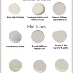
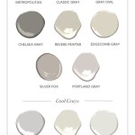
Color families, such as blues, greens, grays, and beiges, form the broadest level of categorization. Within each family, colors are further subdivided based on their undertones. Undertones are the subtle hints of color that influence how a paint color appears in different lighting conditions. For example, a gray paint may have warm undertones of beige or yellow, or cool undertones of blue or green. Identifying the undertone is crucial for ensuring the paint color complements the existing furniture, decor, and natural light in a room.
Valspar often provides curated color palettes inspired by specific themes or design styles. These palettes offer a harmonious selection of colors designed to work well together, simplifying the process of creating a cohesive color scheme. Examples include palettes inspired by nature, coastal living, or modern minimalism. These pre-selected palettes can serve as a starting point for homeowners who are unsure where to begin or who prefer a coordinated look.
The use of color chips and paint samples is an essential step in the color selection process. While digital representations of paint colors can provide a general idea, they may not accurately reflect how the color will appear in a specific room. Factors such as the type of lighting, the direction of the sunlight, and the surrounding colors can all influence the perceived color. Testing paint samples on a small area of the wall allows homeowners to observe the color under different lighting conditions and at different times of day, ensuring that it aligns with their expectations.
Exploring Popular Valspar Color Categories
Valspar offers a diverse range of colors across various categories, each designed to create a specific mood or aesthetic. Exploring these categories can provide inspiration and help homeowners identify colors that resonate with their personal style.
Neutral colors, such as whites, grays, beiges, and creams, are a perennial favorite for interior spaces. These colors provide a versatile backdrop that can be easily adapted to different design styles. Valspar offers a wide selection of neutral paints, ranging from bright and airy whites to warm and inviting beiges. The key to selecting the right neutral is to consider the undertones and how they interact with the existing decor. For example, a warm beige with yellow undertones can create a cozy and inviting atmosphere in a living room, while a cool gray with blue undertones can create a sophisticated and modern look in a bedroom.
Blue and green paints are known for their calming and relaxing qualities, making them ideal for bedrooms, bathrooms, and home offices. Valspar's blue and green palettes encompass a wide range of shades, from soft pastels to deep and dramatic hues. Light blues and greens can create a serene and airy atmosphere, while darker shades can add depth and sophistication. These colors are often associated with nature, evoking feelings of tranquility and peace.
For those seeking to add a touch of vibrancy and energy to their interiors, Valspar offers a selection of red, yellow, and orange paints. These colors can be used as accent colors to create focal points or to add warmth and character to a room. Red is often associated with passion and energy, while yellow is associated with happiness and optimism. Orange is a blend of these two colors, creating a warm and inviting atmosphere. When using these colors, it's important to consider the intensity and balance it with more neutral tones to avoid overwhelming the space.
Another popular category is Valspar's collection of earth tones. These colors, inspired by nature, include shades of brown, terracotta, and olive green. Earth tones can create a warm and inviting atmosphere, adding a sense of grounding and connection to the natural world. These colors are often used in living rooms, dining rooms, and kitchens, where they can create a cozy and welcoming environment.
Factors to Consider When Choosing Valspar Paint Colors
Selecting the right Valspar paint color involves considering several factors beyond personal preference. These factors include the size and lighting of the room, the existing decor, and the desired mood or atmosphere. Taking these factors into account can help ensure that the chosen paint color creates the desired effect.
The size and lighting of a room play a significant role in how a paint color appears. In smaller rooms, lighter colors can help create the illusion of more space, while darker colors can make the room feel smaller and more intimate. Natural light can also influence the perceived color. Rooms with ample natural light can handle darker colors without feeling too closed in, while rooms with limited natural light may benefit from lighter colors to brighten the space.
The existing decor, including furniture, flooring, and accessories, should also be considered when choosing a paint color. The paint color should complement the existing decor and create a cohesive and harmonious look. Consider the color palettes of the furniture and accessories and choose a paint color that either complements or contrasts with them. For example, if the furniture is primarily neutral, a bolder paint color can add a pop of color and create a focal point. Conversely, if the furniture is already colorful, a more neutral paint color may be a better choice.
The desired mood or atmosphere is another important factor to consider. Different colors evoke different emotions and can create different atmospheres. Calming colors, such as blues and greens, are ideal for bedrooms and bathrooms, where relaxation is desired. Warmer colors, such as reds and yellows, can create a more energetic and inviting atmosphere in living rooms and dining rooms. Ultimately, the choice of paint color should reflect the homeowner's personal preferences and the desired effect for the space.
Finally, consider the finish of the paint. Valspar offers a range of finishes, including matte, eggshell, satin, semi-gloss, and gloss. Each finish has its own characteristics and is suitable for different applications. Matte finishes are ideal for low-traffic areas, such as bedrooms, as they are less durable and more difficult to clean. Eggshell and satin finishes are more durable and easier to clean, making them suitable for living rooms, dining rooms, and hallways. Semi-gloss and gloss finishes are the most durable and easiest to clean, making them ideal for kitchens, bathrooms, and trim.
By carefully considering these factors and exploring the wide range of Valspar paint colors, homeowners can create beautiful and personalized interior spaces that reflect their individual style and preferences. The key is to take the time to experiment with different colors and finishes and to observe how they appear in different lighting conditions before making a final decision.

Transitional Valspar Paint Color Palette Home Interior Colors

Neutral Warm Valspar Paint Color Palette Cozy Interior Whole House Colors

Shabby Chic Valspar Paint Color Palette Cottage House Interior

Custom Valspar Paint Color Palette Home Selection Israel

Trending Color Of The Year 2024 Valspar

Interior Exterior Paint Wood Stain Floor Coating Valspar

Trending Color Of The Year 2024 Valspar

Trending Color Of The Year 2024 Valspar

From Cool Blue To Calm Green Valspar S 2024 Colors Of The Year Evoke Comfort Explore 12 Shade Palette Now Trending Paint Brands

Design Bloggers Favorite Paint Colors The Honeycomb Home
Related Posts