Exploring Plum Paint Color: A Comprehensive Guide
Plum paint, a sophisticated and versatile shade, offers a compelling alternative to traditional neutrals and brighter, more vibrant colors. Characterized by its blend of purple and red undertones, plum evokes feelings of luxury, creativity, and tranquility. Its adaptability makes it suitable for various interior design styles, from classic to contemporary, and effective in diverse spaces, ranging from bedrooms and living rooms to kitchens and bathrooms.
This comprehensive guide explores the nuances of plum paint, delving into its color psychology, variations, complementary colors, and practical application in different settings. The objective is to provide a thorough understanding of this complex and captivating color, empowering individuals to confidently incorporate plum into their design projects.
Understanding the Psychology and Undertones of Plum
Color psychology plays a crucial role in how individuals perceive and react to a specific color. Plum, with its inherent purple and red components, inherits associated psychological traits. The purple element contributes to feelings of royalty, spirituality, and creativity. Purple is often linked to intuition and introspection, fostering a sense of calm and thoughtfulness. It suggests sophistication and elegance. The red component injects energy, passion, and warmth into the overall color profile. Red is associated with excitement and stimulation, preventing plum from becoming overly subdued or somber. The balance between these two elements determines the overall mood that plum evokes in a space.
The precise undertones significantly influence the specific shade of plum and its compatibility with other colors and materials. Plum paints can lean more towards red, resulting in warmer, more inviting hues. Conversely, plum paints with a stronger purple influence tend to be cooler and more serene. Some variations may even exhibit subtle hints of brown or gray, adding to their complexity and versatility. Identifying the dominant undertone is essential for selecting complementary colors and creating a harmonious palette.
Examining the undertones under different lighting conditions is crucial. Natural light can accentuate the cooler undertones, while artificial light may bring out the warmer elements. Paying close attention to how the color shifts throughout the day will aid in making informed decisions about its placement and application.
Complementary Colors and Palette Development
Developing a successful color palette around plum requires careful consideration of complementary colors. Complementary colors are those situated opposite each other on the color wheel, creating visual interest and balance. While plum is a complex color, some classic pairings offer reliable results. Greens, especially muted or earthy greens, provide a natural contrast that enhances the richness of plum. The juxtaposition of the cool green and the warm plum creates a dynamic and visually appealing combination.
Grays, particularly warm grays with subtle purple or brown undertones, create a sophisticated and understated palette. This combination is well-suited for contemporary interiors, providing a neutral backdrop that allows plum to take center stage. The use of metallic accents, such as gold or silver, can further enhance the elegance of this pairing.
For a bolder and more dramatic statement, consider pairing plum with shades of gold or mustard yellow. This combination creates a sense of opulence and luxury. The warm tones of the gold complement the richness of plum, resulting in a visually striking and memorable effect. However, caution should be exercised to avoid overwhelming the space with too much color. Balance is key to achieving a harmonious and well-proportioned design.
Monochromatic palettes, utilizing different shades and tints of plum, can also be effective. Varying the intensity of plum, from light lavenders to deep eggplants, creates depth and visual interest. Incorporating textures and patterns can further enhance the complexity of a monochromatic scheme.
Beyond the traditional pairings, exploring analogous colors, those located next to plum on the color wheel, can also yield interesting results. Shades of purple, violet, and red can be incorporated to create a cohesive and harmonious color scheme. These combinations are often more subtle and understated than complementary palettes.
Practical Applications of Plum Paint in Various Spaces
The versatility of plum paint extends to its application in various spaces within a home. In bedrooms, plum can create a sense of tranquility and relaxation, promoting restful sleep. Lighter shades of plum, such as lavender or lilac, are particularly well-suited for bedrooms, creating a soft and calming atmosphere. Pairing these colors with light-colored linens and natural materials further enhances the sense of serenity.
In living rooms, plum can add a touch of sophistication and elegance. Deeper shades of plum, such as eggplant or burgundy, create a sense of warmth and intimacy. These colors are particularly effective in rooms with ample natural light. Pairing plum walls with neutral furniture and pops of color, such as gold or green, creates a balanced and visually appealing space. Plum can also be used as an accent color in living rooms, adding a touch of drama and intrigue.
In kitchens, plum can be used to create a bold and stylish statement. Plum-colored cabinets or accent walls can add a touch of personality and sophistication to the space. Pairing plum with stainless steel appliances and white countertops creates a clean and modern look. However, it's important to consider the overall lighting in the kitchen, as darker shades of plum can make the space feel smaller and more enclosed if not properly illuminated.
In bathrooms, plum can create a spa-like atmosphere. Lighter shades of plum, such as lavender or lilac, are particularly well-suited for bathrooms, creating a sense of relaxation and tranquility. Pairing these colors with white tiles and chrome fixtures creates a clean and modern look. Darker shades of plum can also be used in bathrooms, but it's important to ensure that the space is well-lit to prevent it from feeling too dark and claustrophobic.
Beyond interior walls, plum can be effectively incorporated into exterior design elements. Plum-colored doors or shutters can add a touch of personality and curb appeal to a home. Plum can also be used to paint garden furniture or planters, creating a cohesive and stylish outdoor space. When using plum outdoors, it's important to choose a paint that is specifically formulated for exterior use and that is resistant to fading and weathering.
The texture of the paint finish also influences the final appearance of plum. Matte finishes tend to absorb light, creating a softer and more muted effect. Glossy finishes reflect light, creating a more vibrant and dramatic effect. The choice of finish depends on the desired aesthetic and the specific application.
Ultimately, the successful integration of plum paint hinges on a thoughtful consideration of the space, the desired mood, and the complementary elements that will contribute to a cohesive and harmonious design. Careful planning and experimentation are essential for unlocking the full potential of this captivating color.

Color Exploration Paint It Plum Spectacular Design Interior Designers Portland Oregon

Natural Paint Colours The Organic Co

Purple Wall Paint Colours For Your Home Designcafe

Color Exploration Paint It Plum Spectacular Design Interior Designers Portland Oregon

Purple Paint Colour Chart Find Your Perfect Shade Dulux

Lavender Color Shades Tones Variations Of Colour

Pin Page

31 Cottagecore Paint Colors To Transform Your Home Into A Storybook Retreat

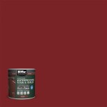
Ecos Paints Colors Plum Cake 1233

View The Most Popular Purple Paint Colours Schemes Dulux
Related Posts