Choosing the Right Martha Stewart Paint Colors For Your Home Interior
Selecting the perfect paint colors for a home interior is a crucial step in creating a cohesive and aesthetically pleasing living space. The color palette of a room significantly impacts mood, perception of size, and overall style. With numerous brands and shades available, making the right choice can seem overwhelming. Martha Stewart paint, known for its sophisticated and timeless hues, offers a curated selection designed to simplify this process. Understanding the nuances of this line can empower homeowners to make informed decisions that reflect their personal style and enhance their home's ambiance.
The Martha Stewart paint collection, often available through various retailers, is characterized by its nuanced undertones and carefully selected range. The colors are designed to work harmoniously together, allowing for easy coordination between different rooms and elements within a space. These paints are formulated to offer durability, coverage, and a consistent finish, making them a reliable option for both DIY enthusiasts and professional painters.
Understanding Color Theory and Its Application
Before diving into the specific Martha Stewart paint colors, a foundational understanding of color theory is essential. Color theory provides a framework for understanding how colors interact and how they impact human perception. Key concepts include the color wheel, which illustrates the relationships between primary, secondary, and tertiary colors, and the concepts of hue, saturation, and value.
Hue refers to the pure color itself, such as red, blue, or green. Saturation describes the intensity or purity of the color; a highly saturated color is vibrant, while a desaturated color is muted or grayed. Value refers to the lightness or darkness of a color, ranging from pure white to pure black. By understanding these elements, individuals can better predict how a particular color will appear in a room and how it will interact with other colors present.
Color temperature is another important consideration. Colors are generally categorized as warm (reds, oranges, yellows) or cool (blues, greens, purples). Warm colors tend to create a sense of energy and coziness, while cool colors evoke feelings of calmness and serenity. The choice between warm and cool colors should be guided by the desired mood and the function of the room. For instance, a bedroom might benefit from cool, soothing colors, while a living room could benefit from warmer, more inviting tones.
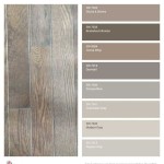
Considering the existing elements of a room, such as furniture, flooring, and lighting, is also crucial. The paint color should complement these elements and create a cohesive visual experience. Analyzing the undertones of existing materials can help in choosing paint colors that harmonize with them. For example, if the flooring has warm undertones, selecting a paint color with similar undertones will create a more unified look. Natural and artificial light sources also play a significant role in how paint colors appear. A color that looks vibrant in natural daylight might appear dull under artificial light, and vice versa.
Navigating the Martha Stewart Paint Color Palette
The Martha Stewart paint line offers a diverse range of colors, each carefully chosen to evoke a specific mood or style. The collection often includes a mix of classic neutrals, subtle pastels, and bolder statement colors. Within each color family, there are variations in saturation and value, allowing for nuanced choices that cater to different preferences and design schemes.
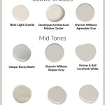
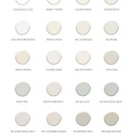
Neutral paint colors form the foundation of many interior designs. These colors, such as whites, beiges, grays, and creams, offer versatility and can be used in virtually any room. Within the Martha Stewart collection, there are numerous variations of these neutrals, each with its own subtle undertones. For instance, a warm white might have slight yellow or peach undertones, while a cool gray might have blue or green undertones. Selecting the right neutral depends on the desired overall effect and the other colors present in the room.
Pastel colors, such as light blues, greens, pinks, and yellows, provide a soft and calming aesthetic. These colors are often used in bedrooms, nurseries, and bathrooms, where a sense of tranquility is desired. The Martha Stewart paint line typically includes a curated selection of pastels that are sophisticated and not overly saccharine. These colors can be used to create a subtle and elegant backdrop, or they can be paired with bolder accents for a more dynamic look.
Bolder statement colors, such as deep blues, greens, reds, and purples, can add drama and personality to a room. These colors are often used as accent walls or in smaller spaces, such as powder rooms or entryways. The Martha Stewart collection includes a range of these colors that are rich and nuanced, offering depth and visual interest. When using bolder colors, it is important to consider the overall balance of the room and to ensure that the color complements the existing furnishings and décor.
To effectively navigate the Martha Stewart paint color palette, it is recommended to obtain color swatches or sample paint pots. These samples allow individuals to see how the colors appear in their own home under different lighting conditions. Painting a small area on the wall or using a foam board to test the color is also advisable. This allows for a more accurate assessment of how the color will look in the context of the entire room.
Applying Color Psychology to Home Interior Design
Color psychology explores the impact of colors on human emotions and behavior. Understanding these psychological effects can inform the selection of paint colors and create a space that supports well-being and enhances the desired mood. Different colors evoke different emotions, and these associations can be leveraged to create specific atmospheres within a home.
Blue, for example, is often associated with calmness, serenity, and stability. It can lower heart rate and blood pressure, making it an excellent choice for bedrooms, bathrooms, and home offices. However, darker shades of blue can sometimes feel melancholic, so it is important to balance them with lighter accents and warm tones. Green is associated with nature, growth, and harmony. It can create a sense of balance and rejuvenation, making it suitable for living rooms, kitchens, and studies. Green is also considered to be a restful color for the eyes, making it a good choice for spaces where relaxation is desired.
Yellow is associated with happiness, optimism, and energy. It can brighten up a room and create a sense of warmth and cheerfulness. However, too much yellow can be overwhelming or agitating, so it is best used as an accent color or in muted shades. Red is associated with passion, energy, and excitement. It can stimulate appetite and conversation, making it suitable for dining rooms and entertainment areas. However, red can also be perceived as aggressive or overwhelming, so it is important to use it sparingly and to balance it with calmer colors.
Purple is associated with creativity, spirituality, and luxury. It can add a sense of sophistication and elegance to a room, making it suitable for bedrooms, living rooms, and studies. However, darker shades of purple can feel heavy or somber, so it is important to balance them with lighter accents and brighter colors. White is associated with purity, cleanliness, and simplicity. It can create a sense of spaciousness and light, making it suitable for virtually any room. However, too much white can feel sterile or impersonal, so it is important to add texture and warmth through furnishings and décor.
By considering the psychological effects of different colors, individuals can create a home environment that supports their well-being and enhances their desired lifestyle. The Martha Stewart paint collection offers a range of colors that can be used to achieve specific emotional and aesthetic goals. Carefully considering the interplay of color and psychology can transform a house into a personalized and harmonious home.
:max_bytes(150000):strip_icc()/marthastewart-neutral-heronplume-2279ee3adae24ccc804ed8ed77daedf8.jpg?strip=all "12 Neutral Paint Colors That Will Look Beautiful In Every Room")
12 Neutral Paint Colors That Will Look Beautiful In Every Room

Martha Stewart S New Nature Inspired Paint Collection Is About To Spark A Home Makeover Frey
:max_bytes(150000):strip_icc()/FD2C4DB9-EFF3-4B2B-8E43-59959433DE26_1_105_c-070a41375cd0482c9834d2cfa96e3114.jpeg?strip=all "9 Trending Paint Colors You Ll See Everywhere In 2025")
9 Trending Paint Colors You Ll See Everywhere In 2025

Interior Paint Color And Palette Ideas With Pictures
:max_bytes(150000):strip_icc()/marthastewart-bathroompaint-sallielord-399ba9edfda1486d943c894187514559.jpg?strip=all "20 Bathroom Paint Colors Interior Designers Always Reach For")
20 Bathroom Paint Colors Interior Designers Always Reach For
:max_bytes(200000):strip_icc()/design--decor-banner-0323-9991afc2f0c34f57aef1d7e7a728eca7.jpg?strip=all "Home Design Decor")
Home Design Decor

Choosing Neutral Paint Colors Christina Maria Blog

Martha Stewart Launches Line Of Nature Inspired Wall Paint

Choosing Neutral Paint Colors Christina Maria Blog

Martha Stewart Says Paint Is The Foundation That Brings Your Core Design Elements Together Her European Inspired Paints Just Made It Easier
Related Posts