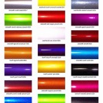
Best Light Blue Paint Colors: Sherwin-Williams
Light blue paint colors are a popular choice for interiors, offering a calming and refreshing atmosphere. With its versatility, light blue can suit various styles and spaces, from contemporary to traditional, creating a sense of serenity and tranquility. Sherwin-Williams, a renowned paint brand, offers an extensive range of light blue shades, each with its unique characteristics and appeal. This article explores some of the best light blue paint colors from Sherwin-Williams, providing insights into their nuances and potential applications.
1. Sea Salt (SW 6204)
Sea Salt is a light, airy blue with a hint of gray that creates a sense of spaciousness and serenity. Its neutral undertone allows it to blend seamlessly with various décor styles, from minimalist to traditional. This versatile color is perfect for living rooms, bedrooms, and bathrooms, where it can provide a calming backdrop for artwork and furniture. In spaces with limited natural light, Sea Salt can help brighten the room while maintaining a soothing ambiance.
Sea Salt's universal appeal makes it a popular choice for both small and large spaces. Its ability to create a serene atmosphere without being overpowering allows it to be a perfect choice for rooms where you want to relax and unwind. It complements a wide range of color palettes, from warm neutrals to bolder accent colors, providing a harmonious background for any décor scheme.
2. Tranquility (SW 6468)
Tranquility, as its name suggests, evokes a sense of calm and tranquility. This soft, pale blue with a touch of green undertone creates a soothing and inviting atmosphere. It offers a gentle and refreshing feel, ideal for bedrooms, bathrooms, and other spaces intended for relaxation. Tranquility's subtle green undertone adds a touch of nature to the space, making it a perfect choice for rooms with greenery or natural light.
Tranquility's light shade allows it to be used in a variety of spaces without feeling overwhelming. For a softer look, consider pairing it with white or cream trim, while bolder accent colors like coral or teal can add vibrancy to the space. Tranquility's versatility makes it suitable for traditional, modern, and contemporary aesthetics, accommodating various design styles.
3. Silver Marlin (SW 6235)
Silver Marlin is a cool, light blue that carries a hint of gray, creating a sophisticated and elegant ambiance. Its calming effect and subtle cool undertone make it an excellent choice for living rooms, dining rooms, and home offices. Silver Marlin can also be used in bedrooms to create a calming and relaxing environment. Its inherent elegance can enhance the visual appeal of any space, adding a touch of sophistication without being overly formal.
Silver Marlin's neutrality allows it to blend well with a variety of furniture and décor styles. Its cool undertone complements both neutral and bolder accent colors, adding depth and dimension to the space. Its calming effect and sophisticated tone create a welcoming and sophisticated atmosphere, making it a perfect choice for spaces where you want to create an impression of calm and refinement.
4. Watery (SW 6467)
Watery is a light, airy blue with a touch of green undertone, capturing the essence of a tranquil lake. This refreshing shade evokes a sense of serenity and tranquility, making it ideal for bedrooms, bathrooms, and other spaces where relaxation is paramount. Watery's green undertone adds a touch of nature to the space, creating a serene and calming atmosphere. Its light hue prevents it from feeling overwhelming in small spaces, while its calming effect makes it suitable for larger rooms as well.
Watery's versatility allows it to be paired with various color palettes, from warm neutrals to bolder accent colors. Its light and airy feel complements both traditional and modern décor styles. Watery can add a sense of tranquility and rejuvenation to any space, creating a welcoming and soothing environment.
5. Bluebell (SW 6501)
Bluebell is a vibrant, light blue with a hint of purple, offering a fresh and cheerful ambiance. Bluebell's energetic nature makes it suitable for spaces where you want to create a lively and inspiring atmosphere. It can work well in kitchens, children's rooms, or hallways, adding a touch of vibrancy to these areas. Bluebell's subtle purple undertone adds depth and sophistication to the color, creating a more complex and interesting look.
Bluebell can be paired with various color palettes, from warm neutrals to bolder accent colors. Its vibrant nature complements modern and contemporary décor styles, while its sophistication allows it to be incorporated into traditional spaces as well. Bluebell can bring a touch of energy and freshness to any space, creating a lively and inviting ambiance.

Paint Colors By Family Sherwin Williams Blue

How To Choose The Best Sherwin Williams Blue Paint Colors 2024 Farmhouse

20 Perfect Sherwin Williams Blue Paint Colors All The Best Blues Love Remodeled

Sherwin Williams Blue 15 Paint Colors That Take Your Breath Away Knockoffdecor Com

The 12 Best Light Blue Paint Colors For 2024 Color Project

Sherwin Williams Blue 15 Paint Colors That Take Your Breath Away Knockoffdecor Com

Light Blue Paint Colors The Best Pale Blues From Benjamin Moore And Sherwin William Diy Decor Mom

20 Perfect Sherwin Williams Blue Paint Colors All The Best Blues Love Remodeled

Pale Dusty Blues Front Door Options Sherwin Williams Blue Wall Colors Teal Paint

10 Best Sherwin Williams Blue Paint Colors Nish E Design
Related Posts