Best Dark Grey Paint Colors Sherwin Williams
Dark grey paint has become increasingly popular in interior design, offering a versatile and sophisticated alternative to stark white or traditional neutral palettes. Sherwin Williams, a leading paint manufacturer, offers a wide range of dark grey shades, each possessing unique undertones and characteristics that can dramatically impact the mood and aesthetic of a space. Selecting the right dark grey paint color requires careful consideration of factors such as lighting, existing décor, and personal preference.
This article will explore some of the best dark grey paint colors Sherwin Williams offers, examining their undertones, ideal applications, and complementary colors to aid in the decision-making process for homeowners and designers alike.
Understanding Undertones in Dark Grey Paint
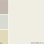
Undertones are the subtle colors that lie beneath the surface of a paint color. These undertones significantly influence how the paint appears in different lighting conditions and in conjunction with other colors in the room. Dark grey paints can have cool undertones (blue, green, or purple) or warm undertones (brown or beige). Identifying these undertones is crucial for ensuring the paint complements the existing elements of your space.
Cool-toned dark greys can create a modern, sophisticated, and calming atmosphere, while warm-toned dark greys can impart a sense of coziness and depth. The choice between cool and warm undertones largely depends on the desired effect and the overall style of the room.
When evaluating undertones, it is recommended to obtain paint samples and observe them under different lighting conditions – natural daylight, artificial light, and evening light. This will reveal how the undertones shift and interact with the existing elements of the room, providing a more accurate representation of the final result.
Sherwin Williams Iron Ore (SW 7069): A Timeless Charcoal
Iron Ore is a highly popular choice, known for its deep, rich charcoal color. It leans towards a slightly warmer grey, making it versatile enough to work in a variety of spaces. It is a sophisticated choice that can add depth and drama to a room without feeling overly harsh. Its near-black appearance makes it excellent for creating contrast and defining focal points.
Iron Ore is particularly well-suited for accent walls, kitchen islands, or exterior trim. It can be paired with crisp white trim for a classic look or with warmer wood tones for a more inviting feel. Given its depth, it is essential to ensure adequate lighting in the space to prevent it from feeling too dark or overwhelming.
Complementary colors for Iron Ore include warm whites, creams, and natural wood tones. Accent colors like mustard yellow, burnt orange, and deep greens can also create a visually appealing contrast. Consider using metallic accents like gold or brass to enhance its luxurious feel.
Sherwin Williams Urbane Bronze (SW 7048): A Warm and Grounded Grey
Urbane Bronze is a dark grey with strong bronze undertones, giving it a warm and earthy feel. It was Sherwin Williams' Color of the Year in 2021, reflecting its increasing popularity as a grounding and comforting color choice. This shade offers a sophisticated alternative to traditional browns, providing depth and richness without being overly dramatic.
Urbane Bronze works well in spaces where a sense of calm and connection to nature is desired. It is a suitable choice for living rooms, bedrooms, and even bathrooms. It can also be used effectively on exterior siding or front doors, lending a touch of modern elegance to the exterior of a home.
Complementary colors for Urbane Bronze include warm beiges, creams, and soft greens. Natural materials like wood, stone, and leather also pair well with its earthy tones. Accent colors like deep blues, rusty reds, and muted yellows can add visual interest and prevent the space from feeling monotonous.
Consider incorporating metallic accents like copper or antique bronze to enhance the warmth and sophistication of Urbane Bronze. Plants and natural textures can further enhance its grounding effect.
Sherwin Williams Peppercorn (SW 7674): A Neutral and Versatile Grey
Peppercorn is a versatile dark grey that straddles the line between warm and cool undertones. Its neutrality makes it a popular choice for various applications, from interior walls to exterior siding. It provides a sophisticated backdrop that allows other design elements to shine.
Peppercorn is particularly well-suited for open-concept spaces, as it can create a cohesive and unified look. It can also be used effectively in bedrooms, bathrooms, and home offices. Its neutrality makes it easy to coordinate with a wide range of furniture styles and color palettes.
Complementary colors for Peppercorn include a wide range of whites, from crisp cool whites to warmer creamy whites. It also pairs well with blues, greens, and purples. Accent colors like coral, teal, and gold can add pops of color and visual interest.
Peppercorn's versatility extends to its ability to work with both modern and traditional design styles. It can be used in conjunction with sleek, minimalist décor or with more ornate and classic furnishings. The key is to choose accent colors and materials that complement the overall style of the room.
Sherwin Williams Dovetail (SW 7018): A Soft and Sophisticated Grey
Dovetail is a mid-tone grey that can appear darker in certain lighting conditions, often considered a dark grey adjacent color. It has warm undertones, making it a versatile choice for creating a welcoming and comfortable atmosphere. While not as dramatic as some of the other options, Dovetail provides a sophisticated and understated elegance.
Dovetail works well in spaces where a soft and calming ambiance is desired. It is a good choice for bedrooms, living rooms, and dining rooms. It can also be used effectively in hallways and entryways, creating a welcoming first impression.
Complementary colors for Dovetail include warm whites, creams, and beiges. It also pairs well with soft blues, greens, and purples. Accent colors like blush pink, sage green, and mustard yellow can add a touch of personality and visual interest.
Dovetail's warmth makes it a suitable choice for creating a cozy and inviting space. Consider using soft textures like wool, cashmere, and velvet to enhance its comforting feel. Natural materials like wood and stone also complement its earthy tones.
Considering Lighting and Space
The amount of natural light a room receives plays a significant role in how a dark grey paint color will appear. Rooms with limited natural light may benefit from lighter shades of dark grey or strategic placement of artificial lighting to prevent the space from feeling too dark and enclosed. Conversely, rooms with ample natural light can handle darker shades without feeling overwhelming.
The size of the room is another important factor to consider. Dark grey paint can make a small room feel even smaller, especially if used on all four walls. In smaller spaces, it may be best to use dark grey sparingly, such as on an accent wall or in smaller decorative elements.
In larger spaces, dark grey can be used more liberally to create a dramatic and sophisticated effect. However, it is still important to ensure adequate lighting and to balance the dark color with lighter elements to prevent the space from feeling too somber.
Testing and Sampling
Before committing to a specific dark grey paint color, it is crucial to test and sample the paint in the actual space where it will be used. Paint colors can appear drastically different depending on the lighting conditions, surrounding colors, and surface texture. Purchasing small sample cans of the desired colors and painting large swatches on the walls is the best way to ensure satisfaction with the final result.
Observe the paint samples under different lighting conditions throughout the day – morning, afternoon, and evening. This will reveal how the undertones shift and interact with the existing elements of the room. It is also helpful to compare the paint samples to other colors in the room, such as furniture, flooring, and textiles, to ensure that they complement each other.
Consider painting the samples on multiple walls in the room, as the color may appear different depending on the wall's orientation and the amount of light it receives. It is also important to allow the paint samples to dry completely before making a final decision, as the color may change slightly as it dries.
Taking the time to test and sample paint colors before committing to a full painting project can save time, money, and frustration in the long run. It ensures that the chosen color is truly the best fit for the space and achieves the desired aesthetic.

Sherwin Williams Grizzle Gray Sw 7068 Paint Color Review Kylie M Interiors

Sherwin Williams 8 Best Dark Gray Paint Colors Grey

Best Gray And Greige Paint Colors From Sherwin Williams So Much Better With Age

The 10 Best Dark Paint Colors Kylie M Interiors

The 12 Best Gray Greige Paint Colours Sherwin Williams Room Colors C Home Decor Living

Sherwin Williams Peppercorn Sw 7674 Review West Magnolia Charm

The 12 Best Gray Greige Paint Colours Sherwin Williams Kylie M Interiors

The Best Gray Paint Colors Life On Virginia Street

The Best Shades Of Gray Paint In 2024 Grey Dark

Finding The Perfect Dark Gray Paint Color Diy Playbook
Related Posts