How to Choose Color in Paint.NET
Paint.NET is a freely available image editing software that offers a robust platform for creating and manipulating digital images. Its ease of use and powerful features make it a popular choice for both beginners and experienced users alike. An integral aspect of digital image editing is color selection, influencing the overall aesthetics, impact, and message of the artwork. The understanding of color principles and proper utilization of Paint.NET's tools is paramount to producing high-quality and visually compelling results.
This article details methods to effectively choose colors within Paint.NET, examining the color wheel, color palettes, the utilization of the color picker tool, and how to adjust color schemes to enhance the desired outcome in image editing projects.
Understanding the Color Wheel and Color Relationships in Paint.NET
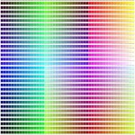
The color wheel is a fundamental tool in understanding color relationships. It visually represents the spectrum of colors and demonstrates how they relate to each other. Paint.NET’s color picker dialogue prominently features the color wheel, allowing users to intuitively select hues. The foundational understanding of primary, secondary, and tertiary colors aids in building harmonious color palettes.
Primary colors, namely red, yellow, and blue, are the building blocks of the color wheel. They cannot be created by mixing other colors. Secondary colors are created by mixing two primary colors. For instance, mixing red and yellow creates orange; mixing yellow and blue creates green; and mixing blue and red creates purple. Tertiary colors are created by mixing a primary color with a neighboring secondary color. Examples include red-orange, yellow-orange, yellow-green, blue-green, blue-violet, and red-violet.
Paint.NET’s color wheel allows for intuitive color selection based on these relationships. Adjacent colors on the color wheel, known as analogous colors, generally create harmonious and visually appealing color schemes. Colors directly opposite each other on the color wheel, called complementary colors, offer high contrast and can be used to draw attention to specific elements of an image. Triadic color schemes involve three colors that are evenly spaced on the color wheel, providing a balanced and vibrant contrast.
Within Paint.NET’s color selector, users can manipulate the hue slider to select a specific base color and then adjust the saturation and lightness/value (HSL) to refine the chosen color. Saturation refers to the intensity or purity of the color, ranging from a dull gray to a vibrant hue. Lightness represents how light or dark the color is, ranging from black to white. Mastering these adjustments is crucial for achieving the desired color tone and mood.
In addition to the HSL model, Paint.NET also supports the RGB (Red, Green, Blue) color model. This model is particularly useful when working with digital displays, as it defines colors based on the intensity of red, green, and blue light. Understanding both HSL and RGB allows for precise color control and consistency across different applications and devices.
The color wheel also enables the user to create various color harmonies for their images. Understanding these relationships allows for the deliberate and effective selection of colors to evoke a specific mood or highlight particular elements in an image. The use of warm colors (reds, oranges, yellows) can evoke feelings of energy, excitement, and warmth, while cool colors (blues, greens, purples) tend to create a sense of calm, peace, and serenity. The understanding of these concepts allows for a more nuanced and deliberate color selection within Paint.NET.
Utilizing Color Palettes Effectively in Paint.NET
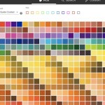
Color palettes are pre-selected sets of colors designed to work together harmoniously. Paint.NET has a default color palette, and users are able to create and save their own. Utilizing color palettes streamlines the selection process and ensures a cohesive aesthetic in projects.
Paint.NET offers several ways to manage color palettes. The default palette provides a starting point with a range of commonly used colors. Users can easily add, remove, or rearrange colors within the palette to create custom palettes tailored to specific projects or personal preferences. This customization allows for the creation of palettes that reflect a specific brand identity, match a particular theme, or evoke a certain mood.
When working with a specific color scheme, it is often helpful to create a custom palette. This ensures that all colors used in the image are consistent and work well together. Users can create a palette by manually selecting colors from the color wheel and adding them to the palette window, or by importing a palette from an external file. Paint.NET supports various palette file formats, allowing for easy sharing and collaboration between users.
Building a color palette requires careful consideration. It's advisable to start with a base color and build the palette around it. Consider complementary, analogous, or triadic color schemes to create a visually balanced and harmonious palette. It is also important to test the palette with the intended image or design. Apply the selected colors to different elements of the image and evaluate how they interact with each other. Adjust the palette as needed to achieve the desired effect.
Beyond the standard color palette, Paint.NET allows for the utilization of plugins that expand color management capabilities. These plugins can provide features such as advanced color mixing tools, the ability to generate color palettes based on mathematical algorithms, and integration with online color palette resources. Exploring and experimenting with these plugins can further enhance the user's ability to create and manage color palettes within Paint.NET.
Employing the Color Picker Tool for Precision Color Selection in Paint.NET
The color picker tool, also known as the eyedropper tool, is an indispensable tool in image editing. It allows users to sample colors directly from an image, making it possible to precisely match colors or replicate color schemes. Paint.NET’s color picker is accurate and efficient, enabling seamless color sampling within the software.
The primary function of the color picker tool is to select a color from an existing image. This is particularly useful when trying to match a color from a photograph or a reference image. To use the color picker, simply select the tool from the toolbar and click on the desired color within the image. The selected color will then be loaded into the primary or secondary color slot (depending on the active mode). This allows users to immediately apply the sampled color to other elements of the image.
Paint.NET's color picker tool offers various sampling options. Users can choose to sample a single pixel, a 3x3 pixel average, or a 5x5 pixel average. Sampling an average of multiple pixels can be useful when dealing with images with subtle color variations or noise. By averaging the color values across a larger area, the color picker can provide a more representative sample of the desired color.
Beyond sampling colors from an existing image, the color picker can also be used to sample colors from other applications or even from the desktop. This is achieved by using the "Sample Desktop" option in the color picker settings. This allows users to select colors from any application running on their computer, making it easy to incorporate colors from various sources into their Paint.NET projects.
The color picker tool is also invaluable for color correction and restoration tasks. When restoring old or damaged photographs, it is often necessary to match the original colors of the image. The color picker can be used to sample colors from undamaged areas of the photo and then apply them to faded or discolored areas. This helps to restore the original look and feel of the image.
In addition to selecting colors, the color picker can also be used to analyze color values. By hovering the color picker over different areas of an image, users can see the RGB, HSL, and hexadecimal values of the colors under the cursor. This information can be useful for understanding the color composition of the image and for making informed decisions about color adjustments.
In summary, choosing color in Paint.NET requires an understanding of color theory, effective utilization of color palettes, and proficiency in using the color picker tool. By mastering these techniques, users can create visually stunning and impactful images with Paint.NET.

Is There Anyway To Select All Of One Color That Isn T The Magic Wand Paint Net Discussion And Questions Forum

The Very Basics Of Paint Net Part 2

How Do I Colour In Diffe Words With Colours 1 Text Box Paint Net Discussion And Questions Forum

Sunnyneo Multi Coloured Gradients In Paint Net

Colors Missing Paint Net Discussion And Questions Forum

How To Edit Image Colors In Paint Net Tip Dottech

Paint Net Color Picker Logo Tutorial

Sunnyneo Multi Coloured Gradients In Paint Net

Find The Average Rgb Color Of A Material Sample And Get Values With Free Tool What Revit Wants

Clothes Color Example With Paint Net
Related Posts