How To Pick Paint Colours For Your House
Selecting paint colours for a house is a significant undertaking, influencing not only the aesthetic appeal of the space but also the overall mood and perceived size of rooms. A well-chosen colour palette can enhance architectural features, create a sense of harmony, and reflect the homeowner's personal style. Conversely, poorly selected colours can clash with existing furnishings, make rooms feel smaller or less inviting, and ultimately detract from the overall value of the property. The process requires careful consideration of various factors, including lighting, existing décor, room function, and personal preferences.
Consider Existing Elements and Undertones
Before diving into the vast sea of paint swatches, it is crucial to assess the existing elements within the house that will remain. This includes fixed features such as flooring, cabinetry, countertops, and any permanent architectural details like trim or built-in shelving. The colours of these elements will heavily influence the choices made for wall paint. Ignoring these existing colours can result in a discordant and visually jarring space.
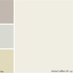
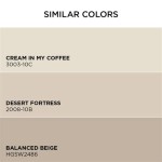
One key aspect of this assessment is identifying undertones. Undertones are the subtle hints of colour that lie beneath the main colour. For example, a supposedly neutral beige might have a pink, yellow, or green undertone. Similarly, a grey might lean towards blue, green, or even purple. Identifying these undertones in existing elements is crucial for selecting paint colours that complement rather than clash. Holding paint swatches up against these existing surfaces in different lighting conditions will reveal these subtle undertones. It is advisable to gather samples of fabrics, carpets, and tiles to use as reference points throughout the colour selection process.
Paying attention to undertones ensures colour harmony. If existing elements have warm undertones (yellow, orange, red), selecting paint colours with similar warm undertones will create a cohesive and inviting atmosphere. Conversely, if existing elements have cool undertones (blue, green, purple), opting for paint colours with cool undertones will result in a more serene and calming space. Mixing warm and cool undertones can be challenging and requires a sophisticated understanding of colour theory. A general rule of thumb is to avoid mixing strongly contrasting undertones, especially in smaller spaces.
Assessing Lighting Conditions
Lighting plays a pivotal role in how paint colours appear in a room. Natural light, artificial light, and the direction a room faces all significantly affect colour perception. A colour that looks vibrant and appealing in a paint store under fluorescent lighting may appear entirely different once applied to the walls of a house. Therefore, it is essential to assess the lighting conditions in each room before making any final decisions.
Rooms that receive ample natural light tend to handle bolder and darker colours more effectively. The abundance of light helps to keep the space from feeling too enclosed or gloomy. Conversely, rooms with limited natural light often benefit from lighter and brighter colours, which reflect light and create a sense of spaciousness. North-facing rooms, which tend to receive cooler, indirect light, may benefit from warmer paint colours to counteract the coolness and create a more inviting atmosphere. South-facing rooms, which receive warmer, direct light, can handle cooler colours without feeling cold or sterile.
Artificial lighting also influences colour perception. Incandescent bulbs cast a warm, yellow light, which can intensify warm colours and slightly mute cool colours. Fluorescent bulbs emit a cooler, bluer light, which can accentuate cool colours and make warm colours appear duller. LED bulbs offer a wider range of colour temperatures, allowing for greater control over the overall lighting environment. It is recommended to observe paint swatches under different types of artificial lighting to see how the colours shift and change. Paint sample areas on the wall and observe them throughout the day and night to get a true sense of how the colour will appear under different lighting conditions.
Considering Room Function and Atmosphere
The function of a room should heavily influence the colour choices. Different colours evoke different emotions and create different atmospheres. Therefore, it is essential to select colours that align with the intended purpose of each space.
For example, bedrooms are typically spaces for relaxation and rest. Therefore, calming and soothing colours such as soft blues, greens, lavenders, and neutrals are often preferred. These colours promote a sense of tranquility and can help to create a restful environment. Avoid vibrant or stimulating colours like bright reds or oranges, as these can be too energizing and disruptive to sleep. The master bedroom may differ in colour palette versus a child's bedroom. A child's bedroom may benefit from brighter, more stimulating colours, however, it is important to factor in a child's personality and preferences when making decisions.
Living rooms and family rooms are often spaces for socializing and entertainment. Therefore, colours that are warm, inviting, and conducive to conversation are typically preferred. Earth tones, such as browns, beiges, and greys, create a sense of groundedness and stability. Warmer colours, such as yellows, oranges, and reds (used sparingly), can add energy and excitement to the space. Kitchens are often considered the heart of the home, so colours that are clean, bright, and cheerful are often chosen. Whites, creams, and light greys are popular choices for kitchens, as they create a sense of cleanliness and hygiene. Accents of colour can be introduced through accessories and appliances. Bathrooms are typically spaces for personal hygiene and relaxation. Therefore, colours that are clean, fresh, and calming are often preferred. Blues, greens, and whites are popular choices for bathrooms, as they evoke a sense of tranquility and cleanliness.
Beyond the primary function, consider the desired atmosphere. Is the goal to create a cozy and intimate space, or a bright and airy one? Darker colours tend to make rooms feel smaller and more intimate, while lighter colours tend to make rooms feel larger and more spacious. The desired atmosphere should be a key consideration when narrowing down the colour options.
Utilizing Colour Theory and Palette Creation
Understanding basic colour theory can be invaluable when selecting paint colours for a house. Colour theory provides a framework for understanding how colours interact with each other and how to create harmonious and visually appealing colour palettes. The colour wheel is a fundamental tool in colour theory, illustrating the relationships between primary, secondary, and tertiary colours.
Complementary colours are located opposite each other on the colour wheel (e.g., blue and orange, red and green, yellow and purple). When used together, they create a strong contrast and can add visual interest to a space. However, using complementary colours requires careful balance, as too much contrast can be overwhelming. Analogous colours are located next to each other on the colour wheel (e.g., blue, blue-green, and green). They create a more harmonious and subtle effect, as they share similar undertones. Analogous colour schemes are often used to create a calming and serene atmosphere. Triadic colours are three colours that are equidistant from each other on the colour wheel (e.g., red, yellow, and blue). They create a vibrant and dynamic effect, but require careful consideration to avoid a sense of chaos.
Developing a cohesive colour palette is essential for creating a harmonious and visually appealing home. A colour palette typically consists of a few key colours that are used throughout the house, with variations and accents to add interest and depth. Start by identifying a dominant colour, which will be the most prevalent colour in the house. This colour should be chosen based on personal preference, existing elements, and the overall desired atmosphere. Then, select a few secondary colours that complement the dominant colour. These secondary colours can be used on accent walls, trim, or in furnishings and accessories. Finally, choose a few accent colours to add pops of interest and personality to the space. These accent colours should be used sparingly, as they are intended to draw the eye and create visual excitement.
When creating a colour palette, consider the flow of colours from room to room. Aim for a sense of continuity and harmony, so that the house feels cohesive and unified. Avoid jarring transitions between drastically different colours, as this can disrupt the visual flow and create a sense of disjointedness. Use similar colours or undertones to connect different rooms, and use accent colours to tie the palette together.
Testing Paint Samples and Seeking Professional Advice
Once a selection of potential paint colours has been narrowed down, it is crucial to test those colours in the actual space where they will be used. Paint stores offer sample pots of paint, which can be used to paint small areas of the wall to see how the colour appears in different lighting conditions and at different times of day. This is an essential step in the colour selection process, as it can reveal subtle nuances and unexpected variations in colour that are not apparent on a small paint swatch.
Paint sample areas of at least two feet by two feet on the wall, and observe them under different lighting conditions, including natural light, artificial light, and both daytime and nighttime lighting. Pay attention to how the colour shifts and changes throughout the day, and how it interacts with the existing elements in the room. It is also helpful to place pieces of furniture and accessories near the painted sample areas to see how the colour looks in context. Don't be afraid to live with the sample colours for a few days before making a final decision. This will allow ample time to observe the colours under various conditions and ensure that they are truly the right choice.
If struggling with the colour selection process, seeking professional advice from an interior designer or colour consultant can be invaluable. These professionals have extensive knowledge of colour theory, lighting, and spatial design, and can provide expert guidance and support in selecting the perfect paint colours for a house. They can also help to create a cohesive colour palette that complements existing elements, enhances architectural features, and reflects personal style. While hiring a professional may incur an additional cost, the investment can be well worth it in terms of time saved, mistakes avoided, and the overall aesthetic appeal of the home.
Choosing paint colours for a house is a multifaceted process that requires careful consideration of various factors. By assessing existing elements, evaluating lighting conditions, considering room function, utilizing colour theory, testing paint samples, and seeking professional advice when needed, homeowners can create a harmonious and visually appealing space that reflects their personal style and enhances the overall value of their property. Meticulous planning and attention to detail are key to achieving a successful and satisfying result.
:strip_icc()/cdn.cliqueinc.com__cache__posts__277032__how-to-pick-paint-colors-277032-1549477716321-image.700x0c-355e170426eb47c7a70362985dc90dc2.jpg?strip=all "How To Pick Paint Colors According An Expert")
How To Pick Paint Colors According An Expert

How To Choose A Paint Color

Pick A Paint Color In 4 Easy Steps
:strip_icc()/cdn.cliqueinc.com__cache__posts__277032__how-to-pick-paint-colors-277032-1549477717179-image.700x0c-d1893d3eeff342bd9daf0a9d1d275e4b.jpg?strip=all "How To Pick Paint Colors According An Expert")
How To Pick Paint Colors According An Expert

Choosing The Perfect Interior Paint Color Artisan Builders

Choose The Perfect Paint Color For Your Living Room

10 Best Tips On Choosing The Right Interior Wall Paint Colours For Home

How To Choose Paint Colors For Your Home Interior

How To Choose A Paint Color The Home Depot

How To Choose Interior Paint Colors For Your Home
Related Posts