The Beauty of Medium Blue: Understanding Color Code and Application
Medium blue, a color nestled comfortably between sky blue and deeper navy tones, holds a unique appeal that makes it a popular choice in various design disciplines. This article explores the allure of medium blue, delving into its color code representation, psychological effects, applications across different industries, and considerations for achieving the desired aesthetic when utilizing this versatile hue.
The term "medium blue" is somewhat subjective, lacking a single, universally accepted definition across color systems. However, it generally refers to a blue shade that is neither overly pale nor excessively dark. Accurately defining and replicating medium blue requires understanding its representation in various color codes, including hexadecimal (hex), RGB (Red, Green, Blue), and CMYK (Cyan, Magenta, Yellow, Key/Black).
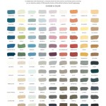
Hexadecimal codes, commonly used in web design, provide a six-digit alphanumeric representation of a color. A typical medium blue hex code might fall within the range of #73A9AD to #60AFFF, although slight variations exist depending on the specific nuance of medium blue desired. RGB values, which specify the intensity of red, green, and blue light, might range from (115, 169, 173) to (96, 175, 255). CMYK values, primarily used in printing, would have a different set of values depending on the desired saturation and brightness; a typical CMYK value that translates to medium blue could be around (55, 35, 0, 0) to (60, 25, 0, 0) or similar.
Understanding these color codes is crucial for consistent replication of medium blue across different mediums, ensuring that the color displayed on a computer screen closely matches the printed outcome or the paint applied to a wall. Discrepancies can arise from variations in monitor calibration, printer settings, and paint formulations. Therefore, using color matching systems and obtaining physical color swatches is recommended to minimize inconsistencies.
Psychological Impact of Medium Blue
Blue is often associated with tranquility, stability, and trust. These associations partially contribute to its widespread use in corporate branding and professional environments. Medium blue, in particular, tempers the intensity of darker blues with a lighter, more approachable feel. Its psychological impact includes promoting feelings of calmness, serenity, and intellectual stimulation. It can be seen as reliable and trustworthy, making it a useful color for companies that want to project those values.
Studies on color psychology suggest that blue can also have a calming effect on the mind, lowering heart rate and blood pressure. This makes medium blue a suitable choice for spaces designed for relaxation, such as bedrooms, spas, or waiting rooms. However, overusing blue can sometimes create a feeling of coldness or detachment. To counteract this, designers often incorporate warmer colors, such as yellows or oranges, as complementary accents.
The specific shade of medium blue can also influence its perceived effect. A slightly more saturated medium blue might evoke feelings of energy and vibrancy, while a more muted tone can create a sense of sophistication and understated elegance. The choice of shade should align with the overall design goals and the intended mood of the space.
Applications Across Industries
The versatility of medium blue makes it a popular choice in a wide range of industries. In the technology sector, it is frequently used in logos, website interfaces, and product packaging to convey trustworthiness, innovation, and user-friendliness. Banks and financial institutions often employ medium blue in their branding to instill confidence and reliability in their customers.
In the healthcare industry, medium blue is used in hospitals, clinics, and medical websites to create a calming and reassuring environment. Its association with cleanliness and hygiene further enhances its suitability for this sector. The hospitality industry also leverages medium blue in hotel rooms, spas, and restaurants to create a relaxing and inviting atmosphere. In home decor, it is often used in living rooms, bedrooms, and bathrooms to evoke feelings of tranquility and serenity.
The fashion industry utilizes medium blue in clothing, accessories, and textiles. It can be used as a primary color for garments or as an accent color to complement other hues. Medium blue is also a popular choice for denim, offering a classic and timeless appeal. In the automotive industry, medium blue is used in car paint colors, offering a sense of sophistication and style.
Beyond these examples, medium blue finds application in various other industries, including education, government, and non-profit organizations. Its versatility allows it to be adapted to suit different contexts and design objectives. The specific shade and application of medium blue should be carefully considered to align with the brand identity and communication goals.
Achieving the Desired Aesthetic: Considerations for Use
Achieving the desired aesthetic when using medium blue requires careful consideration of several factors, including the specific shade of blue, the lighting conditions, the surrounding colors, and the overall design style. Selecting the right shade of medium blue is crucial. Consider the desired mood and the context in which the color will be used. A brighter, more saturated shade may be appropriate for a playful or energetic design, while a more muted tone may be better suited for a sophisticated or calming environment.
Lighting conditions can significantly impact the appearance of medium blue. Natural light tends to enhance its brightness and vibrancy, while artificial light can alter its hue and intensity. It is important to test the chosen shade of medium blue under different lighting conditions to ensure it achieves the desired effect. Using color rendering index (CRI) lighting can help to better replicate natural light conditions.
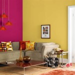
The surrounding colors play a crucial role in how medium blue is perceived. Complementary colors, such as yellow or orange, can create a vibrant and eye-catching contrast. Analogous colors, such as green or purple, can create a harmonious and balanced feel. Neutral colors, such as white or gray, can provide a clean and sophisticated backdrop for medium blue to stand out. Consider the color palette as a whole and how medium blue interacts with other colors in the design.
The overall design style should also inform the use of medium blue. In a minimalist design, it can be used sparingly as a subtle accent color. In a more maximalist design, it can be used more liberally as a dominant color. Consider the overall aesthetic and how medium blue contributes to the desired look and feel. The texture of the surface on which medium blue is applied can also influence its appearance. A smooth, glossy surface will reflect more light, making the color appear brighter, while a rough, matte surface will absorb more light, making the color appear more muted.
Furthermore, it is important to consider the size of the space when using medium blue. In a small space, using too much dark medium blue can make the room feel smaller and more enclosed. Consider using lighter shades of medium blue or pairing it with lighter colors to create a sense of spaciousness. In a large space, darker shades of medium blue can add depth and dimension.

The Beautiful Blue Paint Colors Of Year 2024

Vibrant Shades Of Blue Color And The Way They Brighten Our Art

The Best Blue Green Paint Colors Life On Virginia Street

Diffe Shades Of Blue A List With Color Names And Codes Drawing Blog

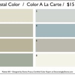
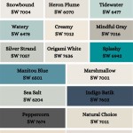
Dusty Blue Paint Colors 8 Go To Picks From Sherwin Williams Porch Daydreamer

Buy Blue Paint Color Palette Benjamin Moore Whole House Scheme Classic Accent Gray Grey Hale Navy In

Gm General Motors Blue 073980 Hex Color Code Rgb And Paints

Benjamin Moore Blue Paint Colors 15 Most Popular And My Best Picks Knockoffdecor

Marine Blue Color Hex Code Is 0981d1

Grey Blue Paint Colors Ideas For A Tranquil Mood O Lovely
Related Posts