Nice Paint Colours For Inside House: A Comprehensive Guide
Selecting paint colours for the interior of a house is a crucial design decision that significantly impacts the overall aesthetic and ambience. The right colour palette can transform a space, making it feel larger, brighter, more inviting, or more tranquil. Considerations must extend beyond personal preferences to encompass the architecture of the house, the functionality of each room, and the desired emotional response the colours are intended to evoke. This article provides a detailed overview of various paint colours considered aesthetically pleasing for interior spaces, offering insights into their characteristics and suitability for different applications.
Understanding the Psychology of Colour
Colour psychology plays a vital role in interior design. Different colours elicit different psychological responses and can influence mood, behaviour, and perception. Therefore, understanding these effects is essential when choosing paint colours for specific rooms.
Blue, for example, is often associated with calmness, serenity, and stability. It is a popular choice for bedrooms and bathrooms, where a relaxing atmosphere is desired. Lighter shades of blue can create a sense of spaciousness, while darker shades can add depth and sophistication. However, it’s important to consider the undertones of blue. Some blues can lean towards a cooler, almost icy feel, which might not be suitable for rooms that receive minimal natural light.
Green is another colour often associated with nature, growth, and harmony. It is believed to reduce stress and promote a sense of well-being. Green is a versatile colour that can be used in various rooms, from living rooms to kitchens. Lighter greens, such as sage or mint, can create a fresh and airy feel, while darker greens, such as forest green or emerald, can add a touch of drama and elegance.
Yellow is a colour associated with happiness, optimism, and energy. It is often used to brighten up spaces and create a welcoming atmosphere. However, yellow can be overwhelming if used excessively. It is best used as an accent colour or in rooms that receive plenty of natural light. Muted yellows, such as butter yellow or cream, are often preferred for larger spaces as they provide a warmth without being overpowering.
Red is a colour associated with passion, excitement, and energy. It is a bold and dramatic colour that can add a sense of sophistication and luxury to a room. However, red can also be overwhelming and is best used sparingly. It is often used as an accent colour or in rooms where a statement is desired, such as a dining room or home office.
Orange is a colour associated with warmth, enthusiasm, and creativity. It is a vibrant and uplifting colour that can add a sense of fun and playfulness to a room. Orange is a good choice for spaces where socializing and activity are encouraged, such as a playroom or family room. Muted oranges, such as terracotta or peach, can be used in larger spaces to create a warm and inviting atmosphere.
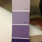
Purple is a colour associated with royalty, luxury, and creativity. It is a sophisticated and elegant colour that can add a sense of drama and mystery to a room. Lighter shades of purple, such as lavender or lilac, can create a calming and relaxing atmosphere, while darker shades, such as eggplant or plum, can add a touch of glamour. Purple is often used in bedrooms, bathrooms, and living rooms.
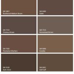
Neutral colours, such as white, grey, beige, and taupe, are versatile and timeless choices for interior paint. They provide a blank canvas for decorating and can be easily paired with other colours. White can make a space feel larger and brighter, while grey can add a touch of sophistication and elegance. Beige and taupe are warm and inviting neutrals that can create a comfortable and relaxing atmosphere.
Exploring Specific Colour Palettes and Their Applications
Beyond individual colours, the way different colours are combined to form a palette significantly impacts the overall look and feel of a space. Coordinating colours effectively requires careful consideration of undertones, saturation levels, and the desired effect on the room's perceived size and light.
Monochromatic Palette: This involves using different shades and tints of a single colour. For example, a monochromatic blue palette could include a light sky blue for the walls, a medium navy blue for the trim, and a dark indigo blue for accent pieces. This creates a cohesive and harmonious look that is both calming and sophisticated. Monochromatic palettes work well in bedrooms, bathrooms, and living rooms.
Analogous Palette: This involves using colours that are next to each other on the colour wheel. For example, an analogous palette could include blue, blue-green, and green. This creates a harmonious and balanced look that is both visually appealing and relaxing. Analogous palettes work well in bedrooms, living rooms, and dining rooms.
Complementary Palette: This involves using colours that are opposite each other on the colour wheel. For example, a complementary palette could include blue and orange, or red and green. This creates a vibrant and energetic look that is both eye-catching and stimulating. Complementary palettes work well in kitchens, family rooms, and home offices. However, it's crucial to balance the intensity of the complementary colours to avoid visual fatigue. Using muted or toned-down versions of the colours can achieve the desired effect without being overwhelming.
Neutral Palette with Pops of Colour: This involves using neutral colours as the base and adding pops of colour through accessories and artwork. For example, a neutral palette could include grey walls, white trim, and pops of colour through colourful pillows, throws, and artwork. This creates a versatile and flexible look that can be easily updated and changed. Neutral palettes with pops of colour work well in any room.
Warm Palette: This involves using warm colours, such as red, orange, and yellow. This creates a cozy and inviting look that is both comfortable and welcoming. Warm palettes work well in living rooms, dining rooms, and kitchens.
Cool Palette: This involves using cool colours, such as blue, green, and purple. This creates a calming and relaxing look that is both peaceful and serene. Cool palettes work well in bedrooms, bathrooms, and home offices.
Factors Influencing Colour Selection
Numerous factors beyond personal preferences should be considered when selecting paint colours for a house. These include the existing architectural features, the amount of natural light, and the specific functions of each room.
Natural Light: The amount of natural light a room receives significantly affects how paint colours appear. Rooms with plenty of natural light can handle darker and more saturated colours, while rooms with limited natural light benefit from lighter and brighter colours that reflect light and make the space feel larger. It is recommended to test paint samples in the room at different times of the day to see how the colour changes under different lighting conditions.
Architectural Features: The architectural features of a house can influence paint colour selection. For example, a house with ornate trim and mouldings may benefit from a more traditional colour palette, while a house with clean lines and a modern aesthetic may benefit from a more minimalist colour palette. The colour of the trim should also be considered, as it can significantly impact the overall look of the room. Often, a lighter trim colour will make the wall colour pop, while a darker trim colour can ground the space.
Room Functionality: The functionality of a room should also be considered when selecting paint colours. For example, a bedroom should be painted in calming and relaxing colours, while a kitchen can be painted in more vibrant and energetic colours. A home office should be painted in colours that promote focus and productivity.
Furniture and Decor: Existing furniture and decor should be taken into account when selecting paint colours. The colours of the furniture, rugs, and artwork should complement the wall colour and create a cohesive and harmonious look. It is often helpful to gather swatches of fabrics and materials used in the room to compare them with potential paint colours.
Personal Style: While practical considerations are important, personal style should not be overlooked. The colours chosen should reflect the individual's personality and create a space that they enjoy spending time in. Consider the overall aesthetic the homeowner is trying to achieve, whether it be modern, traditional, eclectic, or minimalist.
By carefully considering these factors, one can choose paint colours that enhance the beauty and functionality of their home, creating a space that is both aesthetically pleasing and personally reflective.

Lake House Interior Colors The Lilypad Cottage

Choosing The Perfect Interior Paint Color Artisan Builders

How To Choose Interior Paint Colors For Your Home

20 Best Paint Colors Interior Designers Favorite Wall

Interior House Paint Es Fool Proof With Experts

65 Best House Colors Inside Ideas Painting Paint

Best Interior Paint Colors Whole House Color Scheme Abby Organizes

20 Of The Best Paint Colors For Whole House Welsh Design Studio

Living Room Color For The Home Interior House Colors Paint

20 Best Paint Colors Interior Designers Favorite Wall
Related Posts