Off-White Color Paint: A Guide to Creating the Perfect Looks
Off-white paints represent a spectrum of subtle shades that offer versatility and sophistication in interior and exterior design. These hues, subtly deviating from pure white, incorporate undertones that can dramatically influence a space's ambiance. Understanding the nuances of off-white paint is crucial for achieving the desired aesthetic in any project.
The term "off-white" encompasses a broad range of colors, each possessing distinct characteristics. These subtle variations can include creams, ivories, beiges, and even grays, each carrying a specific undertone that contributes to its overall effect. The selection of the appropriate off-white shade demands careful consideration of the existing elements within a space, including natural light, architectural features, and complementary colors.
Understanding the Undertones of Off-White
The key to successfully using off-white paint lies in identifying and understanding its undertones. Undertones are the subtle colors that influence an off-white's overall appearance. These undertones can be warm, cool, or neutral, and they significantly impact how the color interacts with light and other colors in the room.
Warm undertones include yellows, oranges, and reds. Off-whites with warm undertones tend to create a cozy and inviting atmosphere. These shades are particularly effective in spaces that lack natural light or where a warmer, more comforting feel is desired. Common examples include creams and ivories, which often possess a yellow or beige undertone.
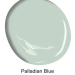
Cool undertones encompass blues, greens, and violets. Off-whites with cool undertones tend to create a crisp, clean, and airy feel. These shades work well in spaces with ample natural light or where a more modern and minimalist aesthetic is desired. Examples include off-whites with a slight gray or green cast, which can appear particularly sophisticated.
Neutral undertones are more balanced and do not lean heavily towards warm or cool. These off-whites are generally more versatile and can work well in a variety of settings. However, even neutral off-whites possess subtle undertones that should be considered in relation to the surrounding environment.
Identifying the undertone of an off-white paint can be achieved by comparing it to a pure white sample under different lighting conditions. Natural light, incandescent light, and fluorescent light can all reveal subtle undertones that might not be apparent under a single light source. Examining the paint sample alongside other colors in the room, such as fabrics, furniture, and flooring, can also help determine how the undertone will interact with the existing color scheme.
Factors Influencing Off-White Paint Selection
Selecting the correct off-white paint involves considering several crucial factors that contribute to the overall success of the project. These factors include the amount of natural light, the size of the room, the existing color palette, and the desired ambiance.
Natural light significantly impacts how off-white paint appears. Rooms with abundant natural light can handle cooler off-whites without appearing sterile. In contrast, rooms with limited natural light benefit from warmer off-whites that can brighten the space and create a more inviting atmosphere. The direction of the light source also plays a role; north-facing rooms tend to have cooler, bluer light, while south-facing rooms receive warmer, yellower light. Therefore, the selected off-white should complement the natural light's inherent characteristics.
The size of the room is another important consideration. Lighter off-whites can make smaller rooms feel more spacious and airy, while darker off-whites can create a more intimate and cozy atmosphere in larger rooms. However, using a very dark off-white in a small room with limited natural light can make it feel cramped and claustrophobic. Conversely, a very light off-white in a large room can appear sterile if not balanced correctly with other design elements.
The existing color palette of the room is crucial for ensuring that the off-white paint complements the other elements. Consider the colors of the furniture, flooring, fabrics, and artwork. The off-white should harmonize with these colors, either by creating a cohesive and monochromatic look or by providing a subtle contrast. It is essential to avoid clashing undertones; for instance, pairing an off-white with a yellow undertone with a cool blue can create a visually jarring effect.
The desired ambiance of the room should also guide the selection of off-white paint. Warmer off-whites are often preferred for creating a cozy and inviting atmosphere, ideal for bedrooms and living rooms. Cooler off-whites are often used to create a clean and modern feel, suitable for kitchens and bathrooms. The choice should align with the room's intended purpose and the overall design aesthetic.
Application and Complementary Colors
Proper application techniques are essential for achieving a flawless finish with off-white paint. Surface preparation, priming, and the application method all play crucial roles in the final outcome. In addition, understanding how to pair off-white paints with complementary colors can enhance their beauty and create a visually appealing space.
Before applying off-white paint, ensure the surface is clean, smooth, and free from imperfections. Repair any cracks or holes with spackle or joint compound and sand the surface smooth. Remove any dust or debris with a damp cloth. Priming the surface is crucial, especially when painting over a dark color or a glossy finish. Primer creates a uniform surface for the paint to adhere to, ensuring better coverage and a more consistent color. Use a high-quality primer that is compatible with the type of paint being used.
The application method depends on the desired finish and the type of surface being painted. Brushes are ideal for cutting in around trim and corners, while rollers are better for covering larger areas. Use a high-quality brush and roller to ensure smooth and even application. Apply thin, even coats of paint, allowing each coat to dry completely before applying the next. Avoid applying too much paint at once, as this can lead to drips and runs. Two coats of paint are typically sufficient for achieving full coverage and a uniform color.
Off-white paints are highly versatile and can be paired with a wide range of complementary colors. For a monochromatic look, combine different shades of off-white with varying textures and finishes. For example, use a matte off-white on the walls and a satin off-white on the trim. For a more contrasting look, pair off-white with bolder colors, such as blues, greens, or yellows. The specific colors chosen should complement the undertones of the off-white paint. For example, an off-white with a yellow undertone pairs well with warm blues and greens, while an off-white with a gray undertone complements cool blues and purples.
Accessories and decor can also enhance the beauty of off-white paint. Use textiles, artwork, and lighting to add warmth, texture, and visual interest to the space. Metallic accents, such as gold or silver, can add a touch of elegance to off-white walls. Consider the overall balance of the room and ensure that the accessories and decor complement the paint color and create a cohesive and harmonious design.
Ultimately, selecting and applying off-white paint is a thoughtful process involving careful consideration of undertones, lighting, room size, and existing colors. Through a detailed and informed approach, a space can be transformed by the subtle elegance and versatility that off-white paint provides.

The Ultimate Guide To White Off Paint Colors Benjamin Moore

Best Designer Approved Off White Color Paints To Try Bless Er House

The Ultimate Guide To White Off Paint Colors Benjamin Moore

The Ultimate Guide To White Off Paint Colors Benjamin Moore

The 12 Best White Paint Colors According To Experts Young House Love

The 10 Best White Paint Colors As Chosen By Designers Jenna Sue Design

The Ultimate Guide To White Off Paint Colors Benjamin Moore

The 10 Best White Paint Colors As Chosen By Designers Jenna Sue Design

Pick The Perfect White Paint For Your Project Colorfully Behr

Benjamin Moore Creamy White Paint Palette 18x12 Painted Color Samples Dove Simply Down Ballet Van Deusen Blue
Related Posts