3 Color Combinations For Interior House Paint
Choosing the right color palette can dramatically impact the ambiance and feel of a home. Interior paint colors influence mood, perceived space, and overall aesthetic appeal. Selecting a cohesive color scheme often feels daunting, but understanding a few basic principles and exploring some tried-and-true combinations can simplify the process and lead to beautiful results.
Monochromatic Elegance
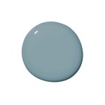
Monochromatic color schemes utilize variations in shade and tint within a single hue. This approach creates a harmonious and sophisticated atmosphere. For example, a monochromatic blue scheme might incorporate navy blue walls, lighter blue furnishings, and pale blue accents. The subtle shifts in intensity add depth and visual interest without overwhelming the space. This method is particularly effective in smaller rooms, as the unified color palette can create an illusion of spaciousness. The absence of stark color contrasts allows the eye to flow smoothly throughout the room, promoting a sense of tranquility and calm.
Consider incorporating different textures and finishes to prevent a monochromatic scheme from becoming flat. A high-gloss paint on trim can contrast beautifully with matte walls in the same hue. Textured fabrics, such as velvet or linen, can further enhance the visual depth and prevent monotony. Incorporating metallic accents like gold or silver can also add a touch of glamour and break up the single-color dominance. Adding artwork or decorative items with subtle variations of the core color can also prevent the space from feeling too uniform.
Complementary Contrast
Complementary color schemes involve pairing colors that sit opposite each other on the color wheel, such as blue and orange, or green and red. This approach creates a dynamic and energetic atmosphere. While full-strength complementary colors can be overwhelming, using muted versions or focusing on one color as the dominant shade and the other as an accent can create a balanced and visually appealing space.
For instance, a living room might feature muted sage green walls with burnt orange throw pillows and artwork. This combination offers a vibrant yet grounded feel. The green provides a calming backdrop, while the orange injections add pops of energy and warmth. The key to success with complementary colors is to find the right balance. Too much of either color can create a space that feels chaotic or visually jarring. Testing paint samples and considering the existing furniture and decor is crucial before committing to a complementary scheme.
Introducing a neutral color, such as white or beige, can further soften the contrast and create a more cohesive look. Neutral rugs, furniture, or curtains can help to ground the bolder complementary colors and prevent them from dominating the space. Consider using lighter tints of the complementary colors for larger areas like walls, and reserve the more saturated shades for smaller accents and accessories.
Analogous Harmony
Analogous color schemes employ colors that sit next to each other on the color wheel, such as blue, green, and yellow. This combination creates a sense of harmony and flow. Analogous schemes often evoke a natural feel, reminiscent of landscapes or gardens. These color palettes are inherently pleasing to the eye and offer a wide range of possibilities for creating different moods.
For example, a bedroom might feature soft blue walls, green bedding, and yellow accents in the artwork and lighting. This combination creates a serene and restful atmosphere. The gradual transition between colors provides a gentle and calming effect. Analogous schemes can be particularly effective in spaces where relaxation and tranquility are desired, such as bedrooms, bathrooms, and living areas.
To add depth and prevent an analogous scheme from feeling too one-note, consider varying the saturation and brightness of the chosen colors. A darker shade of blue on an accent wall can provide a focal point, while lighter tints of green and yellow can be used for furnishings and accessories. Incorporating natural textures like wood and stone can also enhance the organic feel of an analogous color palette.
Careful consideration of lighting is essential when using analogous colors. Natural light can significantly impact how the colors appear, so it's important to observe the room throughout the day to ensure the chosen palette works well in different lighting conditions. Artificial lighting can also be used to enhance the chosen colors and create a specific mood. Warm lighting can enhance the cozy feel of an analogous scheme, while cooler lighting can create a more contemporary atmosphere.

Eye Catching Two Colour Combinations For Your Home By Indigo Paints

10 Best Wall Color Combinations To Try In 2024 For Your Home Interior

20 Top Interior Color Schemes For Your House Design Foyr Neo

Color Palette For Home 12 Combos Designers Love Havenly Interior Design Blog

Best Wall Color Combination Ideas In 2024 To Enhance Your Walls

10 Best Wall Color Combinations To Try In 2024 For Your Home Interior

30 Best New Color Combinations Stylish Combos For 2024

Transform Your Home With Inspiring Colour Combinations Asian Paints

20 Best Room Color Combinations Eye Catching Palettes For Your Home

30 Living Room Color Ideas Best Paint Decor Colors For Rooms
Related Posts