How To Choose The Perfect Color for Room Painting
Selecting the right paint color for a room is a pivotal decision in interior design, influencing not only the aesthetic appeal but also the overall atmosphere and perceived size of the space. The perfect color choice can transform a dull, uninviting room into a vibrant, comfortable, and stylish area. Conversely, a poor color selection can make a room feel smaller, darker, or simply unharmonious. Therefore, a thoughtful and systematic approach to choosing paint colors is crucial.
The process involves considering a variety of factors, from the room's purpose and lighting conditions to the existing furnishings and personal preferences. This guide offers a framework for navigating the complexities of color selection, providing practical advice and highlighting key considerations to help achieve a visually pleasing and functional living space.
Understanding the Psychology of Color
Color psychology plays a significant role in how individuals perceive and react to their environment. Different colors evoke different emotions and associations, and understanding these psychological effects is paramount to selecting colors that align with the desired mood and function of a room. For example, cooler colors like blues and greens are often associated with calmness and tranquility, making them suitable for bedrooms and relaxation areas. Warmer colors, such as reds and yellows, are typically linked to energy and excitement, and may be better suited for social spaces like living rooms or dining rooms.
Blue is often associated with serenity, peace, and stability. It can create a calming atmosphere, promoting relaxation and reducing stress. Light blues are often used in bedrooms and bathrooms, while darker blues can add a touch of sophistication and elegance to a space. However, excessive use of dark blue can sometimes feel cold or depressing, particularly in rooms with limited natural light.
Green symbolizes nature, growth, and harmony. It is a versatile color that can be used in a variety of rooms, creating a sense of balance and well-being. Light greens are refreshing and invigorating, while darker greens can add depth and richness to a space. Green can be particularly effective in studies or home offices, as it is believed to promote concentration and creativity.
Yellow is associated with happiness, optimism, and energy. It can brighten up a room and create a cheerful atmosphere. However, it is important to use yellow judiciously, as excessive exposure to bright yellows can sometimes be overwhelming or agitating. Softer, muted yellows are generally more suitable for larger areas, while brighter yellows can be used as accent colors to add pops of energy.
Red is a powerful color that is associated with passion, excitement, and energy. It can add warmth and drama to a space, but should be used sparingly, as it can also be overwhelming or stimulating. Red accents can be effective in dining rooms or living rooms, creating a focal point and adding a touch of vibrancy. However, red is generally not recommended for bedrooms, as it can disrupt sleep patterns.
Purple is associated with royalty, luxury, and creativity. Lighter shades of purple, such as lavender, can create a calming and elegant atmosphere, while darker shades of purple can add a touch of drama and sophistication. Purple can be used effectively in bedrooms or living rooms, but it is important to balance it with other colors to prevent the space from feeling too dark or heavy.
Neutral colors, such as white, gray, and beige, provide a versatile backdrop for any room. They are timeless and adaptable, allowing for easy integration with various decorating styles and color schemes. Neutral colors can also create a sense of spaciousness and brightness, making them ideal for smaller rooms or rooms with limited natural light. However, it is important to add texture and interest to a neutral space through the use of accessories and furnishings to prevent it from feeling bland or sterile.
The psychological effects of color can be further influenced by factors such as lighting, personal experiences, and cultural associations. Therefore, it’s advisable to consider individual preferences and the specific context of the room when selecting paint colors.
Assessing the Room's Characteristics
Before selecting a paint color, a comprehensive assessment of the room's characteristics is essential. This includes evaluating the size of the room, the amount of natural light it receives, the existing architectural features, and the intended use of the space. These factors will significantly influence how colors are perceived and how they contribute to the overall ambiance of the room.
Room Size: In smaller rooms, lighter colors can create the illusion of spaciousness by reflecting more light. Conversely, darker colors can make a small room feel even more confined. In larger rooms, darker colors can add warmth and coziness, while lighter colors can maintain an open and airy feel. Consider using a combination of light and dark colors to create visual interest and balance in larger spaces.
Natural Light: The amount of natural light a room receives will significantly impact how colors appear. Rooms with abundant natural light can handle bolder and more saturated colors, while rooms with limited natural light benefit from lighter, more reflective colors. Observe the room at different times of the day to understand how the natural light changes and affects the colors. North-facing rooms tend to have cooler light, while south-facing rooms receive warmer light. East-facing rooms receive warm light in the morning and cooler light in the afternoon, while west-facing rooms receive cooler light in the morning and warm light in the afternoon.
Architectural Features: Existing architectural features, such as moldings, trim, and flooring, should be taken into consideration when choosing paint colors. Complementary colors can highlight these features, while contrasting colors can create a dramatic effect. Consider the style and period of the architecture when selecting a color palette. For example, a traditional home may benefit from classic and timeless colors, while a modern home may be better suited for bolder and more contemporary colors.
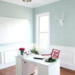
Intended Use: The intended use of the room should also influence the color selection. Bedrooms, for example, typically benefit from calming and relaxing colors, while living rooms and dining rooms may be better suited for more social and energetic colors. Consider the activities that will take place in the room and select colors that support those activities. A home office, for example, may benefit from colors that promote concentration and productivity, while a playroom may benefit from colors that encourage creativity and playfulness.
Existing Furnishings: Existing furniture, décor, and artwork should also be considered when choosing paint colors. Select colors that complement these elements and create a cohesive and harmonious look. Take photographs of the room and existing furnishings to help visualize how different colors will look in the space. Consider bringing fabric swatches and paint samples to the room to see how they look together in the natural light.
By carefully assessing these room characteristics, individuals can narrow down their color choices and select a palette that effectively enhances the space and supports its intended function.
Using Color Tools and Techniques
Selecting the perfect paint color can be daunting, but utilizing various color tools and techniques can simplify the process and increase the likelihood of a successful outcome. These tools and techniques include color wheels, paint samples, and virtual painting applications.
Color Wheels: A color wheel is a visual tool that illustrates the relationships between different colors. It can be used to identify complementary colors (colors that are opposite each other on the wheel), analogous colors (colors that are next to each other on the wheel), and triadic colors (three colors that are equally spaced on the wheel). Complementary color schemes create contrast and visual interest, while analogous color schemes create a harmonious and cohesive look. Triadic color schemes create a vibrant and dynamic effect.
Paint Samples: Before committing to a particular paint color, it is essential to test it out in the room. Purchase paint samples in small quantities and apply them to different areas of the wall. Observe the colors at different times of the day, under different lighting conditions. Paint samples can reveal how the color interacts with the room's light and other elements.
Virtual Painting Applications: Numerous virtual painting applications and online tools allow users to upload a photo of their room and virtually paint the walls in different colors. These tools can provide a realistic preview of how a color will look in the space, helping individuals visualize the final result before making a purchase. Some applications also allow users to experiment with different color palettes and create custom color schemes.
Consider Undertones: When selecting paint colors, it is important to consider the undertones. Undertones are subtle hues that can influence the overall appearance of a color. For example, a white paint may have warm (yellowish) or cool (bluish) undertones. Understanding undertones is crucial for creating a harmonious color scheme and avoiding clashes with existing furnishings and décor. Compare paint samples side-by-side to identify the undertones and choose colors that complement each other.
Consider Sheen Levels: The sheen level of a paint refers to the amount of light it reflects. Different sheen levels are suitable for different applications. Flat or matte sheens have the least amount of reflection and are ideal for hiding imperfections on walls and ceilings. Eggshell or satin sheens have a slight sheen and are durable and easy to clean, making them suitable for living rooms and bedrooms. Semi-gloss and gloss sheens have a high level of reflection and are ideal for trim, doors, and cabinets, as they are durable and resistant to moisture. Choose the appropriate sheen level based on the intended use of the room and the desired level of durability.
By utilizing these color tools and techniques, individuals can approach the color selection process with confidence and make informed decisions that result in a beautifully painted and harmonious living space.

How To Choose Paint Colors Easy Tips And Tricks Craving Some Creativity

How To Choose Bedroom Paint Colors My Best Tips

Interior Paint Ideas 12 Tips To Help You Get The Right Wall Color Extra Space Storage

How To Choose The Perfect Paint Colors For Every Room In Your House Naples Build

How To Choose Bedroom Paint Colors My Best Tips

Color Psychology Choosing The Right Paint For Master Bedroom Mack Painters Pinehurst Nc
:strip_icc()/blue-green-bedroom-8cf099d2-37dd9d51053047779aaeeb40b9e4630b.jpg?strip=all "23 Expert Tips For Choosing The Right Paint Colors Your Home")
23 Expert Tips For Choosing The Right Paint Colors Your Home
:strip_icc()/cdn.cliqueinc.com__cache__posts__277032__how-to-pick-paint-colors-277032-1549477716321-image.700x0c-355e170426eb47c7a70362985dc90dc2.jpg?strip=all "How To Pick Paint Colors According An Expert")
How To Pick Paint Colors According An Expert

How To Choose The Perfect Wall Color Complement Your Art Canvas A Blog By Saatchi

How To Pick A Perfect Living Room Paint Color The Pinnacle List
Related Posts