What Is The Most Popular Neutral Interior Paint Color?
Selecting a paint color for an interior space is a pivotal decision that can significantly impact the overall aesthetic and ambiance. Among the vast spectrum of available hues, neutral colors consistently maintain a position of prominence, largely due to their versatility, timelessness, and ability to complement a wide range of design styles. Determining the "most popular" neutral, however, is a complex endeavor, as preferences fluctuate based on regional trends, design movements, and individual tastes. While a definitive answer remains elusive, exploring the frontrunners in neutral paint color popularity offers valuable insights into current interior design trends and the characteristics that make these shades so appealing.
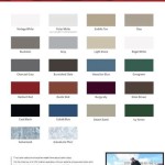
Neutral paint colors encompass a broad range, extending beyond the simplistic categorization of black, white, and gray. They include complex variations of these core shades, often incorporating subtle undertones of other colors such as beige, cream, greige (a blend of gray and beige), and off-whites. These nuances add depth and complexity, allowing for greater flexibility in coordinating with existing furniture, décor, and architectural elements.
The popularity of a neutral paint color is influenced by several factors. Firstly, its ability to create a sense of calm and serenity is a major draw. Neutral tones are perceived as less stimulating than bolder colors, contributing to a relaxing and inviting atmosphere. This is particularly relevant in bedrooms and living rooms, where creating a comfortable and unwinding environment is often prioritized. Secondly, neutral colors offer a blank canvas for homeowners to express their personal style through furniture, artwork, and accessories. The neutrality allows these elements to become the focal point of the room, preventing the paint color from overpowering the overall design. Thirdly, neutral paint colors are highly adaptable to different lighting conditions. They can appear warmer or cooler depending on the amount of natural light and the type of artificial lighting used in the space, making them a safe and reliable choice for various rooms and orientations.
Furthermore, the perception of "popularity" is dynamic and subject to change. Interior design trends evolve continuously, influenced by fashion, technology, and cultural shifts. What was considered the most popular neutral last year might be supplanted by a slightly different shade this year. Therefore, understanding the underlying principles of neutral color theory and how they interact with other design elements is more valuable than simply chasing after the latest "it" color.
The Enduring Appeal of Off-Whites and Creams
Off-whites and creams consistently rank among the most popular neutral paint colors for interior spaces. Their versatility and ability to create a bright and airy atmosphere contribute to their enduring appeal. Unlike stark white, which can sometimes feel sterile or clinical, off-whites and creams possess a subtle warmth that adds a touch of comfort and sophistication. These shades reflect light effectively, making rooms appear larger and more open. They also serve as an excellent backdrop for showcasing artwork, textiles, and other decorative elements.
The variations within the off-white and cream spectrum are vast, ranging from cool-toned options with subtle hints of gray or blue to warmer shades with undertones of yellow or beige. The choice of specific off-white or cream will depend on the desired aesthetic and the existing color palette of the space. For example, a cool-toned off-white might be ideal for a room with ample natural light and a modern, minimalist design, while a warmer cream might be better suited for a cozier space with traditional furnishings.
One of the key advantages of off-whites and creams is their ability to complement a wide range of architectural styles. They work equally well in historic homes with intricate moldings and details as they do in modern, minimalist spaces. This adaptability makes them a safe and reliable choice for homeowners who are unsure of which direction to take with their interior design.
Furthermore, off-whites and creams are relatively easy to work with in terms of coordinating with other colors. They pair well with both bold accent colors and other neutral shades, allowing for a high degree of flexibility in decorating and accessorizing the space. This makes them a practical choice for homeowners who like to change their décor frequently.
The Rise of Greige: A Modern Neutral
Greige, a blend of gray and beige, has emerged as a highly popular neutral paint color in recent years, reflecting a shift towards more sophisticated and versatile color palettes. This hybrid shade combines the coolness of gray with the warmth of beige, creating a complex and nuanced hue that can adapt to a variety of interior design styles. Greige offers a modern alternative to traditional beige and provides a more grounded and sophisticated feel than stark gray.
The appeal of greige lies in its ability to create a sense of calm and serenity while also adding a touch of sophistication and elegance. It works well in both modern and traditional spaces and can be used to create a variety of different moods, depending on the specific shade and the surrounding décor. For example, a lighter, cooler greige can create a bright and airy atmosphere, while a darker, warmer greige can create a more cozy and intimate feel.
One of the key advantages of greige is its versatility in coordinating with other colors. It pairs well with both warm and cool tones, making it a practical choice for homeowners who want to create a cohesive and balanced color scheme. It also works well with a variety of different materials, such as wood, metal, and stone, allowing for a high degree of flexibility in decorating and accessorizing the space.
The popularity of greige can also be attributed to its timelessness. Unlike some trendier colors that quickly fall out of favor, greige has a classic appeal that will likely endure for years to come. This makes it a safe and reliable choice for homeowners who want to invest in a paint color that will stand the test of time.
The Understated Elegance of Light Grays
Light grays have consistently held a position of favor among neutral paint color choices, prized for their understated elegance and versatility in creating a sophisticated and calming atmosphere. These subtle shades of gray offer a clean and contemporary aesthetic, providing a blank canvas for showcasing furniture, artwork, and other decorative elements. Unlike darker grays, which can sometimes feel oppressive or somber, light grays maintain a sense of brightness and airiness, making them suitable for a wide range of interior spaces.
The appeal of light grays lies in their ability to create a sense of calm and serenity. They are perceived as less stimulating than brighter colors, contributing to a relaxing and inviting environment. This makes them an excellent choice for bedrooms, living rooms, and other spaces where creating a comfortable and unwinding atmosphere is a priority. Furthermore, light grays are highly adaptable to different lighting conditions. They can appear warmer or cooler depending on the amount of natural light and the type of artificial lighting used in the space, making them a reliable choice for various rooms and orientations.
One of the key advantages of light grays is their ability to complement a wide range of design styles. They work equally well in modern, minimalist spaces as they do in more traditional settings. This versatility makes them a safe and reliable choice for homeowners who are unsure of which direction to take with their interior design. Light grays also pair well with both bold accent colors and other neutral shades, allowing for a high degree of flexibility in decorating and accessorizing the space.
The variations within the light gray spectrum are vast, ranging from cool-toned options with subtle hints of blue or green to warmer shades with undertones of beige or yellow. The choice of specific light gray will depend on the desired aesthetic and the existing color palette of the space. For example, a cool-toned light gray might be ideal for a room with ample natural light and a modern, minimalist design, while a warmer light gray might be better suited for a cozier space with traditional furnishings.

The Best Neutral Paint Colors Midwest Life And Style Blog

Top 10 Most Popular Neutral Paint Colors 2024 Agape Home Services

20 Best Neutral Paint Colors West Magnolia Charm

Top 20 Neutral Paint Colors For Interiors That Designers Use Foyr

A Word About Neutrals Colorfully Behr Blog

The Best 15 Neutral Paint Colors For 2024 Turquoise Home

The 10 Best Warm Neutral Paint Colors For Your Entire Home Kylie M Interiors

The Best Neutral Paint Colors For Home Love Remodeled

Sherwin Williams 6 Best Neutral Beige Paint Colors With A Bit More Depth Kylie M Interiors

Top 10 Most Popular Neutral Paint Colors 2024 Agape Home Services
Related Posts