Which Is The Best Color For Interior House Painting?
Selecting the optimal interior paint color is a multifaceted decision that significantly impacts the ambiance, perceived space, and overall aesthetic appeal of a home. There is no single "best" color universally applicable to all interiors. The ideal choice depends heavily on individual preferences, the purpose of the room, existing architectural features, lighting conditions, and desired psychological effects.
This article explores the various factors influencing interior paint color selection, outlining the pros and cons of different color families and providing guidance for making informed decisions that align with individual needs and aesthetic goals. Understanding the nuances of color theory and its application in interior design is crucial for achieving a harmonious and visually pleasing living environment.
Understanding the Psychology of Color
Color psychology plays a crucial role in shaping human emotions and behaviors. In the context of interior design, understanding how different colors influence mood and perception is paramount. Using color strategically can transform a room, making it feel more relaxing, energizing, or sophisticated.
For instance, blue is often associated with tranquility, calmness, and stability, making it a suitable choice for bedrooms or bathrooms. However, darker shades of blue can sometimes feel cold or depressing, so it's important to balance them with warmer accents. Green evokes feelings of nature, growth, and harmony, making it a popular choice for living rooms and offices. It can promote a sense of well-being and reduce stress.
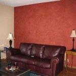
Yellow, on the other hand, is a vibrant and cheerful color associated with optimism, happiness, and energy. While it can be stimulating and uplifting, excessive use of yellow can be overwhelming or even lead to anxiety. Red is a powerful and energetic color associated with passion, excitement, and courage. It can be stimulating and create a sense of drama, but it's best used sparingly as an accent color, as it can be overwhelming if used excessively.
Neutral colors like white, gray, and beige provide a versatile backdrop that allows for greater flexibility in decorating and furnishing. White is often associated with purity, cleanliness, and simplicity. It can make a room feel brighter and more spacious, but too much white can feel sterile or clinical. Gray is a sophisticated and versatile neutral that can range from cool and modern to warm and inviting. It provides a neutral backdrop that allows other colors to stand out. Beige is a warm and inviting neutral that can create a sense of comfort and relaxation. It's a popular choice for creating a cozy and welcoming atmosphere.
The choice of color should also consider the room's function. Bedrooms benefit from calming colors like blues, greens, or soft neutrals. Living rooms, where social interaction takes place, can accommodate warmer and more vibrant colors. Kitchens often benefit from clean and bright colors that promote a sense of hygiene and energy. Bathrooms can be designed with spa-like colors to promote relaxation and tranquility.
Analyzing Room Characteristics
The physical characteristics of a room play a significant role in determining the most suitable paint color. Factors such as room size, natural lighting, and architectural details must be carefully considered to achieve the desired effect.
Smaller rooms generally benefit from lighter colors, which can create an illusion of spaciousness. Darker colors can make a small room feel even smaller and more enclosed. However, in some cases, a carefully chosen dark color can create a dramatic and intimate atmosphere. Larger rooms can accommodate bolder and more saturated colors without feeling overwhelming. However, it's important to maintain a balance and avoid using too many different colors that can make the room feel cluttered.
Natural lighting significantly impacts how colors appear. Rooms with ample natural light can handle a wider range of colors, including darker shades. However, it's important to consider the direction the room faces. South-facing rooms tend to receive warm, sunny light, which can make colors appear warmer and more intense. North-facing rooms receive cooler, indirect light, which can make colors appear cooler and more muted. East-facing rooms receive warm morning light and cooler afternoon light, while west-facing rooms receive cooler morning light and warm afternoon light.
Artificial lighting also plays a crucial role in how colors are perceived. Incandescent lighting tends to cast a warm, yellow glow, which can make colors appear warmer. Fluorescent lighting tends to cast a cool, blue glow, which can make colors appear cooler. LED lighting is available in a wide range of color temperatures, allowing for greater control over the overall lighting effect. It's important to test paint colors under both natural and artificial lighting to ensure they look as intended.
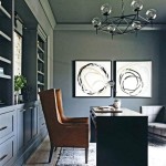
Architectural details such as crown molding, wainscoting, and built-in shelving can also influence color choices. These features can be highlighted with contrasting colors to add visual interest and depth to the room. Conversely, they can be painted in the same color as the walls to create a more seamless and cohesive look. The choice depends on the desired aesthetic and the overall design scheme.
The existing furniture and decor should also be taken into account when selecting a paint color. The paint color should complement the existing furniture and decor and create a harmonious and cohesive look. It's helpful to gather fabric swatches, paint chips, and photos of existing furniture and decor to help visualize the overall design scheme.
Exploring Color Palettes and Trends
Creating a cohesive color palette is essential for a well-designed interior. Understanding the principles of color harmony and current trends can help in making informed decisions that reflect personal style and contemporary aesthetics.
Monochromatic color schemes involve using different shades and tints of a single color. This creates a harmonious and sophisticated look that is easy to achieve. Analogous color schemes involve using colors that are adjacent to each other on the color wheel. This creates a harmonious and balanced look that is slightly more dynamic than a monochromatic scheme. Complementary color schemes involve using colors that are opposite each other on the color wheel. This creates a bold and vibrant look that can be visually striking. However, it's important to use complementary colors carefully to avoid creating a jarring or overwhelming effect.
Triadic color schemes involve using three colors that are equally spaced on the color wheel. This creates a balanced and harmonious look that is more complex than a complementary scheme. Tetradic color schemes involve using four colors that are arranged in two complementary pairs on the color wheel. This creates a complex and dynamic look that requires careful planning and execution.
Current trends in interior paint colors often reflect broader societal trends and cultural influences. In recent years, there has been a growing interest in natural and earthy tones, such as greens, browns, and beiges. These colors evoke a sense of calm, tranquility, and connection to nature. There is also a trend towards using more muted and desaturated colors, which create a more sophisticated and understated look. Gray has remained a popular neutral color, with variations ranging from cool and modern to warm and inviting.
Bold and saturated colors are also making a comeback, but they are often used as accent colors rather than as the dominant color in a room. Jewel tones such as emerald green, sapphire blue, and ruby red are popular choices for adding a touch of luxury and sophistication. Metallics such as gold, silver, and copper are also being used to add a touch of glamour and shine.
Ultimately, the best color palette is one that reflects personal style and creates the desired atmosphere in the home. It's important to experiment with different colors and combinations to find what works best. Using paint samples and digital visualization tools can be helpful in making informed decisions. Consulting with an interior designer can also provide valuable guidance and expertise.
The selection of the "best" interior house painting color is thus a complex and personal undertaking. By considering the psychological effects of different colors, analyzing the characteristics of individual rooms, and exploring various color palettes and trends, homeowners can make informed decisions that create a visually appealing and emotionally resonant living space.

10 Best Wall Paint Colors For The Home Interior Living Room

20 Of The Best Paint Colors For Whole House Welsh Design Studio

Choosing The Best Interior Paint Colors For Your Home In Fair Oaks Ranch

Best Paint Colors For Ing Your Home In 2024 J Van

What Are The Best Paint Colors For Ing Your House Living Room Home

Best Interior Paint Colors Whole House Color Scheme Abby Organizes

20 Of The Best Paint Colors For Whole House Welsh Design Studio

2024 Best Interior Paint Colors To Your House Homeadvisor

10 Best Trending 2024 Interior Paint Colors To Inspire Décor Aid

You Ll See These Interior Paint Colors Everywhere In 2024
Related Posts