How to Use Taupe Paint Color in Home Designer Pro
Taupe, a versatile and sophisticated neutral, holds a prominent place in interior design. Its inherent blend of brown and gray offers a calming and grounding effect, making it a popular choice for various rooms and design styles. When working with Home Designer Pro, understanding how to effectively integrate taupe into your virtual designs is crucial for achieving a desired aesthetic. This article will explore the nuances of using taupe paint color in Home Designer Pro, providing insights into its complementary colors, suitable applications, and practical considerations within the software.
Taupe's appeal lies in its adaptability. It can lean warmer or cooler depending on the undertones present. Some taupes exhibit pink or beige undertones, providing a warm and inviting feel. Others lean towards gray or even green, creating a more contemporary and sophisticated ambiance. This subtle variability requires careful consideration when selecting the right taupe for a specific design project within Home Designer Pro.
Understanding Taupe Undertones in Home Designer Pro
Successfully incorporating taupe into your Home Designer Pro designs hinges on accurately assessing its undertones. This involves scrutinizing the color swatch within the software's material palette. Examine how the taupe interacts with different lighting conditions within the virtual environment. A taupe that appears perfectly neutral under daytime lighting may reveal a warm undertone under artificial illumination. Home Designer Pro allows for adjusting lighting parameters, providing an opportunity to simulate different scenarios and observe the color's true characteristics.
To identify undertones effectively, compare the taupe swatch against pure white and pure gray swatches within Home Designer Pro. This juxtaposition will highlight any subtle color biases. If the taupe appears warmer next to white, it likely has beige or pink undertones. If it appears cooler next to white and closer to gray, it may have cool gray or even greenish undertones. Utilizing the color picker tool in Home Designer Pro, sample the taupe and analyze its RGB (Red, Green, Blue) values. Higher red values may indicate a warm undertone, while higher blue values may indicate a cool undertone. Green values, although less common, can suggest a subtle olive or sage undertone.
Furthermore, consider the existing or planned elements of the room within Home Designer Pro. If the room features warm wood tones, a taupe with warm undertones will create a cohesive and harmonious palette. Conversely, if the room incorporates cool metals and gray accents, a taupe with cool undertones will complement the existing scheme. Pay close attention to fabrics, furniture, and flooring materials, ensuring the taupe paint color harmonizes rather than clashes with these elements. Home Designer Pro's 3D rendering capabilities allow for visualizing these interactions before committing to a final color selection.
Complementary Colors for Taupe in Home Designer Pro
Taupe's neutrality makes it a versatile backdrop for a wide range of complementary colors. The choice of complementary colors can dramatically alter the overall mood and style of the space within Home Designer Pro. Understanding these pairings is essential for creating visually appealing and balanced designs.
For a warm and inviting palette, consider pairing taupe with shades of cream, ivory, and gold within Home Designer Pro. These colors enhance the warmth of the taupe, creating a cozy and comforting atmosphere. Introduce accents of burnt orange or terracotta for a touch of rustic charm. These warm tones can be incorporated through furniture upholstery, artwork, or decorative accessories within the virtual environment. Conversely, for a cooler and more sophisticated palette, pair taupe with shades of gray, silver, and blue-gray. These colors accentuate the cool undertones of the taupe, creating a serene and elegant ambiance. Introduce accents of navy blue or charcoal gray for added depth and contrast.
Bright, saturated colors can also work well with taupe, providing a vibrant contrast against its neutral backdrop. Consider using jewel tones such as emerald green, sapphire blue, or ruby red as accent colors within Home Designer Pro. These bold colors can be introduced through throw pillows, rugs, or artwork, adding a pop of personality to the space. However, exercise caution when using bright colors, ensuring they do not overpower the subtle elegance of the taupe. Home Designer Pro's material editor allows for experimenting with different color combinations and adjusting saturation levels to achieve the desired balance.
Green is a particularly effective complement to taupe, creating a natural and organic feel within Home Designer Pro. Incorporate various shades of green, from soft sage to deep forest, to evoke a sense of tranquility and harmony. Green plants, either real or simulated within the software, further enhance this connection to nature. These can be a valuable addition especially in the creation of exterior designs.
Applications of Taupe in Home Designer Pro Room Design
Taupe's versatility makes it suitable for various rooms throughout the home. Its calming and neutral qualities create a serene and inviting atmosphere, making it an excellent choice for bedrooms, living rooms, and even kitchens. Understanding how to effectively apply taupe in different spaces within Home Designer Pro is crucial for achieving a desired aesthetic. The software enables flexibility here, with the ability to change colors relatively quickly.
In bedrooms, taupe creates a restful and relaxing environment. Use it as the primary wall color and pair it with soft, natural textures such as linen and cotton within Home Designer Pro. Introduce accents of lavender or pale blue for a calming and serene ambiance. Consider incorporating a taupe upholstered headboard or a taupe area rug to further enhance the color's presence. Home Designer Pro's library of furniture and accessories provides a wide range of options for incorporating taupe into the bedroom design.
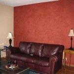
In living rooms, taupe provides a sophisticated and versatile backdrop for furniture and decor. Pair it with a variety of textures, such as velvet, leather, and wood, to add depth and interest. Introduce pops of color through throw pillows, artwork, and accessories within Home Designer Pro. A taupe sofa or a taupe accent wall can serve as a focal point in the room. Experiment with different lighting schemes within the software to see how the taupe responds to various intensities and color temperatures.
In kitchens, taupe can be used to create a warm and inviting space. Use it as the cabinet color or the backsplash tile for a subtle and sophisticated look. Pair it with natural stone countertops and stainless steel appliances for a modern and elegant feel. Introduce accents of copper or brass for a touch of warmth and luxury within Home Designer Pro. Consider using a lighter shade of taupe for the walls to keep the kitchen feeling bright and airy.
Home Designer Pro allows for experimenting with different paint finishes, such as matte, eggshell, or satin. Matte finishes tend to absorb light, creating a softer and more muted look. Eggshell finishes have a slight sheen, providing a more durable and washable surface. Satin finishes have a higher sheen, reflecting more light and creating a more vibrant look. The choice of finish depends on the specific application and the desired aesthetic within the virtual design.
Furthermore, consider using taupe as an accent color to highlight architectural details within Home Designer Pro. Paint crown molding, baseboards, or door frames in taupe to add visual interest to a room. This technique can be particularly effective in rooms with high ceilings or intricate architectural details. Home Designer Pro's architectural tools allow for precisely defining these details and applying paint colors with accuracy.
When working with taupe in Home Designer Pro, it is crucial to consider the overall flow and continuity of the design. Ensure that the taupe complements the colors and styles used in adjacent rooms. Create a cohesive color palette that extends throughout the home, using taupe as a unifying element. This will create a sense of harmony and balance, resulting in a more visually appealing and cohesive design. The ability to view the entire floor plan in Home Designer Pro helps ensure consistency throughout the project.

What Colour Goes With Taupe 10 Cosy Colours 2024 Checkatrade
:strip_icc()/BEHR_22.02_DESIGNERCOLLECTION_KM_019_BlankCanvas_TranquilGray-1-719x1024-a5ee3bb1769f4a17b231f0ad74f46f88.jpg?strip=all "The Best Taupe Paint Colors For Timeless Elegance")
The Best Taupe Paint Colors For Timeless Elegance

How To Use Taupe Color And Why You Need It Now
:strip_icc()/CreamyMushroom_Behr-0505b7df40b74deaa8e0f774ebe9289f.png?strip=all "The Best Taupe Paint Colors For Timeless Elegance")
The Best Taupe Paint Colors For Timeless Elegance

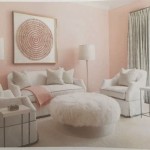
Taupe Paint Color Contemporary Living Room Benjamin Moore Ranchwood Anne Hepfer Designs

7 Beautiful Taupe Paint Colors For Your Home

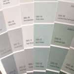
What Everyone Should Know About The Neutral Undertone Taupe

What Everyone Should Know About The Neutral Undertone Taupe

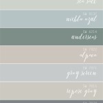
Get Ready To Transform Your Home With This Taupe Paint Palette
:strip_icc()/Flatiron_TaupePaintColor_Clare_02_540x-6457321393ea49a1b56e0e7edc28b992.jpg?strip=all "The Best Taupe Paint Colors For Timeless Elegance")
The Best Taupe Paint Colors For Timeless Elegance
Related Posts