The Alluring Beauty of Spring Thaw Paint Colors
The arrival of spring is often heralded by a dramatic shift in the natural environment. The icy grip of winter loosens, giving way to a gradual awakening of flora and fauna. This transition, often referred to as the spring thaw, provides a rich source of inspiration for artists and designers alike, particularly in the realm of color palettes. Spring thaw paint colors evoke a sense of renewal, optimism, and subtle beauty, offering a refreshing alternative to the bolder, more saturated colors often associated with summer.
This article explores the nuances of spring thaw paint colors, examining their characteristics, psychological impact, and application in various design contexts. The focus will be on understanding how these colors can be effectively utilized to create harmonious and inviting spaces that reflect the season's inherent tranquility and revitalizing energy.
Understanding the Spring Thaw Color Palette
The spring thaw color palette is defined by its muted tones, soft pastels, and earthy neutrals. These colors are not vibrant or overpowering; instead, they possess a subtle luminescence that mimics the gentle sunlight and nascent growth of early spring. Key characteristics include:
Softness and Subtlety: Spring thaw colors are inherently muted, often achieved by incorporating gray or white into their base. This creates a softer, less intense hue that is easy on the eyes and promotes a sense of calm. The subtlety allows for layering and blending, creating depth and visual interest without overwhelming the space.
Earthy Undertones: Reflecting the natural world emerging from winter, many spring thaw colors incorporate earthy undertones of browns, beiges, and greens. These grounding elements provide a sense of stability and connection to nature, preventing the palette from feeling overly saccharine or artificial. Think of the colors of damp earth, budding leaves, and thawing ice – these are the inspiration points.
Pastel Variations: While pastels are a common element, spring thaw pastels are typically less saturated and more complex than traditional Easter egg hues. They often possess a dusty or aged quality, adding a layer of sophistication and preventing them from appearing childish or overly whimsical. Think of a faded robin's egg blue rather than a vibrant turquoise, or a muted lavender instead of a bold purple.
Light Reflectance: A defining characteristic of spring thaw colors is their ability to reflect light. This is crucial for brightening spaces that may have felt dark and confined during the winter months. The light reflectance also contributes to the airy and open feeling associated with the season.
Examples of Spring Thaw Colors: Common examples include soft grays with green or blue undertones, muted beiges and creams, pale yellows with a hint of green, dusty pinks and lavenders, and light olives or sage greens. The key is to choose colors that evoke a sense of freshness and new beginnings without being overly bright or stimulating.
The Psychological Impact of Spring Thaw Colors
Color psychology plays a significant role in how we perceive and react to our environment. Spring thaw paint colors are particularly effective in creating specific emotional responses due to their inherent properties. These colors tend to evoke feelings of:
Calm and Relaxation: The soft and muted tones of spring thaw colors are inherently calming. They lower stress levels and promote a sense of peace and tranquility, making them ideal for bedrooms, bathrooms, and other spaces intended for relaxation.
Optimism and Hope: As colors associated with the rebirth of nature, spring thaw colors evoke feelings of optimism and hope. They symbolize new beginnings and the promise of brighter days, making them suitable for spaces where positivity and motivation are desired, such as home offices or creative studios.
Freshness and Cleanliness: The association with thawing ice and emerging plant life lends spring thaw colors a sense of freshness and cleanliness. They can make a space feel more open, airy, and inviting, particularly after the confinement of winter.
Serenity and Balance: The balance inherent in these color palettes, with their interplay of muted tones and natural undertones, fosters a sense of serenity and balance. This makes them suitable for spaces where harmony and equilibrium are important, such as meditation rooms or yoga studios.
Connection to Nature: The earthy and organic qualities of spring thaw colors foster a connection to the natural world. This can be particularly beneficial in urban environments where access to nature is limited. Integrating these colors into interior spaces can bring a sense of the outdoors in, promoting well-being and reducing stress.
It's important to note that individual responses to color can vary based on personal preferences and cultural background. However, the general psychological associations of spring thaw colors make them a powerful tool for creating specific atmospheres and influencing mood.
Applying Spring Thaw Colors in Design
The versatility of the spring thaw color palette allows for application across various design styles and contexts. However, careful consideration must be given to factors such as lighting, architectural features, and intended purpose of the space to achieve the desired effect. Here are some guidelines for effectively incorporating these colors:
Consider Lighting: Natural light is particularly important for showcasing the subtle nuances of spring thaw colors. Rooms with ample natural light will benefit from the light-reflecting properties of these hues, creating a bright and airy atmosphere. In spaces with limited natural light, artificial lighting should be carefully selected to avoid washing out the colors or creating a dull appearance. Warm-toned LED bulbs can help to bring out the warmth in the palette, while cool-toned bulbs can enhance the freshness.
Use as a Base Color: Spring thaw colors work exceptionally well as base colors for walls, providing a neutral backdrop for layering other elements. This allows for flexibility in incorporating accent colors and patterns without overwhelming the space. A light gray with a hint of green or a muted beige can create a sophisticated and inviting foundation.
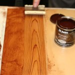
Incorporate Natural Materials: To enhance the connection to nature, pair spring thaw colors with natural materials such as wood, stone, linen, and cotton. These materials complement the earthy undertones of the palette and add texture and warmth to the space. Think light wood floors, woven rugs, linen curtains, and stone countertops.
Add Pops of Contrast: While the overall palette is muted, incorporating pops of contrast can add visual interest and prevent the space from feeling too monotonous. Consider using slightly bolder shades of green, blue, or pink as accent colors in accessories, artwork, or furniture. Metallics, such as gold or copper, can also add a touch of elegance and sophistication.
Layer Textures: Texture is crucial for adding depth and visual interest to a monochromatic or subtly colored space. Incorporate a variety of textures, such as plush rugs, knitted throws, and woven baskets, to create a more inviting and tactile environment. This is particularly important when using lighter colors, as texture can help to prevent the space from feeling flat or sterile.
Don't Overlook Architectural Details: Architectural details, such as trim, molding, and doors, can be highlighted with contrasting spring thaw colors. Painting trim a slightly lighter or darker shade than the walls can add dimension and visual interest. Consider using a matte finish on the walls and a semi-gloss finish on the trim to create subtle contrast.
Consider the Function of the Space: The choice of spring thaw colors should also be guided by the function of the space. For example, a bedroom might benefit from calming blues and greens, while a kitchen might benefit from more energizing yellows and oranges (albeit in muted spring thaw tones). A home office could benefit from a balance of calming and stimulating colors to promote focus and productivity.
By carefully considering these factors, it is possible to effectively utilize spring thaw paint colors to create spaces that are both beautiful and emotionally resonant. The subtle beauty and psychological benefits of these colors make them a valuable tool for designers and homeowners seeking to create harmonious and inviting environments that reflect the tranquility and revitalizing energy of the season.

1508 Spring Thaw By Benjamin Moore Standard Paint Flooring

Chocolate Pudding Spring Thaw Gettysburg Gray Black Beauty Shaker Beige House Paint Exterior Colors Interior Color Schemes

Glidden Essentials 1 Gal Ppg1013 2 Spring Thaw Semi Gloss Interior Paint 2e 01sg The Home Depot

Glidden Essentials 1 Gal Ppg1013 2 Spring Thaw Eggs Interior Paint 2e 01e The Home Depot

Glidden Essentials 1 Gal Ppg1013 2 Spring Thaw Eggs Interior Paint 2e 01e The Home Depot

Glidden Essentials 1 Gal Ppg1013 2 Spring Thaw Eggs Interior Paint 2e 01e The Home Depot

Spring Thaw Arteet By On Deviantart

Glidden One Coat Interior Paint And Primer Spring Thaw White 1 Quart Semi Gloss Com

Glidden Essentials 1 Gal Ppg1013 2 Spring Thaw Eggs Interior Paint 2e 01e The Home Depot

Glidden One Coat Interior Paint And Primer Spring Thaw White 1 Quart Semi Gloss Com
Related Posts