Agreeable Gray Paint Color: Get The Look You Wanted
Agreeable Gray, a popular paint color by Sherwin-Williams, has become a staple in interior design due to its versatility and ability to complement a wide range of styles. This neutral hue offers a sophisticated alternative to stark white or beige, providing warmth and depth to any space. Understanding the nuances of Agreeable Gray, its undertones, coordinating colors, and ideal applications is crucial for achieving the desired aesthetic in a room.
The appeal of Agreeable Gray lies in its chameleon-like quality. Depending on the lighting and surrounding elements, it can lean slightly warmer or cooler, making it a flexible choice for various environments. This color is not a true gray but rather a greige, a blend of gray and beige. This combination creates a neutral base with subtle warmth, preventing it from feeling cold or sterile. Its Light Reflectance Value (LRV) of 60 indicates that it reflects a significant amount of light, making it suitable for both well-lit and dimly lit rooms.
Understanding Agreeable Gray's Undertones
A critical aspect of selecting Agreeable Gray is understanding its undertones. While generally considered a warm gray, it possesses subtle hints of green and sometimes violet. These undertones are not always immediately apparent but can become noticeable depending on the room's lighting and the colors present in the furniture, flooring, and décor. Natural light, particularly sunlight, tends to bring out the warmer beige tones, while artificial light, especially incandescent bulbs, can accentuate the green or violet undertones.
The presence and visibility of these undertones are also influenced by the surrounding colors. For instance, when paired with cool blues or greens, the warmer beige undertones of Agreeable Gray become more prominent, creating a balanced and harmonious color scheme. Conversely, when used in conjunction with warm reds or oranges, the gray aspects of the color may be emphasized, resulting in a cooler overall feel. Therefore, careful consideration of the existing color palette is essential to predicting how Agreeable Gray will appear in a specific space.
To accurately assess the undertones, it is recommended to test Agreeable Gray in the intended room using paint samples. Apply the paint to a large piece of cardboard and observe it under different lighting conditions throughout the day. Compare it to other neutral colors to discern whether the green or violet undertones are more pronounced. This process will help determine if Agreeable Gray is the right choice for the particular room and color scheme.
Coordinating Colors for a Harmonious Palette
The versatility of Agreeable Gray allows it to be paired with a broad spectrum of colors, creating diverse and visually appealing spaces. When developing a color palette, it is important to consider the desired mood and style of the room. For a serene and calming atmosphere, pairing Agreeable Gray with cool blues, greens, and purples can be highly effective. These colors complement the warm undertones of the gray, creating a balanced and inviting space. Examples of successful pairings include shades of pale blue, seafoam green, and lavender.
For a warmer and more inviting ambiance, consider incorporating warmer colors such as yellows, oranges, and reds. These colors create a sense of comfort and energy when combined with Agreeable Gray. However, it is crucial to use these colors sparingly to avoid overwhelming the space. Accent pieces, such as throw pillows, artwork, or rugs, can add pops of warmth without disrupting the overall neutrality of the room. Shades of mustard yellow, burnt orange, and terracotta can be particularly effective.
Another effective strategy is to create a monochromatic color scheme using different shades of gray. Pair Agreeable Gray with lighter grays for a subtle and sophisticated look, or with darker grays for a more dramatic and impactful effect. This approach creates depth and dimension while maintaining a cohesive and unified aesthetic. Consider using different textures and finishes to add visual interest to the monochromatic palette. For example, combining matte paint with glossy accents can create a dynamic and visually appealing space.
White trim is generally a reliable complement to Agreeable Gray. Clean, crisp whites will highlight the gray hue and create a fresh, modern look. Off-whites with slight warmth, such as creamy whites or antique whites, can soften the contrast and create a more traditional feel. The specific white chosen for the trim can significantly impact the overall appearance of the room, so it is important to select a shade that complements the other colors in the space.
Ideal Applications and Room Types
Agreeable Gray's neutrality and versatility make it suitable for a wide range of applications and room types. It is particularly well-suited for living rooms, bedrooms, and hallways, as it creates a welcoming and comfortable atmosphere. The ability to adapt to various lighting conditions makes it a practical choice for rooms with limited natural light.
In living rooms, Agreeable Gray can serve as a neutral backdrop for furniture and décor, allowing statement pieces to stand out. It pairs well with both modern and traditional styles, making it a flexible choice for diverse design preferences. Consider using Agreeable Gray on the walls and incorporating pops of color through accessories such as throw pillows, curtains, and artwork. This approach allows for easy updates and adjustments to the color palette as desired.
In bedrooms, Agreeable Gray promotes relaxation and tranquility. Its subtle warmth creates a cozy and inviting atmosphere, perfect for unwinding after a long day. Pairing it with soft textures, such as plush rugs and comfortable bedding, enhances the sense of comfort and serenity. Consider using lighter shades of gray for smaller bedrooms to maximize the feeling of space and light.
Hallways, often overlooked in interior design, can benefit significantly from a neutral color like Agreeable Gray. It creates a seamless transition between rooms and provides a cohesive look throughout the home. Its ability to reflect light is particularly beneficial in hallways, which often lack natural illumination. Consider adding artwork or decorative mirrors to further enhance the visual appeal of the hallway.
While Agreeable Gray is a popular choice for residential spaces, it can also be used effectively in commercial settings. Its neutrality makes it suitable for offices, waiting rooms, and retail spaces. It creates a professional and inviting atmosphere, while also providing a blank canvas for branding and design elements. Consider using Agreeable Gray in conjunction with corporate colors to create a cohesive and visually appealing workplace.
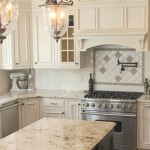
In kitchens, Agreeable Gray can be used on walls or cabinets to create a sophisticated and timeless look. It pairs well with both light and dark countertops and backsplashes, making it a versatile choice for various kitchen styles. Consider using Agreeable Gray on the lower cabinets and a lighter shade on the upper cabinets to create a sense of balance and visual interest. Adding pops of color through accessories such as dish towels, kitchen utensils, and decorative items can further enhance the overall aesthetic of the kitchen.
Bathrooms also benefit from the calming qualities of Agreeable Gray. It creates a spa-like atmosphere, promoting relaxation and well-being. Pairing it with white fixtures and accents enhances the sense of cleanliness and freshness. Consider using different textures, such as textured tiles or wainscoting, to add visual interest to the bathroom. Adding plants can also bring a touch of nature and enhance the overall sense of tranquility.
Ultimately, the key to successfully using Agreeable Gray lies in understanding its nuances and coordinating it with other colors and elements in the space. Careful consideration of lighting, undertones, and desired aesthetic is crucial for achieving the desired look and creating a harmonious and visually appealing environment.

Sherwin Williams Agreeable Gray Paint Color Review

Sherwin Williams Agreeable Gray Paint Color Review Sw 7029 Kylie M Interiors

Sherwin Williams Agreeable Gray Paint Color Review

Sherwin Williams Agreeable Gray Paint Color Review Sw 7029 Kylie M Interiors

Sherwin Williams Agreeable Gray Paint Color Review

What Does Agreeable Gray Look Like In The Home Green With Decor

Sherwin Williams Agreeable Gray Paint Color Review

All About Agreeable Gray The Good And Bad

Agreeable Gray The Ultimate Neutral Greige Paint Color Flooring Girl

Agreeable Gray From Sherwin Williams Sw 7029 Mr Happy House
Related Posts

