Is There Such A Thing As Warm Blue Paint Color?
The world of paint colors can seem vast and complex, with a seemingly endless range of hues, tints, and shades available. Within this expansive landscape, the notion of a "warm blue" might initially appear contradictory. Blue, by its very nature, is often associated with coolness, tranquility, and the vastness of the ocean or sky. However, the reality is far more nuanced. The perceived temperature of a color is not solely determined by its base hue but also by the subtle undertones and surrounding colors that influence its appearance. Therefore, the question of whether a warm blue exists warrants a deeper exploration.
Understanding color theory is crucial to grasping the concept of warm versus cool colors. Colors are typically organized on a color wheel, with reds, oranges, and yellows generally considered warm and blues, greens, and purples considered cool. This categorization stems from associations with elements like fire (warm) and water or ice (cool). However, these are broad generalizations. The precise placement of a color on the warm-to-cool spectrum can shift based on its undertones. For example, a blue with a hint of red or yellow can lean towards the warmer end of the spectrum, while a blue with a strong green undertone will reinforce its cool characteristics.
The perception of color temperature is also subjective and influenced by various factors, including lighting conditions, the colors surrounding the blue in question, and individual preferences. What one person interprets as a warm blue, another might still perceive as cool, albeit less intensely so. The interplay of these factors makes defining a definitively "warm blue" a challenge, but it's certainly possible to identify blues that evoke a sense of warmth compared to their traditionally cool counterparts.
Identifying Blues with Warm Undertones
The key to identifying a warm blue lies in scrutinizing its undertones. Undertones are subtle hues that are mixed into the base color, influencing its overall appearance. In the case of blue, these undertones can significantly alter its perceived temperature. Blues with red, yellow, or even brown undertones tend to feel warmer than those with green or gray undertones.
Consider, for instance, a shade of turquoise or teal that leans slightly towards green-yellow. While still predominantly blue, the subtle infusion of warmth from the yellow undertone can mitigate the inherent coolness of the blue. Similarly, a navy blue with a hint of red can possess a richness and depth that distinguishes it from a stark, icy blue. These subtle additions shift the overall perception, making the blue appear less cold and more inviting.
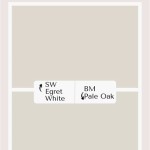
Another example is a dusty or muted blue, often achieved by adding a touch of brown or gray. These colors retain their blue character but offer a softer, more grounded feel than vibrant, saturated blues. The brown or gray undertones help to temper the coolness, creating a sense of warmth and comfort. These muted blues are frequently used in interior design to create relaxing and inviting spaces.
It is crucial to examine paint swatches under different lighting conditions. Natural light, artificial light (both warm and cool), and the existing colors in the room can all affect how a blue paint color appears. A blue that seems warm under warm incandescent lighting might appear cooler under bright, natural daylight.
The Influence of Surrounding Colors
The colors surrounding a blue paint color play a significant role in how warm or cool it appears. The principle of color contrast is key here. Placing a warm blue next to a cool white, for example, will accentuate its warmth. Conversely, pairing it with a warm orange or red could make it seem cooler by comparison.
Consider a room painted a warm, off-white color. In this setting, a blue accent wall or piece of furniture will likely stand out as a cooler element. However, if the room is decorated with warm-toned woods, textiles, and artwork, the blue will integrate more seamlessly and contribute to a balanced and inviting atmosphere. The surrounding colors essentially "contextualize" the blue, influencing how the eye perceives its temperature.
Furthermore, the sheen of the paint can also affect its perceived temperature. Matte finishes tend to absorb light, creating a softer, warmer look, while glossy finishes reflect light, which can make the color appear brighter and cooler. Therefore, the choice of paint sheen should be carefully considered in conjunction with the color itself and the surrounding decor.
Interior designers often use color strategically to create specific moods and effects. By carefully selecting surrounding colors and finishes, they can manipulate the perceived temperature of a room, making it feel warmer, cooler, more inviting, or more energizing.
Examples of Blues that Suggest Warmth
While defining the absolute "warmest" blue is subjective, certain blue hues consistently evoke a sense of warmth more readily than others. These include:
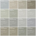
*Denim Blue:
This classic shade bridges the gap between casual cool and comfortable warmth. Its association with well-worn fabric and natural dyes gives it a familiar and approachable feel. It often has subtle gray undertones that soften its intensity. *Teal with Yellow Undertones:
As mentioned previously, teals that lean slightly towards yellow incorporate a hint of warmth, making them feel less austere than pure blues. They strike a balance between tranquility and vibrancy. *Dusty Blue-Grays:
Muted blue-grays, often referred to as "smoky blues," have a subtle, sophisticated warmth. They are calming and versatile and pair well with a variety of other colors. *Navy Blue with Red Undertones:
A deep navy blue with a hint of red feels richer and more luxurious than a stark, cool navy. The red undertones add depth and complexity, creating a warmer impression. *Cornflower Blue with Earthy Undertones:
A soft, muted cornflower blue, with subtle earthy undertones, offers a rustic and comforting feel. It recalls the colors found in nature, which can be viewed as subtly warm and inviting.These examples demonstrate that the spectrum of blue is far more diverse than commonly perceived. By carefully considering the undertones and surrounding colors, it is possible to find blue paint colors that evoke a sense of warmth and comfort rather than solely coolness and detachment.
Ultimately, the selection of paint colors is a deeply personal process. While understanding color theory and the principles of warm and cool tones can provide valuable guidance, the most important factor is choosing colors that resonate with the individual and create the desired atmosphere in their living space. Experimenting with different shades and combinations is crucial to discovering the perfect palette that reflects personal style and preferences.

Warm Blue Gray Paint Colors Yes It S Possible Mod Mood

Best Warm Blue Paint Colors To Cozy Up Your Home Knockoffdecor Com

Warm Blue Gray Paint Colors Yes It S Possible Mod Mood

Warm Blue Gray Paint Colors Yes It S Possible Mod Mood

The Best Blue Green Paint Colors Life On Virginia Street

Warm Blue Gray Paint Colors Yes It S Possible Mod Mood

Is The Temperature Of Blue Warm Or Cool Celebrating Color

The Best Light Blue Paint Colors For Your Home

What Makes A Color Cool Vs Warm
Is The Temperature Of Blue Warm Or Cool Celebrating Color
Related Posts