Ideas for Choosing a Living Room Paint Color
Selecting a paint color for a living room is a crucial decision that significantly impacts the overall ambiance and feel of the space. The living room often serves as a central hub for relaxation, entertainment, and family gatherings, making the chosen color a key element in establishing the desired atmosphere. Considerations such as room size, natural light availability, existing furniture, and personal style all play a part in determining the most suitable paint color. Navigating the vast spectrum of color options can feel overwhelming, but approaching the selection process with a clear understanding of color psychology and practical considerations can lead to a satisfying and aesthetically pleasing result.
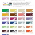
Before delving into specific color suggestions, it is essential to understand the impact of undertones. Undertones are the subtle hues beneath the surface color that can significantly influence how a paint color appears in different lighting conditions and when paired with other elements in the room. Warm undertones, such as red, yellow, or orange, create a cozy and inviting atmosphere, while cool undertones, such as blue, green, or purple, tend to evoke a sense of tranquility and spaciousness. Paying attention to undertones ensures that the chosen color harmonizes with existing elements and achieves the desired effect.
Moreover, understanding the Light Reflectance Value (LRV) of a paint color is important. LRV measures the percentage of light a color reflects. A higher LRV indicates a lighter color that reflects more light, making a room appear brighter and larger. Conversely, a lower LRV indicates a darker color that absorbs more light, creating a more intimate and dramatic atmosphere. Considering the room's natural light conditions and desired mood is crucial when selecting a paint color with an appropriate LRV.
Neutral Colors: A Versatile Foundation
Neutral colors, such as whites, grays, beiges, and creams, are popular choices for living rooms due to their versatility and ability to complement a wide range of interior design styles. These colors provide a blank canvas that allows furniture, accessories, and artwork to take center stage. While often perceived as simple, neutral colors offer a surprising level of complexity, with varying undertones that can significantly impact the overall feel of the room.
White, for example, is not simply white. There are numerous shades of white, ranging from warm whites with yellow or beige undertones to cool whites with blue or gray undertones. Warm whites can create a cozy and inviting atmosphere, while cool whites tend to feel more modern and crisp. The choice depends on the desired mood and the existing elements in the room. For a room with limited natural light, a warm white with a high LRV can help to brighten the space.
Gray is another versatile neutral that has gained significant popularity in recent years. Similar to white, gray offers a wide range of shades and undertones, from warm grays with brown or beige undertones to cool grays with blue or green undertones. Warm grays can create a sophisticated and inviting atmosphere, while cool grays tend to feel more modern and minimalist. When selecting a gray paint color, it is essential to consider the other colors in the room and choose a shade that complements them.
Beige and cream are classic neutral colors that offer a warm and inviting feel. These colors are particularly well-suited for traditional or transitional living rooms. Like whites and grays, beiges and creams also have varying undertones, ranging from warm shades with yellow or orange undertones to cooler shades with green undertones. Choosing a beige or cream with the right undertone can help to create a cohesive and harmonious color palette.
When using neutral colors, consider incorporating texture through furniture, accents, or wall treatments to add visual interest and prevent the space from feeling flat or monotonous. Layering different shades of neutral colors can also create depth and dimension in the room. For example, pairing a light gray wall with a darker gray sofa and white trim can create a sophisticated and contemporary look.
Bold Colors: Making a Statement
For those seeking a more dramatic and expressive living room, bold colors can be an excellent choice. Colors such as blues, greens, yellows, reds, and oranges can create a vibrant and eye-catching space, reflecting personal style and adding visual energy. However, using bold colors requires careful consideration to avoid overwhelming the room and creating an unbalanced atmosphere.
Blue is often associated with tranquility and relaxation, making it a popular choice for living rooms. Different shades of blue can evoke different moods, from a light and airy sky blue to a deep and sophisticated navy blue. Light blues can create a calming and spacious atmosphere, while darker blues can add drama and depth. When using blue, consider balancing it with warmer colors to prevent the room from feeling too cold.
Green is another versatile color that can bring a sense of nature and freshness into the living room. Different shades of green can evoke different emotions, from a vibrant and energetic lime green to a calming and serene sage green. Light greens can create a refreshing and airy atmosphere, while darker greens can add a touch of sophistication and elegance. Green pairs well with natural materials such as wood and stone, creating a harmonious and organic feel.
Yellow is a cheerful and optimistic color that can brighten up any living room. However, yellow can also be overwhelming if not used carefully. Light yellows can create a warm and inviting atmosphere, while darker yellows can add a touch of drama and sophistication. When using yellow, consider balancing it with cooler colors to prevent the room from feeling too intense.
Red is a bold and passionate color that can add a sense of energy and excitement to the living room. However, red should be used sparingly, as it can be overwhelming if used excessively. A deep red accent wall or a few red accessories can add a touch of drama and personality without overpowering the space. Consider pairing red with neutral colors to create a balanced and harmonious look.
Orange is a warm and inviting color that can create a sense of energy and enthusiasm in the living room. Similar to red, orange should be used carefully, as it can be overwhelming if used excessively. A burnt orange accent wall or a few orange accessories can add a touch of warmth and personality to the space. Consider pairing orange with neutral colors or complementary colors like blue to create a balanced and harmonious look.
When using bold colors, it is essential to consider the size of the room and the amount of natural light available. In smaller rooms, it is best to use bold colors sparingly, focusing on accent walls or accessories. In larger rooms with ample natural light, bolder colors can be used more extensively without overwhelming the space. Also, it is wise to acquire a sample of the desired color and apply it to a small area of the wall to observe its appearance in different lighting conditions throughout the day before committing to painting the entire room.
Creating Harmony: Color Palette Considerations
Ultimately, the success of any living room paint color choice hinges on creating a harmonious color palette that ties all the elements of the room together. This involves considering the existing colors in the furniture, flooring, and accessories, and selecting a paint color that complements and enhances these elements. Several approaches can be used to create a harmonious color palette.
The monochromatic approach involves using different shades of the same color to create a cohesive and unified look. This approach is particularly effective for creating a calming and serene atmosphere. For example, a living room could feature a light blue wall, a medium blue sofa, and dark blue accessories. This creates depth and visual interest while maintaining a sense of harmony.
The analogous approach involves using colors that are adjacent to each other on the color wheel. This approach creates a harmonious and balanced look that is slightly more dynamic than the monochromatic approach. For example, a living room could feature a blue wall, a green sofa, and turquoise accessories. This combination creates a sense of tranquility and freshness.
The complementary approach involves using colors that are opposite each other on the color wheel. This approach creates a vibrant and eye-catching look that is full of energy. For example, a living room could feature a blue wall and orange accessories. This combination creates a sense of excitement and contrast. When using complementary colors, it is important to balance them carefully to avoid overwhelming the space.
The triadic approach involves using three colors that are equally spaced on the color wheel. This approach creates a dynamic and playful look that is full of personality. For example, a living room could feature a blue wall, yellow accents, and red accessories. This combination creates a sense of energy and excitement. When using triadic colors, it is important to balance them carefully to avoid creating a chaotic or unbalanced look.
Before committing to a paint color, acquire several paint samples and apply them to different areas of the wall. Observe how the colors appear at different times of day and in different lighting conditions. This will help to ensure that the chosen color harmonizes with the existing elements in the room and achieves the desired effect. Also, take into consideration the sheen of the paint. Different sheens offer varied levels of durability. Matte finish provides minimal sheen while semi-gloss option provides the most. Experimenting with samples and considering all aspects of the room will lead to a living room that is both visually appealing and personally satisfying.

Living Room Paint Color Ideas And Tips To Match The Right

Bright Paint Color Ideas To Consider Forbes Home

Dulux Living Room Paint Colours
.jpg?strip=all "Two New Living Room Paint Colors Dream Green Diy")
Two New Living Room Paint Colors Dream Green Diy

49 Best Living Room Paint Colors Top From Designers

30 Living Room Paint Colors Inspiration For An Inviting Space Benjamin Moore Wall Color Schemes Earth Tone

30 Living Room Paint Colors Inspiration For An Inviting Space Benjamin Moore

5 Neutral Living Room Paint Color Ideas Design Cafe

91 Living Room Paint Colors Ideas For
.jpg?strip=all "Two New Living Room Paint Colors Dream Green Diy")
Two New Living Room Paint Colors Dream Green Diy
Related Posts