Colour Chart For Home Paint
Choosing the right colour palette is crucial for creating the desired ambiance and aesthetic in any home. A well-chosen colour scheme can transform a space, influencing mood, highlighting architectural features, and even affecting perceived spatial dimensions. Navigating the vast spectrum of available paint colours can feel overwhelming. A comprehensive understanding of colour charts and their practical application empowers homeowners to make informed decisions and achieve desired results.
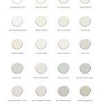
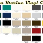
Colour charts provide a systematic organization of paint colours, typically arranged according to hue, saturation, and lightness. These charts offer a valuable visual tool for comparing and contrasting different shades, allowing individuals to visualize how colours might appear in their homes. Many paint manufacturers offer their own proprietary colour charts, often featuring curated palettes and collections designed to simplify the selection process. These charts can be physical booklets, large fan decks, or accessed digitally through websites and mobile applications.
Understanding the underlying principles of colour theory is essential for effective use of a colour chart. The colour wheel, a visual representation of colours arranged according to their relationships, serves as a foundational element. Primary colours (red, yellow, and blue) form the basis of the wheel, with secondary colours (green, orange, and violet) created by mixing primary colours. Tertiary colours emerge from mixing a primary colour with its adjacent secondary colour. The colour wheel helps illustrate concepts like complementary colours (opposite each other on the wheel), analogous colours (adjacent on the wheel), and triadic colours (forming an equilateral triangle on the wheel). These relationships can be leveraged to create harmonious and visually appealing colour schemes.
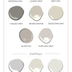
Colour charts often categorize colours by their undertones. Undertones are the subtle hints of colour that lie beneath the surface hue. Recognizing undertones is crucial for achieving colour harmony within a space. For example, a seemingly neutral beige might have warm undertones of yellow or pink, or cool undertones of gray or blue. These undertones can significantly impact how a colour appears in different lighting conditions and in conjunction with other colours in the room. Careful consideration of undertones ensures that chosen colours work well together and create the intended atmosphere.
Light plays a critical role in how colours are perceived. Natural light changes throughout the day, impacting the appearance of wall colours. Artificial lighting, with its varying colour temperatures, also influences how colours are rendered. North-facing rooms tend to receive cooler, bluish light, while south-facing rooms receive warmer, yellowish light. When using a colour chart, it's crucial to consider the specific lighting conditions of the room being painted. Testing paint samples on the walls and observing them at different times of the day and under different lighting conditions allows for a more accurate assessment of how the colour will ultimately look.
Several factors beyond colour theory influence colour selection. The room's purpose plays a significant role. Vibrant, stimulating colours might be suitable for a children's playroom, while calming, neutral colours are often preferred for bedrooms. The room's size and architectural features also influence colour choices. Lighter colours tend to make a room feel larger and more open, while darker colours can create a sense of intimacy and coziness. The existing furniture, decor, and flooring should also be considered when choosing paint colours. The goal is to create a cohesive and harmonious environment where all elements work together aesthetically.
Many paint manufacturers offer tools and resources beyond traditional colour charts to assist in the selection process. Virtual painting tools allow users to upload photos of their rooms and digitally apply different paint colours, providing a realistic preview of the potential outcome. Colour consultants offer expert advice and personalized guidance, assisting individuals in selecting colours that align with their aesthetic preferences and the specific characteristics of their homes. These resources can be invaluable for those who feel overwhelmed by the vast array of colour choices.
Beyond individual colour selections, understanding the impact of broader colour schemes is essential. Monochromatic schemes utilize variations in the lightness and saturation of a single colour, creating a cohesive and sophisticated look. Analogous schemes employ colours adjacent to each other on the colour wheel, resulting in a harmonious and balanced feel. Complementary schemes utilize colours opposite each other on the colour wheel, creating a vibrant and energetic contrast. Triadic schemes involve three colours evenly spaced on the colour wheel, offering a dynamic and visually interesting combination. Understanding these colour scheme principles allows for the creation of well-balanced and aesthetically pleasing spaces.
The finish of the paint also impacts the final appearance of the colour. Matte finishes absorb light and can conceal imperfections on the wall surface, but are less durable and harder to clean. Eggshell and satin finishes offer a subtle sheen and are more washable than matte finishes. Semi-gloss and gloss finishes are highly reflective and durable, making them suitable for high-traffic areas and trim. The chosen finish can significantly impact the perception of colour, with glossier finishes appearing richer and more vibrant.
Proper preparation is vital for achieving optimal paint application and colour representation. Cleaning the walls thoroughly, patching any holes or imperfections, and applying a primer create a smooth and uniform surface for the paint. Primer helps seal the wall, preventing the existing colour from bleeding through and ensuring that the chosen paint colour appears true to its representation on the colour chart. Careful surface preparation contributes significantly to the overall success of the painting project and the final aesthetic of the space.

Natural Paint Colour Chart Card Auro Free The Organic Co

Exterior House Paint Color Chart

Wall Coating Colours House Paint Colour Chart Never Again Combination Color Shades

Pratt And Lambert Colors House Paint Color Chart Chip Sample Swatch Palette Charts For Home Interior

Color Thesaurus Paint Chart Names Mixing

Crafting A Professional Paint Color Comparison Chart For Home Projects Colourdrive

Paint Colours Singapore Asian Paints Colour Shades Wall Colors

Paint Colours Chart 30 On Trend For Every Room

Paint Color Chart The Basics And Beyond Lovetoknow

Natural Paint Colour Chart Card Auro Free The Organic Co
Related Posts