3 Color Combinations For Interior House Paint Colors
Choosing the right paint colors for your home is a crucial step in creating a space that feels both aesthetically pleasing and comfortable. With countless color options available, it can be overwhelming to find the perfect combinations that complement your style and create the desired ambiance. This article will explore three popular color combinations for interior house paint, providing insights into their nuances and how to successfully implement them in your home.
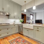
1. Neutral Base with Accents of Color
A timeless and versatile approach to interior design, this combination involves using neutral colors like white, beige, gray, or black as a base for your walls and furniture while incorporating pops of color through accessories, artwork, and textiles. The neutral backdrop creates a sense of calm and spaciousness, while the accents of color bring personality and interest to the space.
For example, you could paint your walls in a soft gray and choose a vibrant blue rug, some terracotta-colored throw pillows, and artwork featuring warm hues. The neutral walls allow the bright accents to shine and create a visually stimulating focal point. This approach is particularly effective in smaller spaces, as it prevents the room from feeling cluttered and overwhelming. It is also adaptable to different styles, ranging from contemporary to traditional, making it a popular choice for many homeowners.
When choosing accent colors, consider the mood you want to create. Warm colors like red, orange, and yellow can evoke energy and excitement, while cool colors like blue, green, and purple can promote relaxation and tranquility. For a more subtle accent, consider using a complementary color to your neutral base, such as a warm brown with a cool gray or a soft peach with a deep teal. Ensure the accent color is balanced with the neutral base to maintain a cohesive look.
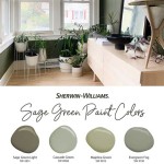
2. Monochromatic Palette with Variations in Tone
A monochromatic color scheme involves using different shades, tints, and tones of a single color to create a harmonious and sophisticated interior. This approach can be applied to the entire house or individual rooms, offering a sense of unity and visual interest. The key is to use variations in tone, from light to dark, to add depth and dimension to the space.
For example, a living room painted in shades of blue could feature a light blue on the walls, a medium blue on the sofa, and a darker blue on the accent pillows. This creates a visually pleasing flow, where the eye is guided from one element to another without feeling overwhelmed by too much variation. By choosing a monochromatic palette, you can create a sense of serenity and elegance, making it perfect for bedrooms, bathrooms, or any space where you want to promote a sense of peace and calm.
When using a monochromatic palette, it is important to ensure that you choose a color that you genuinely enjoy. Since the color will be the focal point of the space, it is essential to select a hue that you find visually appealing and that complements your personal style. To avoid a flat and lifeless look, experiment with different textures and patterns to add dimension to the space. This could involve incorporating natural woven textures in your furniture or using wallpaper with subtle patterns in a complementary shade to your base color.
3. Complementary Colors for Vibrant and Contrasting Interiors
If you prefer a more daring and energetic look, using complementary colors can create a bold and exciting statement. Complementary colors are those that are opposite each other on the color wheel, such as red and green, blue and orange, or yellow and purple. When used together, these colors create a strong visual contrast that can energize and invigorate a space.
For example, a dining room painted in a vibrant blue could be accented with warm orange chairs and artwork featuring shades of yellow. This combination creates a striking contrast that makes the space feel dynamic and inviting. The key to using complementary colors is to ensure that they are balanced. Using one color as the dominant hue and the other as an accent can help create a harmonious and well-balanced look.
Consider the size and shape of your room when using complementary colors. In smaller rooms, using lighter shades of your chosen colors can help create a more spacious feel. In larger rooms, bolder colors can enhance the drama and grandeur of the space. Remember that different colors have different psychological effects. For example, red can stimulate appetite and energy while blue promotes calm and relaxation. Choose complementary colors that align with the intended use of the space and create the desired atmosphere.

20 Best Room Color Combinations Eye Catching Palettes For Your Home

Eye Catching Two Colour Combinations For Your Home By Indigo Paints

Best Wall Color Combination Ideas In 2024 To Enhance Your Walls

Color Palette For Home 12 Combos Designers Love Havenly Interior Design Blog

50 Popular Living Room Colors Paint Ideas

Transform Your Home With Inspiring Colour Combinations Asian Paints

30 Living Room Color Ideas Best Paint Decor Colors For Rooms

20 Top Interior Color Schemes For Your House Design Foyr Neo

15 Stunning Hall Colour Combination Ideas For Living Room

18 Best Home Interior Colour Combination Design Ideas
Related Posts